Snapdeal Rolls Out New Design for Mobile Apps, Website
Advertisement

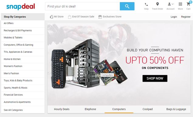
E-commerce retailer Snapdeal has released a new look for their mobile apps and website today, claiming a 25 percent reduction in webpage load times and app crashes to less than one percent.
The new look of the website was rolled out by former senior exec at Bharti Airtel - Anand Chandrasekaran, who joined Snapdeal as Chief Product Officer on June 10'th.
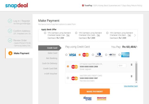
The new user interface is meant to be intuitive and make it easier to locate product information, and make decision-making possible in one view. Users can sort and filter by brand, price, popularity, discounts and new arrivals.

Snapdeal has done away with the red and blue backgrounds and banner ads for a cleaner interface with more white space, interspersed with shades of grey.
"The refreshed interface is designed to give our products an uncluttered look, to make navigation easier and create more focus on visual elements that will highlight the over 12 million products." Chandrasekharan said. The redesign enables users to purchase an item in the first view of the product page, reducing the number of steps involved while shopping on the website.
A Snapdeal spokesperson confirmed that the app updates on iOS and Android, rolled out on June 22nd and July 3rd respectively incorporate the redefined information architecture in terms of category grouping and discovery.
Snapdeal is also scheduled to roll out a redesigned mobile version of the app for 2G connections, which will load 75 percent faster, and a Windows phone app in the coming months.
Founded in February 2010, Snapdeal has received over $1.1 billion (roughly Rs.) in eight funding rounds, with the latest investments coming from Ratan Tata and SoftBank.
The new look of the website was rolled out by former senior exec at Bharti Airtel - Anand Chandrasekaran, who joined Snapdeal as Chief Product Officer on June 10'th.
The new user interface is meant to be intuitive and make it easier to locate product information, and make decision-making possible in one view. Users can sort and filter by brand, price, popularity, discounts and new arrivals.

Snapdeal has done away with the red and blue backgrounds and banner ads for a cleaner interface with more white space, interspersed with shades of grey.
"The refreshed interface is designed to give our products an uncluttered look, to make navigation easier and create more focus on visual elements that will highlight the over 12 million products." Chandrasekharan said. The redesign enables users to purchase an item in the first view of the product page, reducing the number of steps involved while shopping on the website.
A Snapdeal spokesperson confirmed that the app updates on iOS and Android, rolled out on June 22nd and July 3rd respectively incorporate the redefined information architecture in terms of category grouping and discovery.
Snapdeal is also scheduled to roll out a redesigned mobile version of the app for 2G connections, which will load 75 percent faster, and a Windows phone app in the coming months.
Founded in February 2010, Snapdeal has received over $1.1 billion (roughly Rs.) in eight funding rounds, with the latest investments coming from Ratan Tata and SoftBank.
For the latest tech news and reviews, follow Gadgets 360 on X, Facebook, WhatsApp, Threads and Google News. For the latest videos on gadgets and tech, subscribe to our YouTube channel. If you want to know everything about top influencers, follow our in-house Who'sThat360 on Instagram and YouTube.
Further reading:
Anand Chandrasekharan, E commerce portals, Internet, New Snapdeal look, Snapdeal, Snapdeal redesign
Advertisement
