- Home
- Wearables
- Wearables News
- Android Wear 2.0 Unveiled at Google I/O: Everything You Need to Know
Android Wear 2.0 Unveiled at Google I/O: Everything You Need to Know
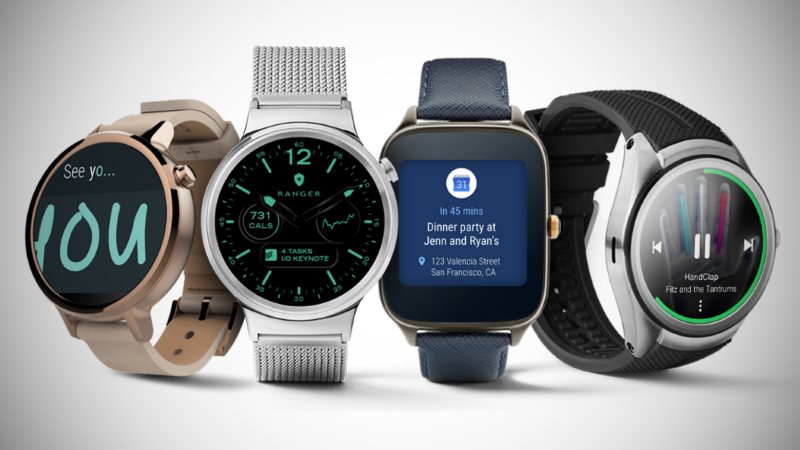
Two years after being unveiled to the public, Google is taking the first major step forward with Android Wear, its OS for wearables.
Called just Android Wear 2.0 - and lacking the name convention that follows its smartphone parent - Google announced the changes coming to smartwatches and wearables in the new version at its developer conference, Google I/O 2016, on Wednesday night.
The biggest of these are the option of standalone apps, input methods, a new notification design, and an API for "complications".
Unlike previously, apps on your wearable device will now be allowed to directly access the Internet (Wi-Fi, cellular or Bluetooth) without having to go through its smartphone app. "This means your app can continue to offer full functionality even if the paired phone is far away or turned off," Google said in a statement. The company noted that removing this need to be tethered allows apps to offer the same experience across Android or iOS.
(Also see: Google Wants Your Help to Name Android N)
In terms of input methods, Android Wear only had support for your voice with the old version. Wear 2.0 supports the inbuilt input framework, giving it access to the keyboards you have installed and letting you use them directly on your wearable, be it via typing or handwriting. Working with a full-size keyboard on a two-inch device is another matter altogether, so you're bound to see app developers come up with creative solutions soon after launch.
Then there is the revamp of the notification platform, part of bigger changes to the system UI itself. With Android Wear 2.0, notifications work and appear differently than before, making better use of round displays. Another change is that you can swipe in both directions - left or right - to dismiss said notifications. And unlike Wear 1.x, the system UI now uses dark background colours that will be derived from the app's colours itself.
Where's the revamp, you ask? That comes by way of expanded notifications which allow app developers to provide a lot more content and a bunch of different actions. For messaging apps on Android Wear 2.0, for example, this could be in the form of smart replies - based on the technology used by the Inbox app.
(Also see: Google's Daydream VR Ecosystem: Everything You Need to Know)
The last big change that Android Wear 2.0 brings is what Google calls "watch face complications". A complication is any feature in a watch face that displays more than hours and minutes, the company says, so a battery indicator then is a complication. Complications appear in the form of small text or an icon; they not only help make the most of the tiny screen on your smartwatch, but also provide you information with a glance. App developers can provide any sort of useful data, such as the number of unread emails, the current date or temperature, your next meeting or how many steps you've completed.
There are tons of other changes as well such as the introduction of Android N features - Data Saver and new emojis, for instance - for apps on Android Wear. For developers, Wear 2.0 brings improvements to the Google Fit platform, and a better guide to Material Design for wearables.
There is a clear shift in design and use with Android Wear 2.0 - a move towards vertical layout and new input methods. It remains to be seen if this will be enough to drive up adoption, though.
Android Wear 2.0 will be available for public release alongside Android N sometime this fall, but you can get the developer preview right now. Head over to the preview website to grab it, and then test it on the official Android emulator, the LG Watch Urbane 2nd Edition LTE, or the Huawei Watch.
Get your daily dose of tech news, reviews, and insights, in under 80 characters on Gadgets 360 Turbo. Connect with fellow tech lovers on our Forum. Follow us on X, Facebook, WhatsApp, Threads and Google News for instant updates. Catch all the action on our YouTube channel.
Related Stories
- Samsung Galaxy Unpacked 2026
- iPhone 17 Pro Max
- ChatGPT
- iOS 26
- Laptop Under 50000
- Smartwatch Under 10000
- Apple Vision Pro
- Oneplus 12
- OnePlus Nord CE 3 Lite 5G
- iPhone 13
- Xiaomi 14 Pro
- Oppo Find N3
- Tecno Spark Go (2023)
- Realme V30
- Best Phones Under 25000
- Samsung Galaxy S24 Series
- Cryptocurrency
- iQoo 12
- Samsung Galaxy S24 Ultra
- Giottus
- Samsung Galaxy Z Flip 5
- Apple 'Scary Fast'
- Housefull 5
- GoPro Hero 12 Black Review
- Invincible Season 2
- JioGlass
- HD Ready TV
- Latest Mobile Phones
- Compare Phones
- Vivo T5 Pro 5G
- OPPO F33 5G
- OPPO F33 Pro 5G
- Redmi A7 Pro 5G
- Redmi R70m 5G
- Redmi R70 5G
- OPPO A6s Pro
- Realme Narzo 100 Lite 5G
- Asus Zenbook S14
- Asus Vivobook 16 (2026)
- Moto Pad (2026)
- Vivo Pad 6 Pro
- boAt Valour Watch 1R
- Xiaomi Watch S5
- Xiaomi TV S Mini LED 2026 (75-inch)
- Xiaomi TV S Mini LED 2026 (65-inch)
- Asus ROG Ally
- Nintendo Switch Lite
- Haier 1.6 Ton 5 Star Inverter Split AC (HSU19G-MZAID5BN-INV)
- Haier 1.6 Ton 5 Star Inverter Split AC (HSU19G-MZAIM5BN-INV)
-
 MediaTek Dimensity 9600 Pro Leak Suggests 5GHz Clock Speed, High Benchmark Scores
-
 Oppo Find X9s Pro Key Specifications Surface Online as Launch Date Draws Closer
-
 Russian-Based Crypto Exchange Grinex Halts Operation After $14 Million Hack
-
 Assassin's Creed: Black Flag Resynced Will Reportedly Release in July, Reveal Set for Next Week


