- Home
- Social networking
- Social networking News
- LinkedIn redesigns homepage to make it more Facebook like
LinkedIn redesigns homepage to make it more Facebook-like

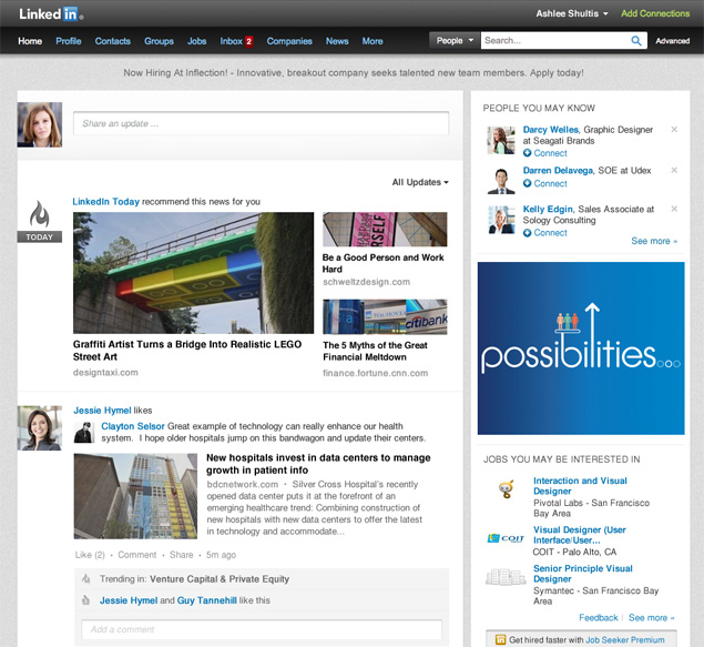
The new homepage layout includes more social features resembling the likes of Google+ and Facebook. The company however mentions in their blog that the aim is to offer users with more relevant news and information based on their industry and connections.
The screenshot above shows images appearing much larger and users will now be able to see the latest updates at the top of the news feed. The 'show more' option at the bottom of the page has now vanished and users can continue viewing posts by simply scrolling down seamlessly. Other expandable and collapsible options like 'see more' on a specific post or 'hide' have also disappeared, keeping the look clean.
The sidebar now lists statistical information on your network and other related info like jobs you may be interested in and other people you may know.
Sharing more about the overhaul on the company blog, LinkedIn product manager Caroline Gaffney said, "This is just the beginning of many more exciting, new features we plan to bring to the Homepage to offer more customization and functionality this year. We look forward to making the LinkedIn Homepage your go-to destination to discover and discuss what matters to you, your industry and your professionals network around the world."
LinkedIn had recently introduced the ability to comment and like posts on LinkedIn Today, which is their social news portal. Additionally, they also featured a new section called Trending in Your Network that shows news that is currently trending in users' individual networks.
Catch the latest from the Consumer Electronics Show on Gadgets 360, at our CES 2026 hub.
Related Stories
- Samsung Galaxy Unpacked 2025
- ChatGPT
- Redmi Note 14 Pro+
- iPhone 16
- Apple Vision Pro
- Oneplus 12
- OnePlus Nord CE 3 Lite 5G
- iPhone 13
- Xiaomi 14 Pro
- Oppo Find N3
- Tecno Spark Go (2023)
- Realme V30
- Best Phones Under 25000
- Samsung Galaxy S24 Series
- Cryptocurrency
- iQoo 12
- Samsung Galaxy S24 Ultra
- Giottus
- Samsung Galaxy Z Flip 5
- Apple 'Scary Fast'
- Housefull 5
- GoPro Hero 12 Black Review
- Invincible Season 2
- JioGlass
- HD Ready TV
- Laptop Under 50000
- Smartwatch Under 10000
- Latest Mobile Phones
- Compare Phones
- iQOO Z11 Turbo
- OPPO A6c
- Samsung Galaxy A07 5G
- Vivo Y500i
- OnePlus Turbo 6V
- OnePlus Turbo 6
- Itel Zeno 20 Max
- OPPO Reno 15 Pro Mini 5G
- Lenovo Yoga Slim 7x (2025)
- Lenovo Yoga Slim 7a
- Realme Pad 3
- OPPO Pad Air 5
- Garmin Quatix 8 Pro
- NoiseFit Pro 6R
- Haier H5E Series
- Acerpure Nitro Z Series 100-inch QLED TV
- Asus ROG Ally
- Nintendo Switch Lite
- Haier 1.6 Ton 5 Star Inverter Split AC (HSU19G-MZAID5BN-INV)
- Haier 1.6 Ton 5 Star Inverter Split AC (HSU19G-MZAIM5BN-INV)


