- Home
- Social networking
- Social networking Reviews
- Ello, Ello Two Days In, the Hottest New Social Network is Pretty Dull
Ello, Ello - Two Days In, the Hottest New Social Network is Pretty Dull
By Gopal Sathe | Updated: 29 September 2014 19:57 IST

Click Here to Add Gadgets360 As A Trusted Source

Advertisement
Ever since the rise and rise of Facebook, we've seen one company after another come up to try and become the next world conquering social network. Ello is the latest in a long line of platforms that have been described as the next big thing but judging by our first brush with the network, Zuckerberg and company have nothing to worry about yet.
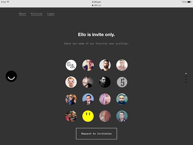
Ello was created last year as a "private" social network, which can only be joined with an invitation. If that reminds you of Google+, then you're not the only person making the comparison. Like Google+, Ello also features great design - it's even better looking in fact, and uses a lot of whitespace to create a friendly, open display. Unfortunately, it's also a bit of a ghost town, that's only now seeing a spurt in interest. And the only thing that people seem to be able to agree on is that Ello looks great.
That's because Ello was initially built by a small group of artists and designers who wanted to share their work and to connect with a closed circle of friends. Over time this grew until the company launched a public version of the network.
Actually using Ello comes with a steep learning curve. Of course that's because Ello is still in "beta", which is admittedly one of the most abused words in the technology space today. Features are being added and functionality is still being fine-tuned.
Using Ello
Adding friends means going to the Discover tab, then clicking on the text where it says "Search", and then typing a name. Search looks like a title and not a field to click and the rest of the links also seem to be designed with aesthetics instead of functionality in mind.
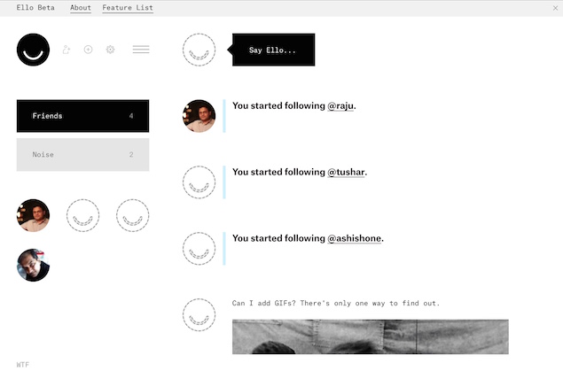
If someone you know is already on Ello (which is admittedly pretty unlikely right now) then you can view their profile and click on either "Friend" or "Noise" next to their name to start following them.

Friends are shown in a detailed feed while Noise sorts condensed posts into a two column layout so you can scan through entries quickly. Like Twitter, Ello has no friend requests - anyone can follow you and all your posts are public. Unlike Twitter, your posts can be as detailed as blogs.
The posts are presented as "containers" for text and images. You can write some text, add some images, and add more text containers again, or rearrange the containers any way you want. Highlight text and you can add a hyperlink. Ello lets you post all sorts of images, so you can create a messy GIF wall if you want, though it's not always a great thing.
Another catch about Ello is that it does not have a mobile app yet. The best Ello experience is on the desktop, where you can easily manage the different visual elements while posting. The site opens easily enough on mobile browsers, but posting anything other than a text update is cumbersome in the extreme, and adding a link didn't work using Safari, though following a tip from another Ello user, we tried it with Chrome on the iPad, and it worked.
Free and ad-free
If you've heard of Ello then you know that one reason for the network's sudden popularity is its manifesto. It speaks to something that is increasingly visible on Facebook - that we are the product now.
Ello promises to be something different. It promises to be free and ad-free forever. New features will roll out over time; this could range from business pages, to changing the colours of the headers and other visual elements, to a mobile app. Ello is hoping that people who want these additional features will be willing to pay for them so that the core service can remain free. The idea is to make a small amount of money from each user.

Is this realistic? Most likely not. While Ello has been pitching itself like an indie band, Robert Scoble noted that the company is VC-funded, as shown in this announcement. If it takes more funding over time, the creators will slowly become more and more answerable to investors, and that doesn't always work out too well for manifestos.
That's a long term concern though. There's also the fact that once you've signed up for your Ello account and marvelled at how good it looks, then there's very little to do.
Still empty
Today if you're a new user to Twitter there are thousands of people you can follow from the very start. You can search for timelines to help you find people to follow and aside from that there is a pretty good chance that you'll find friends to follow as well. In June, Facebook averaged 829 million daily active users and 1.32 billion monthly active users so you're almost certainly going to have a large number of people to communicate with there.
On Ello, you'll be hard pressed to find a dozen individuals to talk to in your first couple of days. And then there's the question of what you'd use it for.
Do you really need one more place to tell the world what you had for breakfast? This is the problem that Google+ faced as well - it's great, and it looks amazing, but it's trying to fill a niche that doesn't really exist. The first few posts that almost everyone made was: "What do I do now?"
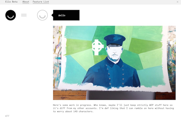
This doesn't mean that Ello is doomed, or even that Ello isn't worth using. But at present, it doesn't feel like it meets the needs of a wide base of users. If you're a designer, or someone who wants to present his or her visual work, then Ello looks like a great place to be. The @ello account which highlights content from around the network shows this. Artists who want to share their work in progress and talk about their process seem to like Ello.
By growing slowly through these tightly knit communities, Ello could grow into something that is relevant by itself, without trying to be the next Facebook. It's going to take more than just two days to really understand Ell,o and a lot longer than that to see whether it grows into something bigger, but we're actually hoping this works. Ello looks great and more companies need to experiment with business models where you are actually the customer, and not the product.
Ello was created last year as a "private" social network, which can only be joined with an invitation. If that reminds you of Google+, then you're not the only person making the comparison. Like Google+, Ello also features great design - it's even better looking in fact, and uses a lot of whitespace to create a friendly, open display. Unfortunately, it's also a bit of a ghost town, that's only now seeing a spurt in interest. And the only thing that people seem to be able to agree on is that Ello looks great.
That's because Ello was initially built by a small group of artists and designers who wanted to share their work and to connect with a closed circle of friends. Over time this grew until the company launched a public version of the network.
Actually using Ello comes with a steep learning curve. Of course that's because Ello is still in "beta", which is admittedly one of the most abused words in the technology space today. Features are being added and functionality is still being fine-tuned.
Using Ello
Adding friends means going to the Discover tab, then clicking on the text where it says "Search", and then typing a name. Search looks like a title and not a field to click and the rest of the links also seem to be designed with aesthetics instead of functionality in mind.
If someone you know is already on Ello (which is admittedly pretty unlikely right now) then you can view their profile and click on either "Friend" or "Noise" next to their name to start following them.
Friends are shown in a detailed feed while Noise sorts condensed posts into a two column layout so you can scan through entries quickly. Like Twitter, Ello has no friend requests - anyone can follow you and all your posts are public. Unlike Twitter, your posts can be as detailed as blogs.
The posts are presented as "containers" for text and images. You can write some text, add some images, and add more text containers again, or rearrange the containers any way you want. Highlight text and you can add a hyperlink. Ello lets you post all sorts of images, so you can create a messy GIF wall if you want, though it's not always a great thing.
Another catch about Ello is that it does not have a mobile app yet. The best Ello experience is on the desktop, where you can easily manage the different visual elements while posting. The site opens easily enough on mobile browsers, but posting anything other than a text update is cumbersome in the extreme, and adding a link didn't work using Safari, though following a tip from another Ello user, we tried it with Chrome on the iPad, and it worked.
Free and ad-free
If you've heard of Ello then you know that one reason for the network's sudden popularity is its manifesto. It speaks to something that is increasingly visible on Facebook - that we are the product now.
Virtually every other social network is run by advertisers. Behind the scenes they employ armies of ad salesmen and data miners to record every move you make. Data about you is then auctioned off to advertisers and data brokers. You're the product that's being bought and sold.
Collecting and selling your personal data, reading your posts to your friends, and mapping your social connections for profit is both creepy and unethical. Under the guise of offering a "free" service, users pay a high price in intrusive advertising and lack of privacy.
Ello promises to be something different. It promises to be free and ad-free forever. New features will roll out over time; this could range from business pages, to changing the colours of the headers and other visual elements, to a mobile app. Ello is hoping that people who want these additional features will be willing to pay for them so that the core service can remain free. The idea is to make a small amount of money from each user.
Is this realistic? Most likely not. While Ello has been pitching itself like an indie band, Robert Scoble noted that the company is VC-funded, as shown in this announcement. If it takes more funding over time, the creators will slowly become more and more answerable to investors, and that doesn't always work out too well for manifestos.
That's a long term concern though. There's also the fact that once you've signed up for your Ello account and marvelled at how good it looks, then there's very little to do.
Still empty
Today if you're a new user to Twitter there are thousands of people you can follow from the very start. You can search for timelines to help you find people to follow and aside from that there is a pretty good chance that you'll find friends to follow as well. In June, Facebook averaged 829 million daily active users and 1.32 billion monthly active users so you're almost certainly going to have a large number of people to communicate with there.
On Ello, you'll be hard pressed to find a dozen individuals to talk to in your first couple of days. And then there's the question of what you'd use it for.
Do you really need one more place to tell the world what you had for breakfast? This is the problem that Google+ faced as well - it's great, and it looks amazing, but it's trying to fill a niche that doesn't really exist. The first few posts that almost everyone made was: "What do I do now?"
This doesn't mean that Ello is doomed, or even that Ello isn't worth using. But at present, it doesn't feel like it meets the needs of a wide base of users. If you're a designer, or someone who wants to present his or her visual work, then Ello looks like a great place to be. The @ello account which highlights content from around the network shows this. Artists who want to share their work in progress and talk about their process seem to like Ello.
By growing slowly through these tightly knit communities, Ello could grow into something that is relevant by itself, without trying to be the next Facebook. It's going to take more than just two days to really understand Ell,o and a lot longer than that to see whether it grows into something bigger, but we're actually hoping this works. Ello looks great and more companies need to experiment with business models where you are actually the customer, and not the product.
Comments
Catch the latest from the Consumer Electronics Show on Gadgets 360, at our CES 2026 hub.
Related Stories
Popular on Gadgets
- Samsung Galaxy Unpacked 2025
- ChatGPT
- Redmi Note 14 Pro+
- iPhone 16
- Apple Vision Pro
- Oneplus 12
- OnePlus Nord CE 3 Lite 5G
- iPhone 13
- Xiaomi 14 Pro
- Oppo Find N3
- Tecno Spark Go (2023)
- Realme V30
- Best Phones Under 25000
- Samsung Galaxy S24 Series
- Cryptocurrency
- iQoo 12
- Samsung Galaxy S24 Ultra
- Giottus
- Samsung Galaxy Z Flip 5
- Apple 'Scary Fast'
- Housefull 5
- GoPro Hero 12 Black Review
- Invincible Season 2
- JioGlass
- HD Ready TV
- Laptop Under 50000
- Smartwatch Under 10000
- Latest Mobile Phones
- Compare Phones
Latest Gadgets
- Motorola Signature
- Vivo Y50e 5G
- Vivo Y50s 5G
- Realme 16 Pro+ 5G
- Realme 16 Pro 5G
- TCL Nxtpaper 70 Pro
- OPPO A6 Pro 5G
- Honor Power 2
- Lenovo Yoga Slim 7x (2025)
- Lenovo Yoga Slim 7a
- Realme Pad 3
- OPPO Pad Air 5
- Xiaomi Watch 5
- Huawei Watch 10th Anniversary Edition
- Acerpure Nitro Z Series 100-inch QLED TV
- Samsung 43 Inch LED Ultra HD (4K) Smart TV (UA43UE81AFULXL)
- Asus ROG Ally
- Nintendo Switch Lite
- Haier 1.6 Ton 5 Star Inverter Split AC (HSU19G-MZAID5BN-INV)
- Haier 1.6 Ton 5 Star Inverter Split AC (HSU19G-MZAIM5BN-INV)
© Copyright Red Pixels Ventures Limited 2026. All rights reserved.


