- Home
- Social networking
- Social networking News
- Twitter rolls out mobile app inspired website redesign to all users
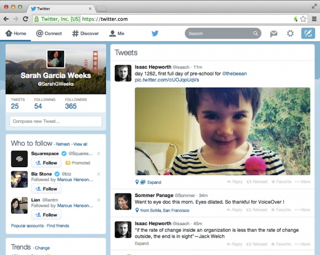
Twitter rolls out mobile app-inspired website redesign to all users

The new look mirrors a lot of the look and feel of Twitter's newest Android and iOS apps. The Twitter for Android update had been launched in the last week of January. The new redesigned look for the website will allow users to personalise their profiles a lot more than before. The settings menu now has the option to include rather add, accent colours.
The changes are purely aesthetic and are not on the functional features of the website. The new changes also include a differently coloured navigation bar. Icons too have received updates. For example the icon for direct messages too has been changed.
- Which is your favourite internet browser?
- CUJO, a newly announced smart Internet security device
- Should The ISPs Provide A Better And Faster Internet At Cheaper Rates?
- I read reports that OnePlus is closing its business. Is it safe to buy OnePlus phones now?
- AI videos are getting better. Are there still any visual hints that reveal a video has been generated synthetically?
At the home feed, a user's profile picture and background will now appear in the top left-hand side of the screen right above the area where the number of Tweets a person has send, are located. White design, bigger buttons all in sync with the mobile apps, have been included.
Interestingly enough the initial reception of the new design has been mixed. While a percentage of users have loved it, others have either directly or indirectly criticised the new design. Some have criticised it outright, others more mellow in their criticism have appreciated the design, whilst asking how can one go back to the previous look. One might want to take a moment to reflect about the kind of reactions that were received when the Facebook Timeline feature had gone live. It has now become synonymous with Facebook.
Reactions will always be mixed for anything new. What remains to be seen is how Twitter's unification initiative across platforms and devices will work out for the micro-blogging site in the coming days.Get your daily dose of tech news, reviews, and insights, in under 80 characters on Gadgets 360 Turbo. Connect with fellow tech lovers on our Forum. Follow us on X, Facebook, WhatsApp, Threads and Google News for instant updates. Catch all the action on our YouTube channel.
Related Stories
- Samsung Galaxy Unpacked 2026
- iPhone 17 Pro Max
- ChatGPT
- iOS 26
- Laptop Under 50000
- Smartwatch Under 10000
- Apple Vision Pro
- Oneplus 12
- OnePlus Nord CE 3 Lite 5G
- iPhone 13
- Xiaomi 14 Pro
- Oppo Find N3
- Tecno Spark Go (2023)
- Realme V30
- Best Phones Under 25000
- Samsung Galaxy S24 Series
- Cryptocurrency
- iQoo 12
- Samsung Galaxy S24 Ultra
- Giottus
- Samsung Galaxy Z Flip 5
- Apple 'Scary Fast'
- Housefull 5
- GoPro Hero 12 Black Review
- Invincible Season 2
- JioGlass
- HD Ready TV
- Latest Mobile Phones
- Compare Phones
- OnePlus Ace 6 Ultra
- Poco C81 Pro
- Vivo Y500s
- Vivo Y600 Pro
- Infinix GT 50 Pro
- Vivo Y6 5G
- Vivo Y05 5G
- Poco C81x
- Dell XPS 16
- Dell XPS 14
- Redmi Pad 2 9.7 4G
- Redmi Pad 2 9.7
- NoiseFit Diva Araya
- OPPO Watch X3 Mini
- Xiaomi TV S Mini LED 2026 (75-inch)
- Xiaomi TV S Mini LED 2026 (65-inch)
- Asus ROG Ally
- Nintendo Switch Lite
- Voltas 1 Ton 3 Star Inverter Split AC (183V Vectra Zenith Silver(4503752))
- Voltas 1 Ton 3 Star Inverter Split AC (123V Vertis Smart Elite Gold(4503704))


