- Home
- Social networking
- Social networking News
- Man draws a map of the world using Facebook
Man draws a map of the world using Facebook
By Sahil Mohan Gupta | Updated: 11 June 2012 15:56 IST
Click Here to Add Gadgets360 As A Trusted Source

Advertisement
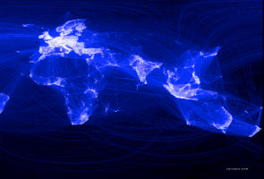
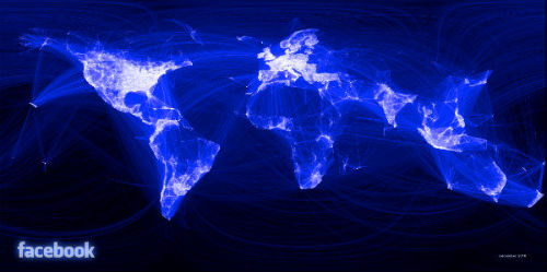
Interested in drawing maps? Try using Facebook for this. Yeah that's what exactly Paul Butler did. He constructed a map of the world using over 10 million Facebook connections and joining them.
We can clearly identify regions of Russia, South America and Australia not having defined structures in the map. This could account for the lack of penetration achieved by Facebook in these regions.
On the flipside we can see the region of North America, Western Europe and our very own India having detailed structures accounting for the heavy Facebook activity in these regions.
According to Paul Butler, "I defined weights for each pair of cities as a function of the Euclidean distance between them and the number of friends between them. Then I plotted lines between the pairs by weight, so that pairs of cities with the most friendships between them were drawn on top of the others. I used a color ramp from black to blue to white, with each line's color depending on its weight. I also transformed some of the lines to wrap around the image, rather than spanning more than halfway around the world.''
He explained further, "After a few minutes of rendering, the new plot appeared, and I was a bit taken aback by what I saw. The blob had turned into a surprisingly detailed map of the world. Not only were continents visible, certain international borders were apparent as well. What really struck me, though, was knowing that the lines didn't represent coasts or rivers or political borders, but real human relationships. Each line might represent a friendship made while traveling, a family member abroad, or an old college friend pulled away by the various forces of life.''
He finally concluded on how he managed to get the shapes right.
"Later I replaced the lines with great circle arcs, which are the shortest routes between two points on the Earth. Because the Earth is a sphere, these are often not straight lines on the projection."
Check out the Facebook page.
Comments
Get your daily dose of tech news, reviews, and insights, in under 80 characters on Gadgets 360 Turbo. Connect with fellow tech lovers on our Forum. Follow us on X, Facebook, WhatsApp, Threads and Google News for instant updates. Catch all the action on our YouTube channel.
Related Stories
Popular on Gadgets
- Samsung Galaxy Unpacked 2026
- iPhone 17 Pro Max
- ChatGPT
- iOS 26
- Laptop Under 50000
- Smartwatch Under 10000
- Apple Vision Pro
- Oneplus 12
- OnePlus Nord CE 3 Lite 5G
- iPhone 13
- Xiaomi 14 Pro
- Oppo Find N3
- Tecno Spark Go (2023)
- Realme V30
- Best Phones Under 25000
- Samsung Galaxy S24 Series
- Cryptocurrency
- iQoo 12
- Samsung Galaxy S24 Ultra
- Giottus
- Samsung Galaxy Z Flip 5
- Apple 'Scary Fast'
- Housefull 5
- GoPro Hero 12 Black Review
- Invincible Season 2
- JioGlass
- HD Ready TV
- Latest Mobile Phones
- Compare Phones
Latest Gadgets
- Vivo Y60
- Sony Xperia 1 VIII
- Itel Zeno 200
- OnePlus Nord CE 6 Lite
- OnePlus Nord CE 6
- Honor Play 70C
- Honor Play 80 Plus
- Moto G47
- Alienware 15 (2026, AMD)
- Alienware 15 (2026, Intel)
- Huawei MatePad Pro Max
- HP OmniPad 12
- Garmin Forerunner 170
- Garmin Forerunner 70
- Lumio Vision 9 (2026)
- Lumio Vision 7 (2026)
- Asus ROG Ally
- Nintendo Switch Lite
- Blue Star 1.5 Ton 5 Star Inverter Split AC (IA518ZXUS)
- Blue Star 1.5 Ton 3 Star Inverter Split AC (IA318ZXU)
© Copyright Red Pixels Ventures Limited 2026. All rights reserved.


