- Home
- Social networking
- Social networking News
- Facebook's Like and Share buttons redesigned for the first time
Facebook's Like and Share buttons redesigned for the first time
By Anupam Saxena | Updated: 7 November 2013 12:25 IST
Click Here to Add Gadgets360 As A Trusted Source

Advertisement
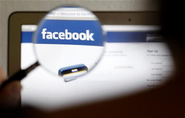
It won't be wrong to say that the Like button is the soul of Facebook, the popular social networking service. The Like and Share buttons aren't just confined to the Facebook website but extend much beyond it across the Internet allowing users to share and recommend content driving referral hits.
For the first time, Facebook has decided to give these buttons a makeover. The social network says that it's already seeing a 'favourable increase in Likes and Shares with the new design' and that it would be rolling these buttons out to everyone in the next few weeks.
The new buttons sport a brighter shade of blue with white 'Like' text in a new font and a Facebook 'F' logo instead of the thumbs-up symbol.
Facebook will automatically upgrade the new design of the buttons part of the roll out for websites currently using the old ones. The new design allows websites to use the Like and Share button together in convenient ways.
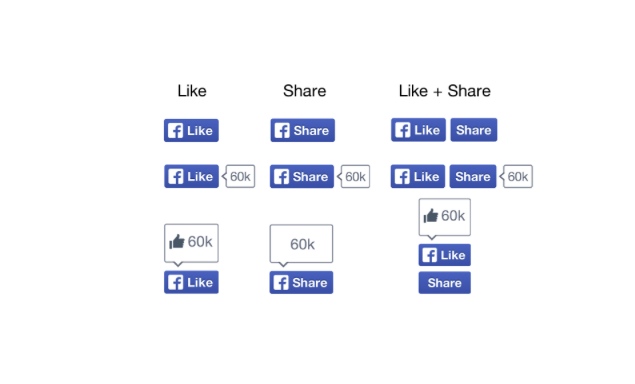 For media publications, the Like button lets readers post links to Facebook with one click, while the Share button enables them to add a personalised message and customise target audience (share with a particular group of friends through lists or as a personal message) before links are posted.
According to Facebook, the Like and Share buttons are viewed over 22 billion times daily across more than 7.5 million websites.
As per a report by The Verge that quotes Facebook product manager Ling Bao, the redesign took six months as the company had to make sure the button is displayed properly by all browsers.
"'They're just buttons, why did it take so long?' you ask, but getting a design that works across all these websites at different scales and in different browsers is quite a herculean task," he told the website.
For the first time, Facebook has decided to give these buttons a makeover. The social network says that it's already seeing a 'favourable increase in Likes and Shares with the new design' and that it would be rolling these buttons out to everyone in the next few weeks.
The new buttons sport a brighter shade of blue with white 'Like' text in a new font and a Facebook 'F' logo instead of the thumbs-up symbol.
Facebook will automatically upgrade the new design of the buttons part of the roll out for websites currently using the old ones. The new design allows websites to use the Like and Share button together in convenient ways.
According to Facebook, the Like and Share buttons are viewed over 22 billion times daily across more than 7.5 million websites.
As per a report by The Verge that quotes Facebook product manager Ling Bao, the redesign took six months as the company had to make sure the button is displayed properly by all browsers.
"'They're just buttons, why did it take so long?' you ask, but getting a design that works across all these websites at different scales and in different browsers is quite a herculean task," he told the website.
Comments
Get your daily dose of tech news, reviews, and insights, in under 80 characters on Gadgets 360 Turbo. Connect with fellow tech lovers on our Forum. Follow us on X, Facebook, WhatsApp, Threads and Google News for instant updates. Catch all the action on our YouTube channel.
Related Stories
Popular on Gadgets
- Samsung Galaxy Unpacked 2026
- iPhone 17 Pro Max
- ChatGPT
- iOS 26
- Laptop Under 50000
- Smartwatch Under 10000
- Apple Vision Pro
- Oneplus 12
- OnePlus Nord CE 3 Lite 5G
- iPhone 13
- Xiaomi 14 Pro
- Oppo Find N3
- Tecno Spark Go (2023)
- Realme V30
- Best Phones Under 25000
- Samsung Galaxy S24 Series
- Cryptocurrency
- iQoo 12
- Samsung Galaxy S24 Ultra
- Giottus
- Samsung Galaxy Z Flip 5
- Apple 'Scary Fast'
- Housefull 5
- GoPro Hero 12 Black Review
- Invincible Season 2
- JioGlass
- HD Ready TV
- Latest Mobile Phones
- Compare Phones
Latest Gadgets
- Vivo Y60
- Sony Xperia 1 VIII
- Itel Zeno 200
- OnePlus Nord CE 6 Lite
- OnePlus Nord CE 6
- Honor Play 70C
- Honor Play 80 Plus
- Moto G47
- HP OmniBook 5 (2026)
- HP OmniBook Ultra 14 (Snapdragon, 2026)
- HP OmniPad 12
- Acer Iconia iM11-22M5G
- Garmin Forerunner 170
- Garmin Forerunner 70
- Lumio Vision 9 (2026)
- Lumio Vision 7 (2026)
- Asus ROG Ally
- Nintendo Switch Lite
- Blue Star 1.5 Ton 5 Star Inverter Split AC (IA518ZXUS)
- Blue Star 1.5 Ton 3 Star Inverter Split AC (IA318ZXU)
© Copyright Red Pixels Ventures Limited 2026. All rights reserved.


