- Home
- Social networking
- Social networking News
- Facebook Timeline getting revamped again?
Facebook Timeline getting revamped again?
By KS Sandhya Iyer | Updated: 4 June 2012 22:21 IST

Advertisement
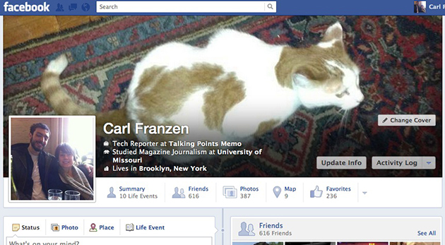
After gradually thrusting the Timeline feature on its users, Facebook is now working undercover on a possible redesign. As reported by Talking Points Memo, the new look brings noticeable changes. The user's 'About' information is now displayed on top of the cover photo. Currently, the text is in white to be seen against darker background photos.
A new tab called "Summary" makes an appearance which will give details of a user's major "Life Events". The "Likes" option now reads as "Favourites". Tabs below the cover photo namely Friends, Photos, Map and Likes (now known as "Favourites") have now been streamlined. The Update Info and Activity Log icons continue to stay on the bottom right corner of the backdrop photo.
The new Timeline is currently in its testing phase and nothing's official on the number of user profiles being tested or whether this would be the final version to be rolled out for all.
Comments
For the latest tech news and reviews, follow Gadgets 360 on X, Facebook, WhatsApp, Threads and Google News. For the latest videos on gadgets and tech, subscribe to our YouTube channel. If you want to know everything about top influencers, follow our in-house Who'sThat360 on Instagram and YouTube.
Related Stories
Popular on Gadgets
- Amazon Great Indian Festival 2024
- Big Billion Days 2024
- Apple Vision Pro
- Oneplus 12
- iPhone 14
- Apple iPhone 15
- OnePlus Nord CE 3 Lite 5G
- iPhone 13
- Xiaomi 14 Pro
- Oppo Find N3
- Tecno Spark Go (2023)
- Realme V30
- Best Phones Under 25000
- Samsung Galaxy S24 Series
- Cryptocurrency
- iQoo 12
- Samsung Galaxy S24 Ultra
- Giottus
- Samsung Galaxy Z Flip 5
- Apple 'Scary Fast'
- Housefull 5
- GoPro Hero 12 Black Review
- Invincible Season 2
- JioGlass
- HD Ready TV
- Laptop Under 50000
- Smartwatch Under 10000
- Latest Mobile Phones
- Compare Phones
Latest Gadgets
- Nubia V70 Design
- Tecno Pop 9 4G
- Nubia Z70 Ultra
- Vivo Y300 5G
- Red Magic 10 Pro+
- Red Magic 10 Pro
- Asus ROG Phone 9
- Asus ROG Phone 9 Pro
- Asus Zenbook S 14
- MacBook Pro 16-inch (M4 Max, 2024)
- Huawei MatePad 11.5
- Acer Iconia Tab 10.36 (iM10-22)
- Nubia Watch GT
- Redmi Band 3
- Sony 65 Inches Ultra HD (4K) LED Smart TV (KD-65X74L)
- TCL 55 Inches Ultra HD (4K) LED Smart TV (55C61B)
- Sony PlayStation 5 Pro
- Sony PlayStation 5 Slim Digital Edition
- Carrier 2.0 Ton 5 Star Inverter Split AC (24K EMPERIA LXI INV)
- Lloyd 2 Ton 3 Star Inverter Split AC (GLS24I36WGVR)
© Copyright Red Pixels Ventures Limited 2024. All rights reserved.


