- Home
- Social networking
- Social networking News
- Facebook shows off new home page design
Facebook shows off new home page design

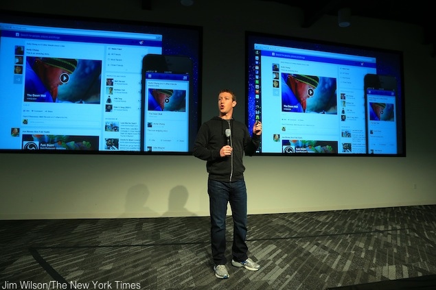
The new design of the Facebook News Feed presents bigger photos and links, including for advertisements, and lets users see specialized streams focused on topics like music and posts by close friends.
The changes are designed to address the company's two most vital challenges: how to hold on to users at a time of competing, specialized social networks and how to draw more advertising dollars to please Wall Street.
- Facebook and Instagram using bone structure analysis sounds a bit unsettling
- What can Meta AI do? I use Instagram, Facebook, and WhatsApp a lot, and want to try it out.
- How many social media platforms are you on?
- I’m tired of AI features and AI content on social media platforms.
- Your mobile phone will be safer with this application
Mark Zuckerberg, the company's co-founder and chief executive, said at a news conference that he wanted Facebook to be "the best personalized newspaper in the world." And like a newspaper editor, he wants the "front page" of Facebook to be more engaging - in particular on the smaller screens of mobile devices.
The topic-specific News Feeds could well persuade users to spend more time scrolling through various streams of content. And the redesign will offer bigger real estate for advertisers, including more opportunities for brands to feature bigger pictures, which marketers say are more persuasive than words.
Facebook's proprietary algorithms, which try to guess what every user will want to see, will continue to filter the items that show up on each person's main News Feed. And users will be able to drill down into specific topics they are interested in, akin to the sections of a newspaper.
For instance, they can switch over to specialized feeds that are focused on just the music they are interested in, or they can scroll through a feed that consists of posts from the pages of products and people they follow - a bit like Twitter. If they want to see everything that their friends have posted, they can choose to do that, too; those posts will rush down in chronological order, without any filtering by Facebook's robots.
Facebook introduced the new design to some users of the Web version of its service Thursday and will extend it to all Web users and to mobile apps in coming weeks.
It's unclear how users will react to the changes; in the past, major design changes have often been greeted by complaints, at least initially.
Investors seemed to welcome the new look. Shares of Facebook rose 4.1 percent Tuesday, to $28.58. But the company's stock price remains substantially lower than its $38 initial public offering price last May.
Facebook is clearly hoping the new format will encourage users to stay longer on the site. At the news conference to announce the changes, officials offered examples of content they hoped would be compelling photos of a cousin's babies on one area of the page, Justin Timberlake concert news on another, a list of stories your friends liked on National Public Radio on still another.
"The best personalized newspaper should have a broad diversity of content," Zuckerberg said. "The most important stuff is going to be on the front page," he went on. "Then people have a chance to dig in."
The announcement met with swift praise from the advertising industry. In addition to bigger ad formats, the redesign's specialized content streams could keep users glued to the site longer, marketers said.
"This will result in more time spent overall on the Facebook News Feed - and of course, increase engagement with content and ads," said Hussein Fazal, chief executive of AdParlor, which buys advertisements on Facebook on behalf of several brands.
Facebook executives suggested that there would be no immediate changes to the number of advertisements that appear on the News Feed.
Julie Zhou, the company's design chief, said only that ads would be more visual. "Everything across the board is going to get this richer, more immersive design," Zhou said.
The redesign is also a nod to the ubiquity of mobile devices, which a majority of Facebook's 1 billion users worldwide use to log into their accounts. Pictures will show up bigger in the News Feed, and there will be larger images of maps and links to articles. In that way, the new look is a nod to other social networks that are seeing viral growth, like Pinterest, which is built around large pictures.
The new News Feed emphasizes the importance of photographs, which are one of Facebook's most underexploited assets. Zuckerberg said half of all News Feed posts were pictures, compared with about a quarter of all posts a year ago. Every day, 350 million pictures are uploaded to Facebook by individual users and brands.
The new design is virtually identical on the desktop and on tablets and cellphones.
Colin Sebastian, an analyst at Robert W. Baird, said the changes were positive for the company. "We see this as more likely enhancing the longer-term value of Facebook for both users and advertisers rather than adding materially to financial performance in the very near term," he said.
Users weighed in on Twitter.
"Not sure if (AT)facebook is merchandising our attention or Zuckerberg cares about our reading habits," Daixin Neill-Quan, a self-described Boston University senior, posted after the news.
Others pointed out that Flipboard, a popular app, already offers a personalized newspaper in which users choose the topics and publications they are interested in.
Siva Vaidhyanathan, chairman of the media studies department at the University of Virginia, said the redesign could help educate users as to just how much Facebook's algorithms filter what they see on what they think of as their social network.
"Users will at least be under less of an illusion that what's happening on Facebook is merely a function of what their friends are doing," he said. "Facebook is the puppet master of our social network."
© 2013, The New York Times News Service
Get your daily dose of tech news, reviews, and insights, in under 80 characters on Gadgets 360 Turbo. Connect with fellow tech lovers on our Forum. Follow us on X, Facebook, WhatsApp, Threads and Google News for instant updates. Catch all the action on our YouTube channel.
Related Stories
- Samsung Galaxy Unpacked 2026
- iPhone 17 Pro Max
- ChatGPT
- iOS 26
- Laptop Under 50000
- Smartwatch Under 10000
- Apple Vision Pro
- Oneplus 12
- OnePlus Nord CE 3 Lite 5G
- iPhone 13
- Xiaomi 14 Pro
- Oppo Find N3
- Tecno Spark Go (2023)
- Realme V30
- Best Phones Under 25000
- Samsung Galaxy S24 Series
- Cryptocurrency
- iQoo 12
- Samsung Galaxy S24 Ultra
- Giottus
- Samsung Galaxy Z Flip 5
- Apple 'Scary Fast'
- Housefull 5
- GoPro Hero 12 Black Review
- Invincible Season 2
- JioGlass
- HD Ready TV
- Latest Mobile Phones
- Compare Phones
- Itel Zeno 200
- OnePlus Nord CE 6 Lite
- OnePlus Nord CE 6
- Honor Play 70C
- Honor Play 80 Plus
- Moto G47
- Motorola Razr 2026
- Motorola Razr+ 2026
- HP OmniBook 5 (2026)
- HP OmniBook Ultra 14 (Snapdragon, 2026)
- HP OmniPad 12
- Acer Iconia iM11-22M5G
- NoiseFit Halo 3
- NoiseFit Diva Araya
- Lumio Vision 9 (2026)
- Lumio Vision 7 (2026)
- Asus ROG Ally
- Nintendo Switch Lite
- Blue Star 1.5 Ton 5 Star Inverter Split AC (IA518ZXUS)
- Blue Star 1.5 Ton 3 Star Inverter Split AC (IA318ZXU)


