- Home
- Social networking
- Social networking News
- Facebook revamps News Feed with mobile inspired redesign
Facebook revamps News Feed with mobile-inspired redesign
By NDTV Correspondent | Updated: 7 March 2014 13:17 IST

Click Here to Add Gadgets360 As A Trusted Source

Advertisement
Facebook on Friday took the covers off a new News Feed design. The social network has faced a lot of criticism from users in the past over even minor design changes to the News Feed, so it will be interesting to see how the users react to the latest set of tweaks.
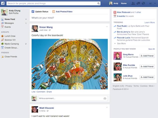
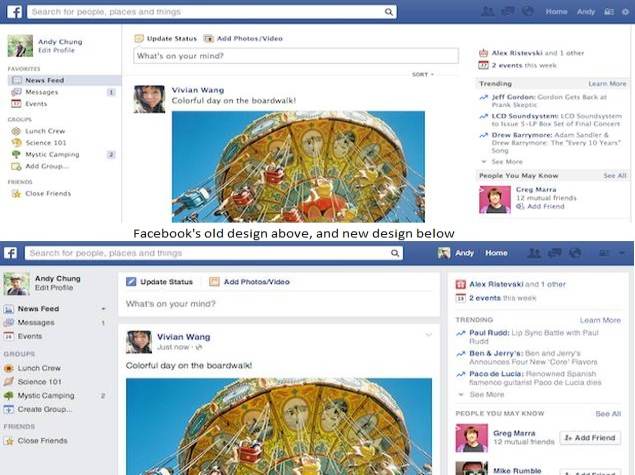
The new look of the News Feed (the first page you see when you open Facebook) focuses on photos, with large images, new fonts (Helvetica and Arial) and cards for stories. The look is very similar to its mobile apps, and will be rolled out to users around the world gradually over the next few weeks. You can read Facebook's full announcement here.

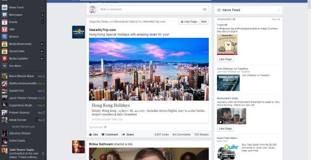
One year ago, Facebook had redesigned the News Feed to make it feel more like a "personalised newspaper". Users were given a large amount of control over what they were seeing, and they could also have clicked on navigation links on the right side of the screen, to jump to topics like sports or music related content as well.
Last year's redesign was rolled out to a fraction of the social network's users, but the feedback was apparently mixed. Facebook says people "liked the bigger photos and images, but found it more difficult to navigate Facebook overall." With the new layout, Facebook aims to combine the best of both worlds as it "keeps the layout and navigation people liked, but offers bigger images and photos, as well as a new font."
There design on mobiles remains the same.
 The latest News Feed is more familiar, and has ditched the drop down menu of feeds on the right which came in last year, and as can be seen from the screenshots, the new design is fairly close to the classic look but with a bigger emphasis on photos.
Facebook also clarified that their algorithms for surfacing content are not affected by the redesign, stating: "These changes are visual updates and do not affect how we surface content to people, nor do they change how stories are ranked in News Feed. Though in the new design all images are larger, both organic stories and ads will be the same size - similar to the way images appear on mobile."
This means that brands and marketers won't need to significantly change their tactics on the platform. The experimental design had also placed a lot of emphasis on helping you surface news; with this new look, it's clear that Facebook doesn't want to do that anymore, at least not on their desktop platform. The Paper app from Facebook suggests that they're splitting the two ideas off, which might actually be the best choice.
The new look of the News Feed (the first page you see when you open Facebook) focuses on photos, with large images, new fonts (Helvetica and Arial) and cards for stories. The look is very similar to its mobile apps, and will be rolled out to users around the world gradually over the next few weeks. You can read Facebook's full announcement here.
One year ago, Facebook had redesigned the News Feed to make it feel more like a "personalised newspaper". Users were given a large amount of control over what they were seeing, and they could also have clicked on navigation links on the right side of the screen, to jump to topics like sports or music related content as well.
Last year's redesign was rolled out to a fraction of the social network's users, but the feedback was apparently mixed. Facebook says people "liked the bigger photos and images, but found it more difficult to navigate Facebook overall." With the new layout, Facebook aims to combine the best of both worlds as it "keeps the layout and navigation people liked, but offers bigger images and photos, as well as a new font."
There design on mobiles remains the same.
Facebook also clarified that their algorithms for surfacing content are not affected by the redesign, stating: "These changes are visual updates and do not affect how we surface content to people, nor do they change how stories are ranked in News Feed. Though in the new design all images are larger, both organic stories and ads will be the same size - similar to the way images appear on mobile."
This means that brands and marketers won't need to significantly change their tactics on the platform. The experimental design had also placed a lot of emphasis on helping you surface news; with this new look, it's clear that Facebook doesn't want to do that anymore, at least not on their desktop platform. The Paper app from Facebook suggests that they're splitting the two ideas off, which might actually be the best choice.
Comments
Get your daily dose of tech news, reviews, and insights, in under 80 characters on Gadgets 360 Turbo. Connect with fellow tech lovers on our Forum. Follow us on X, Facebook, WhatsApp, Threads and Google News for instant updates. Catch all the action on our YouTube channel.
Further reading:
facebook, facebook redesign, paper, redesign, social media, social networks, user interface
Related Stories
Popular on Gadgets
- Samsung Galaxy Unpacked 2026
- iPhone 17 Pro Max
- ChatGPT
- iOS 26
- Laptop Under 50000
- Smartwatch Under 10000
- Apple Vision Pro
- Oneplus 12
- OnePlus Nord CE 3 Lite 5G
- iPhone 13
- Xiaomi 14 Pro
- Oppo Find N3
- Tecno Spark Go (2023)
- Realme V30
- Best Phones Under 25000
- Samsung Galaxy S24 Series
- Cryptocurrency
- iQoo 12
- Samsung Galaxy S24 Ultra
- Giottus
- Samsung Galaxy Z Flip 5
- Apple 'Scary Fast'
- Housefull 5
- GoPro Hero 12 Black Review
- Invincible Season 2
- JioGlass
- HD Ready TV
- Latest Mobile Phones
- Compare Phones
Latest Gadgets
- Infinix GT 50 Pro
- Vivo Y6 5G
- Vivo Y05 5G
- Poco C81x
- Poco C81
- Honor 600
- Honor 600 Pro
- OPPO Find X9s
- Honor Win H9 Gaming Laptop
- Honor Win H7 Gaming Laptop
- Honor MagicPad 3 Pro 12.3
- Redmi K Pad 2
- NoiseFit Diva Araya
- OPPO Watch X3 Mini
- Xiaomi TV S Mini LED 2026 (75-inch)
- Xiaomi TV S Mini LED 2026 (65-inch)
- Asus ROG Ally
- Nintendo Switch Lite
- Haier 1.6 Ton 5 Star Inverter Split AC (HSU19G-MZAID5BN-INV)
- Haier 1.6 Ton 5 Star Inverter Split AC (HSU19G-MZAIM5BN-INV)
© Copyright Red Pixels Ventures Limited 2026. All rights reserved.


