- Home
- Social networking
- Social networking News
- Facebook Changed Its Logo: Can You Spot the Difference?
Facebook Changed Its Logo: Can You Spot the Difference?
By Robin Sinha | Updated: 2 July 2015 12:07 IST
Click Here to Add Gadgets360 As A Trusted Source
Advertisement
The last time Facebook made a minor change to a part of its widely-used website, the majority of us were not able to spot the difference in the first go. The social networking giant has this year made a change in its main wordmark logo, which again may not be noticed by billions of daily users easily.
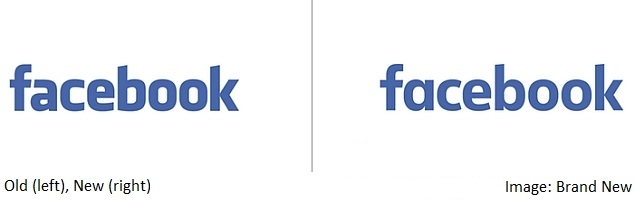
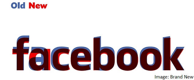
The new Facebook wordmark logo comes with minimal change, and the font remains nearly the same as the old one. However, there are several minor changes, and seeing the two logos overlaid on each other really makes them apparent. The overall size of the new logo has now shrunk marginally and the letters are slightly slimmer than before in the new typeface. Also, the gaps inside the letters a, e, b, and o have now been made more circular. Besides this, the letter 'a' has been completely overhauled in the new Facebook logo.
The Facebook product designer Christophe Tauziet on Wednesday revealed the new Facebook brand logo (seen above) on Twitter. The logo has been created by the company's in-house design team in collaboration with Eric Olson, a popular typeface designer whose typeface Klavika was used in the original wordmark. The design however, doesn't seem to have rolled out everywhere as yet, as we are still seeing original wordmark on Facebook's login and logout page.
Josh Higgins, Facebook's Creative Director told the Brand New website that Facebook's new wordmark logo was made intentionally to make it "more friendly and approachable."
"When Facebook's logo was first created in 2005, the company was just getting started and we wanted the logo to feel grown up and to be taken seriously. Now that we are established, we set out to modernize the logo to make it feel more friendly and approachable. While we explored many directions, ultimately we decided that we only needed an update, and not a full redesign. We worked with Eric Olson - whose typeface Klavika was used in the original logo - and developed a custom typeface to reflect where we are now and where we are headed," he said.
Comments
Get your daily dose of tech news, reviews, and insights, in under 80 characters on Gadgets 360 Turbo. Connect with fellow tech lovers on our Forum. Follow us on X, Facebook, WhatsApp, Threads and Google News for instant updates. Catch all the action on our YouTube channel.
Advertisement
Follow Us
-

04:12
Samsung Galaxy A37 Review: Camera, Gaming & Battery Tested! -
14:16
[Partner Content] OPPO F33 Pro 5G Explained: Built for the Big Moments -
05:21
Poco X8 Pro Max Review | Is This the Ultimate Budget Beast? -
04:16
OnePlus Nord 6 Review | Full Honest Review, Camera Test, Performance & Battery -
05:17
Samsung Galaxy A57 Full Review: 50MP Triple Camera & 5000mAh Battery. Worth It?
Advertisement
Popular on Gadgets
- Samsung Galaxy S26 Ultra
- Motorola Razr Fold
- ChatGPT
- OPPO Find N6
- Mobiles Under Rs. 40,000
- Vivo X300 Ultra
- Asus Zenbook S14
- iQOO 15
- Vivo X300 Pro
- Lenovo Yoga Slim 7i Aura Edition
- iQOO 15R
- Vivo X Fold 5
- Sony PlayStation 5
- HP OmniPad 12
- OnePlus Nord CE 6 Lite
- OnePlus Pad 4
- OPPO F33 Pro 5G
- Cryptocurrency
- HP OmniBook Ultra 14 (2026)
- iPhone 17
- Eureka Forbes AP 355 Room Air Purifier
- Latest Mobile Phones
- Compare Phones
Latest Gadgets
- Vivo Y60
- Sony Xperia 1 VIII
- Itel Zeno 200
- OnePlus Nord CE 6 Lite
- OnePlus Nord CE 6
- Honor Play 70C
- Honor Play 80 Plus
- Moto G47
- Dell 14S
- Dell 16S
- Huawei MatePad Pro Max
- HP OmniPad 12
- Garmin Forerunner 170
- Garmin Forerunner 70
- Lumio Vision 9 (2026)
- Lumio Vision 7 (2026)
- Asus ROG Ally
- Nintendo Switch Lite
- Blue Star 1.5 Ton 5 Star Inverter Split AC (IA518ZXUS)
- Blue Star 1.5 Ton 3 Star Inverter Split AC (IA318ZXU)

- About Us
- Sitemaps
- Feedback
- Archives
- Contact Us
- RSS
- Advertise
- Career
- Privacy Policy
- Ethics
- Editorial Policy
- Terms & Conditions
- Complaint Redressal
Download Our Apps
Available in Hindi
© Copyright Red Pixels Ventures Limited 2026. All rights reserved.


