The new look Facebook
-
 1/6
1/6The new look Facebook
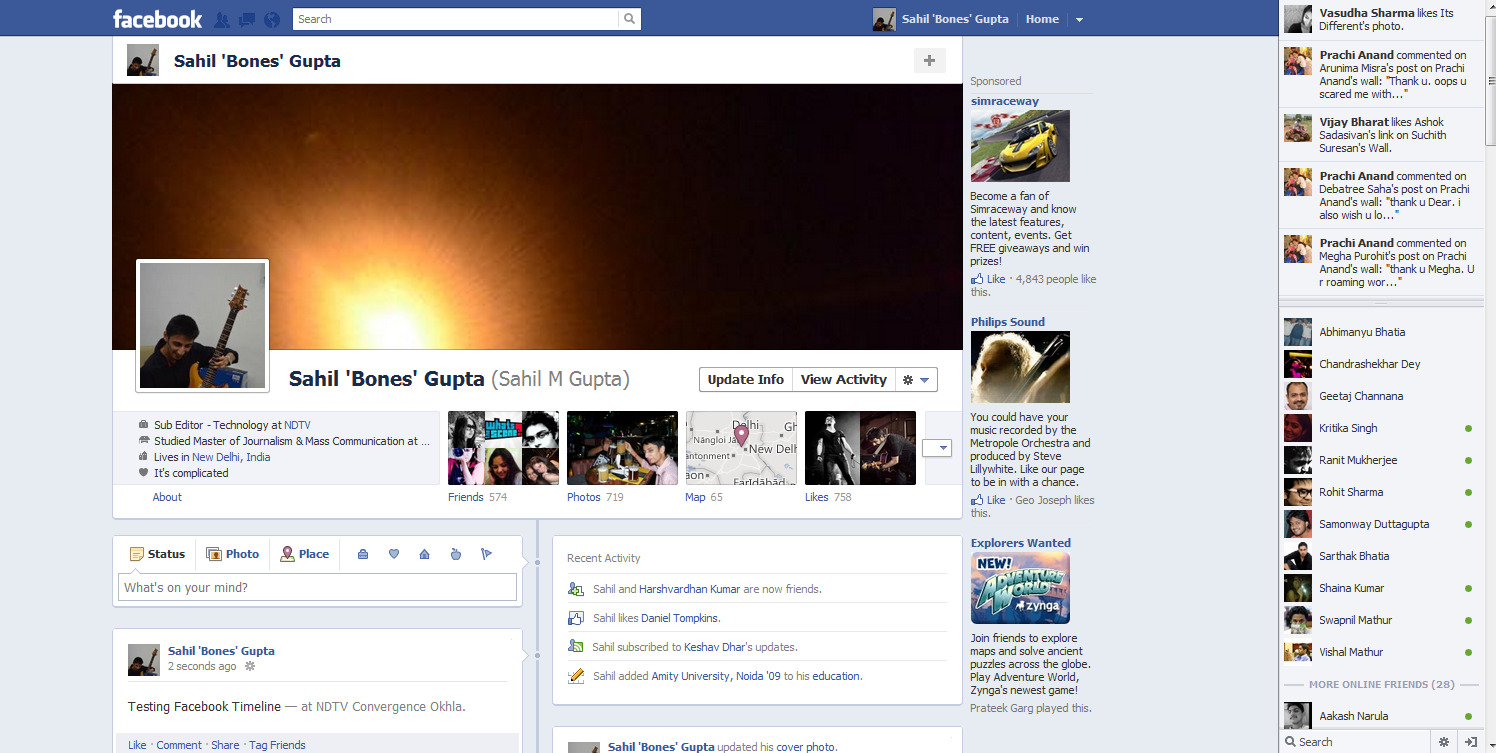
This is what Facebook will look like from September 30. The new Timeline interface displays information in more and neat organized way. (Photo: Sahil Mohan Gupta)
-
 2/6
2/6The new look Facebook
One of the big changes in Timeline is the cover image which sits along side the profile picture. It's like a slide show and changes everyday. (Photo: Sahil Mohan Gupta)
-
 3/6
3/6The new look Facebook
This is how the Events, Likes, Places and Photos tabs have been redesigned and are now more visually rich. (Photo: Sahil Mohan Gupta)
-
 4/6
4/6The new look Facebook
Through Timeine we can actually navigate between all the our old images and status updates using the year and month scroller on the right. It's like all history of every individual's use of Facebook (Photo: Sahil Mohan Gupta)
-
 5/6
5/6The new look Facebook
This is the new Friends explorer. Not much has changed but, then again, nothing much was wrong with it. (Photo: Sahil Mohan Gupta)
-
 6/6
6/6The new look Facebook
Images and photo gallery updates will be displayed in a more graphically rich way on each user's wall. (Photo: Sahil Mohan Gupta)
Related Photos
Related News
-
 Meta's Smartwatch Leak in New Images, Tipped to Come With Android, Qualcomm SoC
-
 Mark Zuckerberg Calls Apple's App Store Moderation Rules a 'Conflict of Interest'
-
 WhatsApp India Head, Meta India Public Policy Director Quit Days After Massive Layoffs Announcement
-
 WhatsApp Privacy Policy Not Withdrawn, Probe Must Continue, CCI Tells Delhi HC
-
 Meta Hints at Launching Crypto-Supported Payments Platform, Files for Five Patents

![[Sponsored] Haier C90 OLED TV | Dolby Vision IQ, 144Hz OLED and Google TV in Action](https://www.gadgets360.com/static/mobile/images/spacer.png)


