In Pics: The Motorola Xoom
-
 1/15
1/15In Pics: The Motorola Xoom
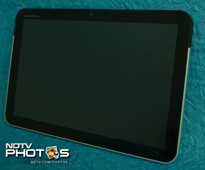
Motorola Xoom, the flagship Google Honeycomb OS device, has finally hit store shelves in India and is priced quite competitively compared to the iPad 2 with the Wi-Fi + 32GB version costing Rs. 32,990 and the Wi-Fi + 3G variant at Rs. 39,990. (Photo: Sameer Mitha)
-
 2/15
2/15In Pics: The Motorola Xoom
In terms of hardware, the Motorola Xoom boasts of NVIDIA's Tegra 2 1GHz dual core processor, 1GB of RAM, Wi-Fi and Bluetooth. (Photo: Sameer Mitha)
-
 3/15
3/15In Pics: The Motorola Xoom
The volume rocker rests on the left edge of the device. The buttons could have been a bit bigger for better ease of use. (Photo: Sameer Mitha)
-
 4/15
4/15In Pics: The Motorola Xoom
The rear of the device houses a 5MP camera with dual LED flash that can record videos in 720p. The rear also houses the lock/unlock button. This may seem odd at first but once you get used to the device it seems very conveniently placed. The front of the device houses a 2MP camera, which is pretty good for video chatting. (Photo: Sameer Mitha)
-
 5/15
5/15In Pics: The Motorola Xoom
The device has a 10.1-inch LED display with a resolution of 1280x800. By default the device has three home screens, which can be customized by app shortcuts and widgets. A lot of the apps running on Honeycomb have been optimized for use on a large screen. (Photo: Sameer Mitha)
-
 6/15
6/15In Pics: The Motorola Xoom
The 3G SIM card and memory card slot are housed on the top edge in a plastic drawer. The only problem is that the Micro SD card will be useless unless the device receives the 3.1 update, which is currently not available in India. Motorola says that the update will be available soon, but they have not specified a specific date for the update. (Photo: Sameer Mitha)
-
 7/15
7/15In Pics: The Motorola Xoom
The bottom of the device houses an HDMI out, a micro USB port and a charging port. A disadvantage here is that the device will not charge through the micro USB port, only through the dedicated charging port. (Photo: Sameer Mitha)
-
 8/15
8/15In Pics: The Motorola Xoom
Notifications are one of the best features of the Honeycomb OS. They pop up on the bottom-right of the screen and you can see all your notifications with a simple tap. This is one feature where Honeycomb wins over Apples current generation iOS. The notifications popup is accompanied by information such as time, Wi-Fi details, battery level and settings. (Photo: Sameer Mitha)
-
 9/15
9/15In Pics: The Motorola Xoom
All the apps on the device can be viewed in a grid like view that looks similar to its smartphone counterpart. The only downside here is that they cannot be segregated in folders like in the Apple OS. (Photo: Sameer Mitha)
-
 10/15
10/15In Pics: The Motorola Xoom
The YouTube Honeycomb app is one of the best around. The videos appear in a Matrix like view and you can browse through the videos with a swipe of your finger. The search tab is conveniently located at the top of the screen. (Photo: Sameer Mitha)
-
 11/15
11/15In Pics: The Motorola Xoom
Third party e-reader apps such as the Kindle app too have been optimized for use on the tablet. The 10.1-inch screen is really great to read books on. (Photo: Sameer Mitha)
-
 12/15
12/15In Pics: The Motorola Xoom
The Gmail app too has been built to suit the 10.1-inch display. The left panel of the app shows the contents of your inbox whereas the right side shows you the content of individual mails. (Photo: Sameer Mitha)
-
 13/15
13/15In Pics: The Motorola Xoom
The biggest advantage of Android over iOS is flash support. Adobe recently released Flash 10.3 for Android devices. (Photo: Sameer Mitha)
-
 14/15
14/15In Pics: The Motorola Xoom
The on board music player is quite a funky with a 3D swiping style interface which displays the track details including artist, album, duration, etc. (Photo: Sameer Mitha)
-
 15/15
15/15In Pics: The Motorola Xoom
The YouTube home widget is pretty cool as it displays the videos in a small window and you can flick through them to see the most watched, most popular or the just added videos. (Photo: Sameer Mitha)

![[Sponsored] Haier C90 OLED TV | Dolby Vision IQ, 144Hz OLED and Google TV in Action](https://www.gadgets360.com/static/mobile/images/spacer.png)


