- Home
- Mobiles
- Mobiles Reviews
- Yota Devices YotaPhone Review: It's Different
Yota Devices YotaPhone Review: It's Different
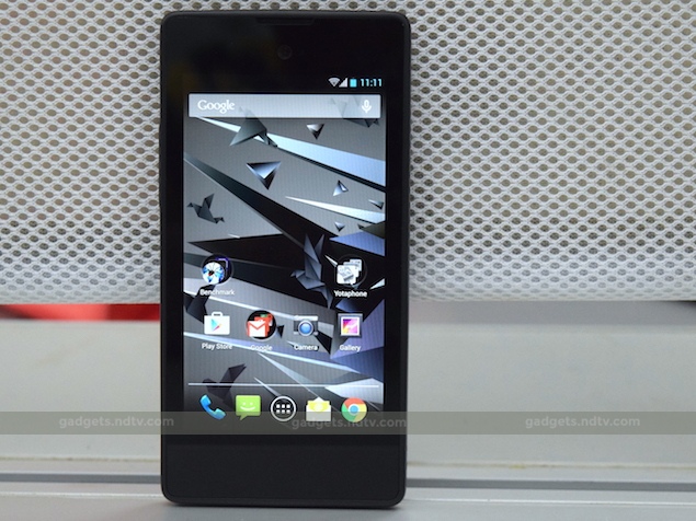
While smartphones these days are stuffed to gills with powerful technology, design-wise, it would not be far-fetched to state that companies are unwilling to push the boundaries and actually take a risk, though recent launches like Blackberry Passport (Review | Pictures) and Lenovo Vibe X2 (Review | Pictures) have managed to buck that trend. Another exception that particularly caught our fancy is the YotaPhone made by a Russian broadband service provider Yota Devices.
The YotaPhone has what the company claims, "The world's first dual-screen smartphone with an always-on display." We are definitely intrigued by the ingenuity of this particular device to the point that we were left wondering why couldn't someone else think of this before!
Before we get to the review, do bear in mind that this is the first version of the YotaPhone that the company unveiled at CES 2012. In India, the YotaPhone is being sold by Jumbo Electronics exclusively via Flipkart. It's also worth noting that Yota Devices has already unveiled the next iteration of the YotaPhone, which will be unsurprisingly called YotaPhone 2, and it is all set for a December launch in London. Obviously, the YotaPhone 2 betters it predecessors in a lot of ways and we will try to get hands on one when it is launched here. But until then, lets find out if the first generation YotaPhone still has the chops to create a stir in India.
Look and feel
We really want to give the YotaPhone full marks for innovation for its design because it turned heads every single time we pulled the phone out of the pocket. People were curious about the second screen and we were happy to oblige with an explanation.
The rear of this phone is made of 4.3-inch curved e-ink display and if reports are to be believed Yota Devices commissioned Corning to create a special curved Gorilla Glass 3 to be added for additional protection. The company did this right before showcasing the phone at CES 2012. One problem we faced in our time with the phone is that the curved rear actually made the phone feel bottom heavy. Also, the soft plastic edges around the matte rear can't do much to prevent the phone from slipping.
This e-ink display is not touch sensitive and there is a touch panel right below it, which accepts swipes and taps for navigation. The rear camera and flash is quite oddly placed at the bottom of the rear (below the screen), which is an inconvenience because our fingers invariably covered the camera while trying to click a picture. However, this might be less of a problem as one uses the YotaPhone for longer durations. Additionally, there is a slit for a speaker at the bottom.
Turn the phone around and things start looking more familiar. The nondescript front is dominated by a 4.3-inch screen, with copious bezels surrounding all the sides. There is a front camera and an earpiece above this screen. Below it lies another touch panel, like the one on its rear, which can again be used for navigation. A Micro-USB port lies at the bottom and is accompanied by a microphone. The volume rocker lies on the left edge of the phone. The power button has curiously been placed on the Micro-SIM card tray - it doesn't have good travel and feels very soft to use as well. On the top, one can also find the 3.5mm jack and another microphone.
Dual Displays
The main display on the YotaPhone is 4.3-inch primary screen IPS LCD panel with a resolution of 720x1280, which is really good because it translates to a pixel density of 342ppi. It is a very crisp display with a good amount of saturation but we noticed that the whites had a very warm tone to the extent that the screen looked really yellow. The viewing angles were great and the sunlight legibility was really good too. All in all, we really liked this display.
The highlight of the device is of course the rear 4.3-inch e-ink panel has a display resolution of 360x640 pixels, which translates to a pixel density of 170ppi. In comparison, the cheapest Amazon Kindle's screen has a pixel density of 167ppi. This screen displays 16-grayscale colours just like the display on the Kindle. We checked both the screens together and noticed that the Kindle's screen was only slightly sharper but the YotaPhone screen still gets the work done.
We had no problem in sifting through the pages of H.G.Wells' classic novel Time Machine thanks primarily to the fact that an e-ink display is the only technology at the moment that comes close to emulating the characteristics of real paper. The additional benefit is that, despite being an always-on display, it actually consumes less power than an LCD screen which in turn can help save battery life. Our AmazonKindle review talks about the e-ink displays in general and in more detail.
Apps need to be updated to utilise this additional display for things other than notifications, which are handled by the system software. More on this later in this review.
Specifications and camera
According to YotaPhone's official website and Flipkart's online listing of the phone it is supposed to be packing a Qualcomm Snapdragon 400 SoC clocked at 1.7GHz. We generally use a software called CPU-Z to double-check the specifications and quite surprisingly it showed that the phone is actually using a Qualcomm Snapdragon S4 Pro clocked at 1.73GHz. The model number it showed was QCT MSM8960 CDP. Incidentally, Yota Devices used the Snapdragon S4 Pro in the initial build of the YotaPhone. We got a confirmation from Jumbo Electronics that the phone uses the MSM8960 chip but the company categorically stated that it is running Snapdragon 400. However, Qualcomm's official website states that the Yotaphone uses a Snapdragon S4 Pro processor (MSM8960 Pro). In any case, we have benchmark numbers for our readers in the performance section.
The phone has 2GB of RAM and 32GB of internal storage space with no provision for adding more space using a memory card. YotaPhone has a 13-megapixel rear camera and a 1-megapixel front-facing camera. The Micro-SIM card inside the phone can connect to 3G networks and LTE as well but it does not support the 2.3GHz band on which the Indian networks operate. An 1800mAh battery powers the phone.
The 13-megapixel rear camera can take some decent shots in daylight. We noticed that the images are quite sharp and the software processing manages to keep noise at a bare minimum. Having said that, we did catch some purple fringing around the edges. The lens blows out the highlights but this can be overcome a bit using the HDR mode. Weirdly, in the HDR mode we couldn't get the lens to autofocus however hard we tried - it's not clear if this is a software issues or a problem specific to our unit.
(click for full size)
In low-light, the camera captures images which have a lot of noise to the point we'd suggest not using this camera in low-light. The camera app used by the YotaPhone is the one Google introduced with its Ice Cream Sandwich update, which we personally find unintuitive. Of course this can be easily fixed by downloading one of the many third-party apps from Google Play.
Software
The YotaPhone is running Android 4.2.2 Jelly Bean, which is quite evidently outdated. But, please remember that Yota Devices unveiled the phone in 2012 and at that time it was running the latest Android 4.1 OS. We are unsure if the company has plans to update the software to Android 4.4. KitKat or 5.0 Lollipop anytime soon, but it seems highly unlikely at this moment considering the YotaPhone 2 is already being prepped for launch. The phone is running mostly stock Android save for the inclusion of a few apps made for working with the rear screen. Apart from this, there is absolutely no bloatware, which is a great thing.
Yota Devices adds front touch panel in place of buttons. To navigate through the OS it makes use of a combination of swipes and taps on this panel. A single swipe to the left acts as the Back function while the exact opposite can be used to get back Home. Double tapping on the centre opens Recents. While both the swipe functions worked absolutely fine every single time, finding the sweet spot for double tapping was an exercise in frustration - again something that might get better as you use the phone everyday. Thankfully, the phone has an option to use on-screen capacitive buttons as an alternative but it takes up a bit of the screen estate.
The touch panel on the rear also works in a similar fashion. Swiping to the right or the left unlocks the screen. To dismiss a notification one has to swipe to the left. While reading, you can swipe left or right to flip through pages. Double tapping on the panel opens the wallpaper. Swiping from the top of the front takes a screenshot and displays it on the back. The swipes and taps take time to register, and there is a perceptible lag that can make it rather annoying to use initially. However, e-ink panels are not meant to be as touch sensitive as traditional displays, and once you teach yourself not to be as demanding, it gets a little better. Still, switching between the two displays - one with great touch response, and the other not so much - can be a frustrating experience.
A few proprietary apps that make use of the rear screen are Wallpaper, Organiser, Internet Hub, TeachMe, Notepad, Bookmate and MapsWithMe. Wallpaper is, as you'd guess, used to change the wallpaper of the display. Organiser is a calendar app that can be used to display your daily meetings/tasks on the rear screen. One can sift through the days using left/ right swipes on the touch panel or clicking the volume rocker. Internet hub is a collection of feeds, including Facebook and Twitter feeds, that can be displayed on the rear screen.
TeachMe is an app that can be used to learn languages like Russian, German, Spanish, Italian and a few more. Notepad displays your recent notes on the rear screen. Yota Devices has tied up with Bookmate to display e-books on the rear screen and it comes in quite handy. While we would have really loved an integration with Amazon's Kindle app, we know that it is too much to ask for. MapsWithMe is probably the most unintuitive app of the lot and we struggled to use it while on the move. However, if you are going on a long drive and will need to be seeing maps along the way with minimal interaction, it's great to have an option to view them on a display that uses minimal battery rather than a conventional one.
The e-ink display can also show incoming notifications but they aren't actionable because of the lack of a touchscreen.
Performance
Keeping the benchmark numbers aside for a bit, we think the phone was generally zippy to use and it can even play the latest high-end games smoothly without any lags. We tried Dead Trigger 2 and Shadowgun, and both the games worked flawlessly, thanks to the presence of the fairly powerful Adreno 320 GPU. This is further corroborated by the GFXbench and 3D Mark Ice Storm (<=720p) tests in which YotaPhone achieved scores of 24.7fps and 9,957 respectively. In AnTuTu 5 and Quadrant the phone managed to log 26,900 and 6,835 respectively. Please note that these numbers are indicative of the MSM8960 chip inside the phone.
The phone also played all our test videos, which also included a highly encoded 40mbps file, without skipping frames or any lag. The bundled headset sounds fine for most purposes but using a better pair is advisable. The speakers are adequately loud and don't crackle at maximum volume. The sound quality in calls is pretty good and we didn't face any call drops either. In our battery test the phone lasted us 5 hours and 46 minutes, which is pretty average by any standards. If users can find a way to use the rear screen effectively then they can definitely squeeze more juice out of the inbuilt battery.
Verdict
In our opinion, the first generation YotaPhone is high on innovation but the execution could've been better. Like we mentioned before, we like the e-ink display for reading books, but we wish there were more apps that could use the same. It's especially difficult to recommend the YotaPhone when a better device is around the corner, where Yota Devices is likely to address at least some of the shortcomings of the device.
Despite the innovation, the first generation YotaPhone feels more like an experiment, an experiment we cannot recommend as a purchase unless you are in an absolute urgency to buy a phone with an e-ink display and cannot wait for the YotaPhone 2 to hit Indian markets. The rest can probably pick up a Moto G (Gen 2) and an Amazon Kindle for the e-ink display.
Yota Devices YotaPhone in pictures
Get your daily dose of tech news, reviews, and insights, in under 80 characters on Gadgets 360 Turbo. Connect with fellow tech lovers on our Forum. Follow us on X, Facebook, WhatsApp, Threads and Google News for instant updates. Catch all the action on our YouTube channel.
Related Stories
- Samsung Galaxy Unpacked 2026
- iPhone 17 Pro Max
- ChatGPT
- iOS 26
- Laptop Under 50000
- Smartwatch Under 10000
- Apple Vision Pro
- Oneplus 12
- OnePlus Nord CE 3 Lite 5G
- iPhone 13
- Xiaomi 14 Pro
- Oppo Find N3
- Tecno Spark Go (2023)
- Realme V30
- Best Phones Under 25000
- Samsung Galaxy S24 Series
- Cryptocurrency
- iQoo 12
- Samsung Galaxy S24 Ultra
- Giottus
- Samsung Galaxy Z Flip 5
- Apple 'Scary Fast'
- Housefull 5
- GoPro Hero 12 Black Review
- Invincible Season 2
- JioGlass
- HD Ready TV
- Latest Mobile Phones
- Compare Phones
- Nord 6
- Honor X80i
- Honor Play 80 Pro
- Redmi Note 15 SE 5G
- Redmi A7 Pro
- OPPO K15 Pro
- OPPO K15 Pro+
- Lava Bold N2 Lite
- Xiaomi Book Pro 14
- MacBook Neo
- Vivo Pad 6 Pro
- Lenovo Legion Y700 Gen 5
- boAt Valour Watch 1R
- Xiaomi Watch S5
- Xiaomi QLED TV X Pro 75
- Haier H5E Series
- Asus ROG Ally
- Nintendo Switch Lite
- Haier 1.6 Ton 5 Star Inverter Split AC (HSU19G-MZAID5BN-INV)
- Haier 1.6 Ton 5 Star Inverter Split AC (HSU19G-MZAIM5BN-INV)


