- Home
- Mobiles
- Mobiles Reviews
- Xolo Win Q900s Review: Windows Phone 8.1 With a Local Twist
Xolo Win Q900s Review: Windows Phone 8.1 With a Local Twist
In fact Windows Phone is almost synonymous with Nokia and its colourful Lumia line - Samsung and HTC did launch a few models nearly two years ago, but they were never refreshed. It's only now that we're seeing a little more variety in the Windows Phone space, thanks largely to Microsoft's decision to not charge a license fee for the new WP8.1 release, and conscious support for hardware that is already common in the Android world. Manufacturers can thus give Windows Phone a try without spending a lot of time and money - in fact, we're already seeing exactly the same devices running Android and WP8.1.
It makes sense that Xolo and Micromax would jump on the bandwagon in India. Xolo, in particular, has had a long history of trying to stand out as an innovative yet value-oriented brand. Most recently, it became the first Indian company to invest in a completely custom Android skin, which it calls Hive UI. In a market crowded with dozens of phones in each budget segment, Windows Phone 8 gives the company another avenue to explore.
The Xolo Win Q900s (which is in effect a variant of the Android-based Xolo Q900s) is an interesting device and we're eager to put it through our test process.
Look and feel
The first thing you'll notice about the Xolo Q900s is how light it is. At just 100g, it feels like a lot of phones do before you've put the battery in them. It's also surprisingly thin - much more so than the Nokias we're used to seeing.
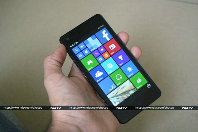
The Q900s is quite slick - we like its overall look. The front is glossy black while the rear panel has a grip-friendly matte finish. A dark metallic rim runs around the sides. Not much space is wasted above and below the screen, which means that the capacitive buttons are very close to the device's bottom edge. The Back button is the dot on the right, while the one on the left pulls up Bing search - this is the opposite of the usual layout, but plenty of Android vendors do this as well so it will be consistent for some switchers. Actual button labels would have helped a lot.
The power button is on the right edge while the volume rocker is on the left. The camera and flash are in one corner on the rear, and both the 3.5mm headset jack and the Micro-USB port are on top. Popping off the rear cover shows the two Micro-SIM slots and the microSD slot as well as the removable 1800mAh battery.
This is a very good-looking phone, and it feels great in the hand too. Xolo's recent launches have been consistent in this regard, and anyone who considers Indian branded phones ugly and cheap should give this device a second look. That said, the company still bundles low-quality accessories including the charger and USB cable.
Specifications and software
At the heart of the Q900s is a relatively poky Qualcomm Snapdragon 200 SoC with four cores running at 1.2GHz and Adreno 302 graphics. There's 1GB of RAM and 8GB of internal storage space. MicroSD cards of up to 32GB are supported. The 4.7-inch screen has a resolution of 720x1280. Wi-Fi, Bluetooth and GPS are of course supported. There's an 8-megapixel camera on the rear and a 2-megapixel one on the front.
These specifications seem well balanced for a phone that costs just a hair under Rs. 10,000. We're a little worried that 1800mAh is too little for a battery, but the rest of it should do nicely.
Windows Phone 8.1 doesn't offer much scope for customisation, and Xolo seems happy with using a boring blue as its default theme colour rather than the cool new photo background effect. The homescreen is densely packed with tiles, including individual dialler and messaging shortcuts for each SIM card. The default layout has three thick columns or six narrow ones - you can mix and match tile sizes and change the placement in any way you wish.
The default layout is cramped and it won't be easy for first-time Windows Phone users to learn where everything is - most of the tiles are set to the smallest possible size and don't have text labels. Oddly, there's no camera shortcut at all - you have to go into the full alphabetically sorted menu to find it.
Windows Phone 8.1 introduces some neat apps and features including Data Sense, Storage Sense and Wi-Fi Sense which help you manage space and quotas, see which apps are consuming resources, and share information with friends. You can read all about the improvements in Microsoft's latest mobile OS update in our review of the Nokia Lumia 630 Dual SIM.
We're used to associating Windows Phone with Nokia, so the absence of Nokia's usual apps and improvements is very noticeable. The default camera app is not as nice as Nokia's, and there's no sign of Here Maps or MixRadio. Microsoft's own Office, OneDrive, Skype, and Bing apps are accounted for, but Xolo's only addition is a Xolo Care app which shows a few basic details of the device and has shortcuts to the company's phone, SMS and email support lines.
Performance
We had mixed experiences with the Xolo Q900s. We've never been fans of Windows Phone's excessive animations which make every transition feel like it's taking forever, and the effect is amplified on this device. The phone occasionally recognised swipes as taps, and we wound up inadvertently launching apps while simply trying to scroll through the home screen and app menu.
Otherwise, the Q900s was generally pleasant to use. The low weight really makes a difference - it's the kind of thing you'll really notice only when you use another phone after using this one. Benchmark scores were just about okay; the phone managed only 4.3fps and 10,799 points in the Windows Phone versions of GFXbench and AnTuTu respectively which are only slightly less than the Nokia Lumia 630 managed.
(Click to see full size)
The screen is sharp, but a little dull. We had trouble playing even 720p video files. Audio sounded muffled, and details were not very discernible in speech or music. Considering how small this phone's battery is, we were surprised to get 5 hours, 28 minutes of runtime while playing a video loop. This phone probably won't last all day with heavy usage, which is the price you'll have to pay for it being so thin and light.
The camera takes fairly decent shots. There's quite a bit of noise and compression but you won't notice it unless you expand pictures to actual size on a large screen. Low light performance is just about okay, though we weren't expecting much from a phone at this price level. We weren't impressed at all with the video quality, which was too grainy even in very good light.
Verdict
It feels as though Xolo and/or its manufacturing partners in China slapped Windows Phone 8.1 onto the hardware they had lying around just because they could, without really fine-tuning the end result. There definitely is scope for improvement.
The Nokia Lumia 630 Dual SIM (Review | Pictures) is the closest competitor in terms of pricing, and while it might be well built with a brilliant battery, it has a different balance of specifications. You'll get a more powerful processor but a lower resolution screen and half the amount of RAM. On the Android side of the fence, you could pick up the 8GB version of the very impressive Asus Zenfone 5 (Review | Pictures) at the same price.
The Q900s has been calibrated to look good above all else. It's an interesting move and we are always happy to have more choices in the market. This phone is a worthy alternative to the Nokia Lumia 630 - you'll just have to choose what aspects of a smartphone are more important to you.
Get your daily dose of tech news, reviews, and insights, in under 80 characters on Gadgets 360 Turbo. Connect with fellow tech lovers on our Forum. Follow us on X, Facebook, WhatsApp, Threads and Google News for instant updates. Catch all the action on our YouTube channel.
Related Stories
- Samsung Galaxy Unpacked 2026
- iPhone 17 Pro Max
- ChatGPT
- iOS 26
- Laptop Under 50000
- Smartwatch Under 10000
- Apple Vision Pro
- Oneplus 12
- OnePlus Nord CE 3 Lite 5G
- iPhone 13
- Xiaomi 14 Pro
- Oppo Find N3
- Tecno Spark Go (2023)
- Realme V30
- Best Phones Under 25000
- Samsung Galaxy S24 Series
- Cryptocurrency
- iQoo 12
- Samsung Galaxy S24 Ultra
- Giottus
- Samsung Galaxy Z Flip 5
- Apple 'Scary Fast'
- Housefull 5
- GoPro Hero 12 Black Review
- Invincible Season 2
- JioGlass
- HD Ready TV
- Latest Mobile Phones
- Compare Phones
- Nord 6
- Honor X80i
- Honor Play 80 Pro
- Redmi Note 15 SE 5G
- Redmi A7 Pro
- OPPO K15 Pro
- OPPO K15 Pro+
- Lava Bold N2 Lite
- Xiaomi Book Pro 14
- MacBook Neo
- Vivo Pad 6 Pro
- Lenovo Legion Y700 Gen 5
- boAt Valour Watch 1R
- Xiaomi Watch S5
- Xiaomi QLED TV X Pro 75
- Haier H5E Series
- Asus ROG Ally
- Nintendo Switch Lite
- Haier 1.6 Ton 5 Star Inverter Split AC (HSU19G-MZAID5BN-INV)
- Haier 1.6 Ton 5 Star Inverter Split AC (HSU19G-MZAIM5BN-INV)


