- Home
- Mobiles
- Mobiles Reviews
- Xolo Q1200 Review: It's All About the Software
Xolo Q1200 Review: It's All About the Software

We've been fairly impressed with some of the phones Xolo has released in the past six months. The company seems to be determined to break out of the mould of Indian-Chinese importers, and has stepped up to deliver good-looking, well-built devices for the mid-budget segment.
The Xolo Q1200 follows the Q1010i and Q1000 Opus, with each iteration bringing new improvements to the company's formula. We've spent quite a bit of time with this device.
Look and feel
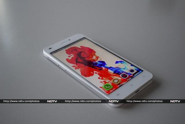
The Xolo Q1200 is a fairly solid phone. It feels a bit heavy and chunky in the hand, unlike many of today's devices which aim only to be light and slim. It's well constructed, but doesn't quite hit all the right notes in terms of aesthetics. Our review unit was white, and we noticed that the different plastic pieces on the front and rear had totally different shades and textures. The rear is split into three panels (with very iPhone 5-like proportions) but the white plastic ends above and below the metallic silver middle section look a bit cheap. A shiny chrome ring around the edges just adds to the confusion.
The front face is pretty standard. The three Android navigation buttons below the screen aren't backlit, but at least they're visible. The phone is completely sealed, so you can't get at the battery. There's a neat tray on the right edge which holds both, the Micro-SIM card and microSD card, and sits perfectly flush with the side of the device.
The power and volume buttons are on the left, which takes a bit of getting used to. The power button is in fact beneath the volume rocker, so it's really easy to hit the wrong key by accident. The camera lens sticks out quite a bit from the rear, which is always annoying as it could lead to scratches. The only Xolo logo on the whole device is relatively unobtrusive and placed in the centre of the silver panel. Interestingly, there appear to be twin stereo speakers on the rear as well. These are oriented in landscape mode, so we look forward to testing the audio and video playback experiences on this phone.
While the Q1200 itself looks quite solid, we can't say the same about its bundled accessories. The charger and headset feel extremely cheap, and even the bundled snap-on case isn't anything to get excited about.
Features, specifications and software
Xolo stays true to its budget roots with a MediaTek MT6582 processor with four cores running at 1.3GHz. There's 1GB of RAM and 8GB of internal storage space, which are both standard for this price range. The 5-inch screen has a comfortable resolution of 720x1280 pixels - anything lower and we would have been quite annoyed! There's Wi-Fi b/g/n, Bluetooth 4.0, A-GPS, and all the usual sensors. Overall there's nothing exciting at all about the Q1200's internals.
While we don't fault the budget hardware, it's disappointing to see that the Q1200 is still stuck on Android 4.2.2. That, combined with an unusually ugly default UI skin, really detracts from the usage experience. Xolo has really overdone the customisation here - app shortcuts and widgets are mixed haphazardly across the home screens, and there's no dedicated app drawer. An analog clock widget takes up an entire home screen, for example. The default wallpaper and icon set are way too busy, and it's really hard to see what's going on sometimes.
Luckily, you can swap themes, wallpapers, and even lock screens without too much trouble. These are more than just cosmetic changes, though there's no indication of it. By trial and error, we discovered that the 'Business' theme was the most similar to classic Android, and even had a distinct app launcher. However most of the available choices (and even the ones downloadable from Xolo's online gallery) are just as ugly as the default 'Simple' theme.
There are various minor tweaks - a CPU usage meter in the About page of the settings, a totally customised notification area, configurable shortcuts, a data connection speed counter in the taskbar, a floating task manager and audio/video windows, a "game mode" that locks the Back and Menu keys, and a Read Mode that just always keeps the screen on.
Xolo's big push for the Q1200 is software customisation, including gesture and voice recognition features. For some reason, there's no easy way to discover or get to these features - we found some of the gestures and "cold screen access" features buried in assorted submenus in the Accessibility section of the Settings app. Even the most useful ones, such as allowing a double-tap to phone the screen from sleep, are hidden away and poorly labelled.
There's no explanation of what some items such as "non-touch operation" are, but we eventually discovered that you can tap and hold some of them to display a pop up explanation. Without the popups, there's no way to know what the differences between "generic mode" and "performance mode" are, or how things labelled "non-touch unlock" and "non-touch switch in launcher" are supposed to work. After playing with them for a while we were left with mixed feelings - some did work, and we can see potential here for users with mobility impairments, but we wish we could have switched gesture recognition on and off more easily. There's no shortcut in the notifications shade, and sometimes it isn't worth the lag and potential misinterpretation of gestures.
Also buried in the Accessibility options are the settings for voice control. This feature is extremely limited in scope, and pales in comparison to Siri, Google Now, or even the basic voice command features of older phones. You can only accept or reject incoming calls, trigger the camera shutter (when the app is already open), and silence or snooze alarms. That's it - we wish Xolo had just worked with Google's existing features instead.
There's a Xolo Care app for registration and contacting customer service, and a Xolo Secure app which lets you back up personal data and lock your phone if it's stolen (which Google already does). The Xolo Power app is the most useful of the three - it lets you set battery-saving options such as limiting background data, shows how long you can expect the phone to stay alive in various scenarios, and even lets you know which apps have been draining the battery the most.
Camera
Xolo's camera app is fairly good. There are shortcuts for the flash and voice command feature, plus a menu of options including HDR mode, panorama mode, "smile shot", and something called "professional mode". This opens up options related to the image size, white balance, scene mode, number of shots in burst mode, exposure compensation, self timer, ISO, hue, saturation, and auto exposure metering.
There's a lot to play with, but we can't understand why some everyday options are buried here and why others are duplicated. You also get filters and effects such as pin focus, miniature, poster, nostalgia, mirror, and fisheye. There are also a few funny cutouts that you can superimpose over people's faces as you frame your shots.
(Click to see full size)
In terms of image quality, the Xolo Q1200 is actually surprisingly good. We were very pleased with the level of detail and accuracy in captured images. The phone struggled a little with closeups, and also totally flattened longer-range landscape shots, leaving no trace of depth or distance. Everything was generally sharply in focus. We managed to take some great shots in daylight as well as indoors and in low light. The flash was a bit overpowering, and you'll have to judge the distance between your subjects and the camera order not to drown them out. The front camera was far less impressive. It's adequate for video chats, but not photos that you'd like to keep or share online.
Performance
Although it feels smooth in operation, we were surprised to see that the Q1200 often stalled when we were exiting apps. There was an annoying delay and a 'Please wait' message on screen before the home screen popped up. Other than this, there wasn't anything wrong with the device.
Benchmark scores were consistent with those of the Oppo R1 which is based on the same MediaTek MT6582 processor but costs twice as much as this phone does. Graphics scores were way too weak for any kind of 3D gaming, though casual titles will work just fine. The Q1200 managed to push out only 6.4fps in GFXbench and scored only 2871 in the 3DMark Ice Storm simulation. General performance tests were satisfactory, considering this phone's price.
The speakers on the rear are certainly loud, but the sound is really thin and shrill. Mids and lows are completely absent. They also can't handle any complex music - we suffered through a lot of distortion in all our test tracks. The Q1200 can play low-bitrate 1080p video files, but with occasional stutters.
The battery lasted 5 hours and 51 minutes in our video loop test, which isn't all that great. We were honestly hoping for a lot more considering this phone's size and heft. We also noticed that it heated up quite a lot when pushing any intensive workload. Call quality was unremarkable, with no problems on either end.
Verdict
We like what Xolo has done with the Q1200 - especially its price. This is a great phone for just under Rs. 13,000 (street price), and unlike several others in its class, this one doesn't cut corners when it comes to screen resolution or storage space. The camera is also quite remarkable.
It seems as though Xolo was targeting the Motorola Moto G, which has become the de facto model to recommend in this price range. Put side by side, the Moto G's processor and software look better, but the Q1200 has a microSD slot and a great camera. It's an even match between the two.
Our impressions of the Q1200 are positive overall though we do wish Xolo would stop messing around with the software unnecessarily. The company is well on its way to becoming a top-tier player in India, but needs to fine tune its products a little more before it can get there.
Xolo Q1200 in pictures
Get your daily dose of tech news, reviews, and insights, in under 80 characters on Gadgets 360 Turbo. Connect with fellow tech lovers on our Forum. Follow us on X, Facebook, WhatsApp, Threads and Google News for instant updates. Catch all the action on our YouTube channel.
Related Stories
- Samsung Galaxy Unpacked 2026
- iPhone 17 Pro Max
- ChatGPT
- iOS 26
- Laptop Under 50000
- Smartwatch Under 10000
- Apple Vision Pro
- Oneplus 12
- OnePlus Nord CE 3 Lite 5G
- iPhone 13
- Xiaomi 14 Pro
- Oppo Find N3
- Tecno Spark Go (2023)
- Realme V30
- Best Phones Under 25000
- Samsung Galaxy S24 Series
- Cryptocurrency
- iQoo 12
- Samsung Galaxy S24 Ultra
- Giottus
- Samsung Galaxy Z Flip 5
- Apple 'Scary Fast'
- Housefull 5
- GoPro Hero 12 Black Review
- Invincible Season 2
- JioGlass
- HD Ready TV
- Latest Mobile Phones
- Compare Phones
- Honor 600
- Honor 600 Pro
- OPPO Find X9s
- OPPO Find X9s Pro
- OPPO Find X9 Ultra
- Vivo Y6t
- Redmi K90 Max
- Redmi A7 4G
- Asus ExpertBook P5 G1
- Asus ExpertBook P3 G1
- Redmi K Pad 2
- OPPO Pad Mini
- NoiseFit Diva Araya
- OPPO Watch X3 Mini
- Xiaomi TV S Mini LED 2026 (75-inch)
- Xiaomi TV S Mini LED 2026 (65-inch)
- Asus ROG Ally
- Nintendo Switch Lite
- Haier 1.6 Ton 5 Star Inverter Split AC (HSU19G-MZAID5BN-INV)
- Haier 1.6 Ton 5 Star Inverter Split AC (HSU19G-MZAIM5BN-INV)


