- Home
- Mobiles
- Mobiles Reviews
- Xolo 8X 1000 Review: A Fresh New Face
Xolo 8X-1000 Review: A Fresh New Face

We have reviewed a number of Xolo smartphones in the recent past and have been quite impressed. The company is clearly trying to break away from the general perception that Indian brands only sell cheap, low-quality products that can be dumped into the market with zero actual effort. Of course Xolo phones are manufactured in China just like all others are, but you can generally expect better looks, build quality and hardware than you'd get from other brands.
Xolo has taken the next step in its journey of differentiation by developing its own Android software overlay. All the major Android players, from global giants Samsung, Sony and LG to Chinese upstarts Lenovo, Gionee, Oppo and Xiaomi have their own custom Android skins, and now Xolo has decided it's time to join the club.
In a sea of affordable Android phones with nearly identical specifications (and quite a few recycled design ideas), software is the only way to stand apart and do something unique. If Xolo can manage to come up with something really good, it might help attract and retain customers. On the other hand, companies do tend to go overboard with the razzle-dazzle, making us wish they had just stuck to stock Android. We're looking forward to seeing whether Xolo has managed to balance features, improvements and bloat.
Software aside, the Xolo 8X-1000 is also a pretty interesting device, and we're going to give it the full review treatment.
Look and feel
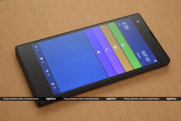
At first glance, the 8X-1000 looks like a solid black slab with almost no markings of any kind. You won't see anything on the front face, but you'll just about be able to make out where the front camera, sensors and earpiece are. It would be very easy to pick this phone up and try to use it upside down. There's a shiny silver Xolo logo on the rear and silver accents around the camera lens, flash, headset socket and Micro-USB port - that's it for design flourishes.
The front and rear are shiny, reflective and immensely easy to smudge up with fingerprints. Xolo says the device is protected by Asahi Dragontrail glass over the screen as well as Gorilla Glass 3, presumably on the rear. There top, bottom and sides are a simple matte black, with a slight bevel wrapping around the rear. The 8X-1000 doesn't open out, which means the battery is not accessible.
There's one tray on the right edge for a microSD card, and another on the left for the two Micro-SIM cards. The power and volume buttons are also on the right edge, but they're all too low to be reached comfortably with a thumb.
The 8X-1000 is meant to look stealthy and minimalistic, but it almost feels as a bit too cold and severe. It's very well built and feels quite solid; it's just not the kind of design that everyone will automatically love.
Specifications and software
The Xolo 8X-1000 is powered by an octa-core MediaTek MT6592M processor running at 1.4GHz with integrated Mali-450 MP4 graphics. There's 2GB of RAM and 16GB of storage space. The 5-inch screen has a decent resolution of 720x1280. There's an 8-megapixel camera on the rear and a 2-megapixel one in front. Bluetooth 4.0 and Wi-Fi b/g/n are supported, along with the usual proximity sensor, ambient light sensor and accelerometer.
The phone runs Android 4.4, but Xolo's Hive UI is a massive departure from stock Android. Most things are in their usual places, but they look completely new. The style is very modern and fresh, which we have to credit Xolo for. However, not all the changes are positive.
The lockscreen is the perfect example of this. You'll see four bars across the screen and four icons at the bottom. You can drag any of the bars downwards to unlock the phone and jump to a particular feature: the bottom one just takes you to the homescreen, while the others are for the phone, messaging and camera apps respectively. The icons at the bottom show you how many missed calls, unread messages, emails and appointments you have. It looks great, but the bars are a bit too narrow, and you have to pay a little more attention than usual to make you're swiping in the right place.
The homescreens also look great, and everything from the colour scheme to the wallpaper and font is slick and modern. There's a bit of unnecessary animation which adds 2-3 seconds of lag to unlock transition. This is also where we get our first look at Xolo's software efforts - there are four hexagonal icons labelled Edge, Secure, Power and Connect. Icon styles aren't really consistent and you'll notice a mix of hexagons and squared-off circles in various styles everywhere in the Hive UI.
The apps themselves are interesting. Edge is a store for themes, ringtones and wallpapers, but with a social twist. You have to register for a "Hive Key" account, which can be done with one-tap Facebook or Google authentication. Your votes and comments on the store's contents are then displayed in a stream and on content pages for all other users to see. There's quite a diversity of tastes and styles, including some slick modern themes. Everything seems to be free, which might change in the future.
Edge ties in to Conncect, which is another social app designed to let you communicate with the Xolo team regarding support issues and feature suggestions. Conceptually, it reminds us a lot of Dell's ongoing Idea Storm initiative. You can vote on ideas and see which ones have been accepted by the team. The app also includes detailed contact information for Xolo customer support and a list of service centres (with map links). In its current state, the comment stream is full of complaints, spam and unintelligible gibberish. There appears to be little moderation or guidance to help new users, but we do have to commend Xolo for trying this.
Xolo Secure is an anti-theft solution that lets you track a lost or stolen phone, lock or wipe it out remotely, and back up your contacts and messages. Xolo Power lets you enable a power-saving mode or selectively restrict background data transfers, check out how much time you have left to get various things done, and see which apps are consuming the most power.
There's a lot more to be seen. Xolo has totally overhauled the quick settings tab of the notifications shade - you'll see two prominent circular dials for the screen brightness and timeout settings, plus regular icons for the usual Wi-Fi, Bluetooth and more. The app launcher is totally new, but a bit confusing. You can sort icons alphabetically, by usage frequency, or in categories. There's no custom order, which is odd. You can't reorder icons in any of the views so that your favourites are more easily accessible - you'll have to set up homescreens for that. There are a few neat widgets, such as a dashboard for Xolo Power, though styles still tend to clash.
The phone, messaging, contacts and other apps are significantly overhauled. The contacts app deserves special mention for presenting each entry like a social network profile page with a large cover photo and links to messages and a history of interactions. Facebook and Google connections let you sync contacts with those services too.
The camera, gallery and music player apps are brand new and even the Android browser has been reskinned. The custom apps are designed well for the most part, but not all the changes are major improvements over the stock apps. The gallery app is easy to scroll through, and images are sorted neatly into folders. You get basic filter, frame, crop and correction tools but also a few neat features such Photoshop-style RGB curve adjustment. Another neat feature is that you can tweak brightness, saturation and contrast in selective parts of a photo, to adjust over- or underexposed areas.
The music app is called FusionX and relies on the same circular control metaphor, but in this case it's just extra-fiddly for no reason. You can create playlists and adjust the EQ, which are nice feature to have. FM radio is part of the app, and there's a section called Charts that lists a few current and old Hindi movie tracks which you can stream with a tap. YouTube and Last.fm are also integrated so you can see related videos and recommendations, which are not always relevant.
One more thing to note is that the 8X-1000 does not use on-screen buttons. The space beneath the screen looks blank but there are three capacitive buttons here, denoted by tiny dots that light up only when you touch that area. This lack of labelling is very problematic - you'll only learn by trial and error that the Back button is on the right, and the button on the left is for the old-style Android menu, not recent apps. The buttons are difficult to find and use, which is an extremely basic thing to get wrong.
Camera
We were very pleased with the performance of the 8-megapixel camera. It uses an Exmor-R sensor with a fixed f/2.0 aperture. Xolo advertises a five-stage lens for better quality. We were surprised by how bright and clear images were in daylight, regardless of cloud cover. Low-light performance was also quite good. Images actually look a lot better on a big screen than they do on the phone itself.
(Click to see full size)
The camera did not always autofocus on the areas we expected, but this can be fixed very easily. Photos came out sharp, detailed and mostly accurate in terms of colours, without too much compression. The front camera isn't half as good, but is acceptable for video chats and a few odd selfies now and then.
The camera app provides loads of options, but most are buried inside a menu. You only get quick access to the flash, modes and effects settings. There's a Pro mode that gives you control over white balance, ISO and exposure level. The rest of the options include voice triggering, face detection, burst, a self timer, electronic stabilisation, and image or video quality.
Performance
Eight CPU cores might sound like a lot, but we already know that MediaTek's popular MT6592 doesn't always match up to quad-core offerings from more established rivals such as Qualcomm. This time, Xolo has gone with the low-power MT6592M, which is a bit slower.
The 8X-1000 did adequately well in our benchmark tests, but definitely won't be setting any performance records. Scores were notably lower than those of other devices based on the MT6592. We logged 26,278 points in AnTuTu 5 and 11,055 overall in Quadrant. The 13.9fps score in GFXbench is reasonable, and you'll be able to play casual 3D games without much trouble. We did notice significant tearing in our high-bitrate 1080p video test, but other 1080p videos played well. The upper half of the phone's rear got uncomfortably hot when we did anything even a little stressful with it.
There are two grilles on the phone's bottom which look like stereo speakers, but only one is actually a speaker. It's pretty loud and surprisingly clear, though sound is still very thin and high-pitched. It works much better for voices in videos than for complex music.
We were especially disappointed by the battery life - the Xolo 8X-1000 lasted only 4 hours, 9 minutes in our video loop test. We wouldn't expect this phone to last even a full day if you're doing anything more basic than making calls and surfing the Web.
Verdict
It's clear that a lot of effort and even some original thought has gone into the Hive UI. Considering this is the company's first release, it's very polished and no major features are missing. We hope to see regular updates that improve usability and flexibility. A few months from now users might prefer stock Android L to any custom skin, so it will be interesting to see how Xolo evolves the Hive UI from here.
The 8X-1000 seems to be targeted at style-conscious users who like to stand out and are more concerned with features than performance. There are of course things about it we'd like to change, but again, it's a sign that the company is moving in a good direction. We've said before that Xolo stands out from the crowd of Indian smartphone brands, and now with this new combination of hardware and software, it's almost ready to leave them all behind in the dust.
This is not the phone to buy if you're concerned about battery life or raw performance, but it does come across as a viable alternative to similarly priced models from Gionee, Oppo, Lenovo and other value-oriented brands.
Xolo 8X-1000 in pictures
Get your daily dose of tech news, reviews, and insights, in under 80 characters on Gadgets 360 Turbo. Connect with fellow tech lovers on our Forum. Follow us on X, Facebook, WhatsApp, Threads and Google News for instant updates. Catch all the action on our YouTube channel.
Related Stories
- Samsung Galaxy Unpacked 2026
- iPhone 17 Pro Max
- ChatGPT
- iOS 26
- Laptop Under 50000
- Smartwatch Under 10000
- Apple Vision Pro
- Oneplus 12
- OnePlus Nord CE 3 Lite 5G
- iPhone 13
- Xiaomi 14 Pro
- Oppo Find N3
- Tecno Spark Go (2023)
- Realme V30
- Best Phones Under 25000
- Samsung Galaxy S24 Series
- Cryptocurrency
- iQoo 12
- Samsung Galaxy S24 Ultra
- Giottus
- Samsung Galaxy Z Flip 5
- Apple 'Scary Fast'
- Housefull 5
- GoPro Hero 12 Black Review
- Invincible Season 2
- JioGlass
- HD Ready TV
- Latest Mobile Phones
- Compare Phones
- Nord 6
- Honor X80i
- Honor Play 80 Pro
- Redmi Note 15 SE 5G
- Redmi A7 Pro
- OPPO K15 Pro
- OPPO K15 Pro+
- Lava Bold N2 Lite
- Xiaomi Book Pro 14
- MacBook Neo
- Vivo Pad 6 Pro
- Lenovo Legion Y700 Gen 5
- boAt Valour Watch 1R
- Xiaomi Watch S5
- Xiaomi QLED TV X Pro 75
- Haier H5E Series
- Asus ROG Ally
- Nintendo Switch Lite
- Haier 1.6 Ton 5 Star Inverter Split AC (HSU19G-MZAID5BN-INV)
- Haier 1.6 Ton 5 Star Inverter Split AC (HSU19G-MZAIM5BN-INV)


