- Home
- Mobiles
- Mobiles Reviews
- Xiaomi Mi 3 Review: Amazing Performance at a Crazy Price
Xiaomi Mi 3 Review: Amazing Performance at a Crazy Price

Xiaomi has come out of nowhere and captured the imagination of the Indian market. We might be extremely brand conscious, but that's never stood in the way of a fantastic bargain. The upstart Chinese smartphone manufacturer promises just that - a Rs. 14,000 phone with specifications that match those of competitors' products which cost twice as much.
The Mi 3 looks great on paper, and if Xiaomi can pull off what it's promising, it will throw the entire market into disarray. The effect could be far more significant than that of the Motorola relaunch in India, which has redefined our expectations and kicked competition into high gear this year. At the end of it, consumers gain the most, with improved choices and lower prices.
(Also see: 2014: The Year of the Great Smartphone Price Wars)
We have the Xiaomi Mi 3 with us for review, so of course we put it through our exhaustive test process to see what all the fuss is about.
Look and feel
The Xiaomi Mi 3 comes in a beautifully minimalist Muji-esque cardboard box with nothing but a small MI logo in one corner. The phone itself is snugly encased in a small cavity in the middle. It looks fantastic, but unfortunately the label on the rear and the text on the protective plastic are in Chinese. There's nothing in the box other than the phone, a charger head, USB cable, and a small sheaf of papers (with a SIM eject pin much like Apple's) - not even a headset. The papers are all in Chinese, and the charger has flat pins too. We hope the packages that end up in retail here are suitably localised.
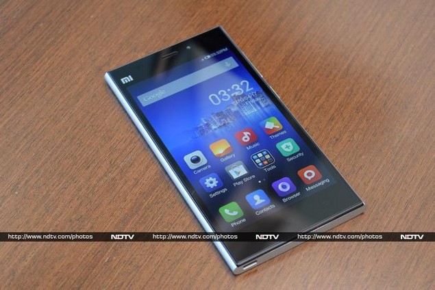
The phone itself looks good at first, but that impression doesn't carry through when you pick it up. It's very plasticky and feels a bit insubstantial even though Xiaomi advertises an "Aluminium-Magnesium alloy frame". The material quality is on par with that of similarly priced devices from Indian brands, so we have to remind ourselves not to expect too much.
The Mi 3 has a unique design, with the black front panel set into a unibody plastic shell. Its sides are rounded but the top and bottom are flat, resulting in corners that dug into our palms when we held the phone. The screen is large enough that one finger won't reach all corners, but shifting it around in one hand is also difficult. The front face is protected by reinforced Corning Gorilla Glass 3.
There's a bright silver MI logo in one corner above the screen. The three capacitive buttons light up when the screen is active but are invisible otherwise. There is a large speaker grille on the bottom, with the Micro-USB port set off to one side. The 3.5mm headset socket is on the top, along with an oversized SIM card tray and secondary microphone. The power and volume buttons are on the right edge, leaving the left totally blank.
The camera and flash are in the top right corner of the rear, and the rest of it is blank apart from another MI logo towards the bottom, right above a few regulatory logos and more text in Chinese. Overall, the Mi 3 is distinct, and we'd go so far as to call it handsome, but there's no confusing it for a top-end Sony or HTC smartphone.
Features and specifications
Now comes the most interesting part. Somehow, Xiaomi has managed to cram all the components of a 2013 flagship into a 2014 budget phone. The spec list starts with a Qualcomm Snapdragon 800 SoC with four Krait 400 CPU cores running at 2.3GHz and an Adreno 330 GPU. The screen is a 5-inch full-HD (1080x1920-pixel) IPS panel and the camera is a 13-megapixel Exmor unit with a dual-LED flash. There's also 2GB of RAM, 16GB of internal storage space, a 3050mAh battery, NFC, Wi-Fi b/g/n/ac, Bluetooth 4.0 and A-GPS with GLONASS.
It's still a bit hard to digest the fact that all this hardware is contained within a phone that costs just Rs. 14,000. The Moto G, which has been the most obvious phone to recommend at this price ever since its launch is based on a Snapdragon 400 SoC and has a 720p screen - and that was what we considered a breakthrough in value devices just six short months ago.
There's only one shortcoming, but it's a really big one. For some strange reason, the Xiaomi Mi 3 lacks a microSD card slot. With all this power at our fingertips, it's a crying shame that storage space is limited to 16GB (only around 13GB of which is user-accessible). Xiaomi does sell a 64GB model internationally, but it is not being offered in India at launch time. If the company stays on track and keeps the price premium minimal if or when it does launch, there should be no reason to buy the 16GB version anymore.
Software
The Mi 3 runs Android 4.4.2, but for better or worse, it's nearly invisible under Xiaomi's custom MIUI skin. Right from the lock screen, you know it's unique. You have to swipe downwards to unlock the phone, which takes some getting used to. You can also swipe in other directions to jump straight to the camera, phone or messaging apps. MIUI lets you define custom text that shows up on the lock screen, which could include your contact details so that people can return the phone to you if you lose it.
Xiaomi has gone with a redundant Menu button rather than a dedicated Recents button - this is a waste, considering menus are always visible in Android 4.4. Long-pressing the button brings up a custom app switcher which shows you how much RAM is currently occupied, and lets you close all open apps with one tap.
We aren't huge fans of custom interfaces which merge the Android homescreens and app launcher pages. MIUI allows you to place custom icons in the app grid which are either shortcuts to a specific Settings page or independent toggles for functions such as Wi-Fi and Bluetooth. Other widgets, such as a search bar, email preview, photo gallery and sticky note can also be sprinkled in with the app icons and shortcuts. This gets really confusing once you start filling up your homescreens.
The notifications shade is also heavily customised. Quick settings aren't visible immediately, which is a shame considering the available screen space, but you can switch to a tab full of toggles as well as a brightness slider. The Settings app also has a Quick Settings tab for options you need to get to frequently. You can tweak lots of little settings, such as the system font and font size, colour temperature, notification LED behaviour, capacitive button functions, and even the behaviour of buttons on a headset. We like having this much control over the phone's functions.
You can sign up for an Mi Cloud account if you want to sync data between devices, send messages (to other Mi Cloud users), and locate or wipe out your phone if it's lost or stolen. The account is also required if you want to download additional UI themes (such as the overly cutesy 'India' theme with kitschy icons and images of the Taj Mahal everywhere).
There's a Guest Mode which lets you hides sensitive personal information while others use your phone. The preloaded Security app lets you scan for problems, block troublesome callers, monitor data usage and review app permissions.
MIUI also includes an updater app, a torch, a file explorer, an NFC tag utility, Facebook, Kingsoft Office and the Flipkart app, as well as custom Gallery and Music apps. Of course Google's usual buffet of apps is also present, but they're all lumped into one folder. Even though there are duplicate apps, at no point did we see the usual annoying popups asking us which app to open a file or link in.
Camera
Like the rest of its software, the Mi 3 has a custom camera interface. It's set to Simple Mode by default, but there's also an Advanced Mode that increases the number of controls available. There are easily accessible toggles the flash, HDR mode, panorama, filters and skin tone enhancement. Dig a little deeper and you'll find settings for picture quality, sounds, watermarking, exposure settings, face recognition, saturation, sharpness and more.
In Advanced Mode, you'll also get focus controls including a dedicated macro setting and manual focus, ISO and simulated shutter speed control, white balance (including manual adjustment and measurement tools), and exposure compensation.
(Click to see full size)
Image quality is pretty good, though this is the one area in which we didn't feel as though we were testing a much more expensive device. Detailing could have been better and compression could have been scaled down a bit. Textures seemed to be indistinct even on objects in the foreground. Most of our photos, even those taken in daylight, came out with a slightly artificial feel, as though a creative filter had been applied.
(Click to see full size)
Indoors, lighting made a huge difference. Our shots of a room at night were quite terrible, even with plenty of light coming in from outside through glass walls. Noise was evident everywhere, and the edges of objects became indistinct.
We were pleased with the low light performance outdoors and the powerful flash. Shots taken outdoors at night were of course noisy and slightly blurred, but looked good enough when scaled down to screen size. With a very steady hand, you'll be able to get some nice shots. On the other hand, the front-facing camera isn't anything to get excited about.
(Click to see full size)
Performance
There's no doubt about it - the Xiaomi Mi 3 is outrageously powerful. It runs rings around anything in its price class and nearly doubles the scores we recorded with the Moto G, which was until now our gold standard for value and performance at this price point. The Mi 3 scored 26,308 in AnTuTu and 15,395 in Quadrant overall, whereas the Moto G scored 11,874 and 8,569 respectively. The Mi 3 maxed out 3DMark's Ice Storm test and managed 28fps in GFXbench, while the Moto G managed 5,629 points and 11fps. The numbers really do paint a startling picture.
The Lenovo Vibe Z and Gionee Elife E7 have very similar specifications to the Xiaomi Mi 3 and interestingly, both of them performed significantly better than it in most tests - for example, their AnTuTu scores were 35,105 and 33,636 respectively. It's hard to pinpoint the exact reason for the Mi 3's lower performance, but then again it costs almost exactly half as much as either of these competitors. It's worth noting that we ran all tests on the Mi 3 in the standard balanced power mode, not the high performance or battery saver modes which are available in the Battery section of the Settings app.
We had no doubt that the Mi 3 would play all our test videos, and it lived up to our expectations. Audio quality through the speaker was a pleasant surprise. 3D games ran well enough for our liking. Music and movies were loud and clear, though not especially detailed. Call quality was also quite good.
With everything so far seeming too good to be true, we hoped that the Mi 3's battery wouldn't turn out to be a dud. The Mi 3 defied all our expectations and lasted for 9 hours, 44 minutes in our video loop test. Even in everyday usage, we were constantly surprised by how slowly the charge level dropped.
Verdict
The Xiaomi Mi 3 is a sensational product. Competitors, especially Indian companies, should be very afraid. If Xiaomi keeps going the way it has begun, it could easily take over the entire Indian market. We'll have to wait a while to see how the company's after-sales network shapes up, but that shouldn't be a problem for long given how serious it appears to be about the Indian market.
This phone might not have it all, but it's got more than enough to tempt buyers who would have otherwise gone for the Moto G. It is by far the best phone available for less than Rs. 15,000 today (and by many measures could also be the best phone available for less than Rs. 20,000 or even more). We cannot wait to see how the industry responds to this new threat.
The Mi 3 is a triumph, not just for Xiaomi but for all Indian smartphone buyers.
Xiaomi Mi 3 in pictures
Get your daily dose of tech news, reviews, and insights, in under 80 characters on Gadgets 360 Turbo. Connect with fellow tech lovers on our Forum. Follow us on X, Facebook, WhatsApp, Threads and Google News for instant updates. Catch all the action on our YouTube channel.
Related Stories
- Samsung Galaxy Unpacked 2026
- iPhone 17 Pro Max
- ChatGPT
- iOS 26
- Laptop Under 50000
- Smartwatch Under 10000
- Apple Vision Pro
- Oneplus 12
- OnePlus Nord CE 3 Lite 5G
- iPhone 13
- Xiaomi 14 Pro
- Oppo Find N3
- Tecno Spark Go (2023)
- Realme V30
- Best Phones Under 25000
- Samsung Galaxy S24 Series
- Cryptocurrency
- iQoo 12
- Samsung Galaxy S24 Ultra
- Giottus
- Samsung Galaxy Z Flip 5
- Apple 'Scary Fast'
- Housefull 5
- GoPro Hero 12 Black Review
- Invincible Season 2
- JioGlass
- HD Ready TV
- Latest Mobile Phones
- Compare Phones
- Moto G47
- Motorola Razr 2026
- Motorola Razr+ 2026
- Motorola Razr Ultra 2026
- Moto G37
- Moto G37 Power
- Moto G87
- OnePlus Ace 6 Ultra
- Dell XPS 16
- Dell XPS 14
- OnePlus Pad 4
- Redmi Pad 2 9.7 4G
- NoiseFit Diva Araya
- OPPO Watch X3 Mini
- Xiaomi TV S Mini LED 2026 (75-inch)
- Xiaomi TV S Mini LED 2026 (65-inch)
- Asus ROG Ally
- Nintendo Switch Lite
- Voltas 1 Ton 3 Star Inverter Split AC (183V Vectra Zenith Silver(4503752))
- Voltas 1 Ton 3 Star Inverter Split AC (123V Vertis Smart Elite Gold(4503704))


