- Home
- Mobiles
- Mobiles Reviews
- Vivo Y17 Review
Vivo Y17 Review
Vivo's latest mid-range offering doesn't have pathbreaking features or specifications, but promises great battery life.

The Vivo Y17 is priced at Rs. 17,990 in India
Vivo is well known in India thanks to its high-volume publicity campaigns featuring celebrities and its sponsorship of major sports tournaments. The company hit the number three spot in India in terms of smartphone shipments for the first quarter of this year, doubling its figures compared to the same period last year. That's despite not trying to disrupt the market with extremely low prices and high specifications like Xiaomi, Realme, and now Samsung do. Vivo promotes its phones' camera capabilities heavily, and has ridden many trends at the right time, releasing phones with high-quality selfie cameras, in-display fingerprint sensors, borderless screens, and colourful patterned bodies.
The company recently launched the Vivo Y17, a sub-Rs. 20,000 phone that boasts of three rear cameras and a huge 5,000mAh battery. It looks slick and has quite a few features that will tempt buyers, especially those who aren't too fussed about specifications. Here's our full review.
![]() The Vivo Y17 has a 5000mAh battery and supports fast charging
The Vivo Y17 has a 5000mAh battery and supports fast charging
Vivo Y17 design
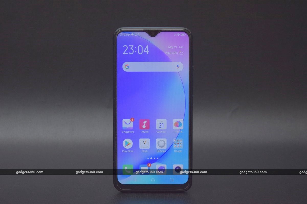
There's nothing unique or new about the overall design of the Vivo Y17. It's a flat slab with rounded sides and a waterdrop-style notch for the front camera. However, this phone does have character thanks to the choice of deep jewel-tone colours for the frame and rear panel.
You can choose between Mineral Blue and Mystic Purple, both of which are pretty unconventional. Both options have gradient finishes, with the Mineral Blue one fading into a much darker tone at the bottom, and the Mystic Purple doing the same, but at the top. If you look closely and tilt the phone so it catches the light, you'll see a fine pattern of diagonal lines. Vivo says this is inspired by the interplay of water and light.
Our blue review unit had an eye-catching gold ring around the slightly protruding triple camera module on the rear, while the purple option just has a matching purple ring. The frame of the phone has the same gradient as the rear.
The material used for the rear panel is plastic, though it does look like it has the depth of glass. As nice as the finish of this phone is, it picks up fingerprints and smudges very easily.
The display of the Vivo Y17 has a slightly unusual 19.3:9 aspect ratio, though this makes no practical difference to usability. The curved sides mask how thick the borders to the sides of the screen are but there's no hiding the thick chin. Vivo shipped our review unit to us with a plastic screen protector already stuck on it, and we found the upper edge a bit scratchy against our ear.
The power and volume buttons are positioned low enough on the right side to be within the reach of our thumb, but the fingerprint sensor on the rear was just a little too high for our liking. There's a tray on the left with individual cutouts for two Nano-SIMs as well as a microSD card. We're slightly disappointed to see a Micro-USB port on the bottom. There's also a 3.5mm headset socket and a single speaker.
The Vivo Y17 is a fairly heavy phone at 190.5g, and at 8.92mm thick, it also isn't the most pocketable. That's the tradeoff Vivo has made in order to fit in the enormous 5000mAh battery, so a lot of buyers will still be glad. Thankfully the rear panel isn't slippery at all, so even though one-handed usage was awkward, we didn't feel as though the Y17 might fall from our grasp when we were stretching with one thumb.
![]() The Vivo Y17 has a Micro-USB port and 3.5mm headset socket on the bottom
The Vivo Y17 has a Micro-USB port and 3.5mm headset socket on the bottom
Vivo Y17 specifications and software
The MediaTek Helio P35 processor is a strange choice, as it has shown up in phones that cost much less than the Vivo Y17, most notably the Oppo A5s (Review). This is a mid-range processor with eight ARM Cortex-A53 cores all running at 2.3GHz, and an integrated PowerVR GE8320 GPU. The Vivo Y17 comes in a single configuration with 4GB of RAM and a relatively generous 128GB of storage.
The 6.35-inch screen has a resolution of 720x1544 in a 19.3:9 aspect ratio, and Vivo has used a standard LCD panel. Several other smartphones at this price level, including the Samsung Galaxy M30 (Review) and Xiaomi Redmi Note 7 Pro (Review) feature superior full-HD panels.
One of the big selling points of this phone is its 5000mAh battery, though curiously Vivo doesn't publish any battery life claims in terms of hours for context like most companies do. The Y17 comes with an 18W charger and the company says this phone supports “dual engine” fast charging, which means there's extra circuitry for speed as well as protection.
Vivo says the Y17 supports dual-band Wi-Fi, but hasn't specified which version. You also get Bluetooth 5, GPS, and FM radio. 4G with VoLTE is supported on both SIMs at the same time. In addition to the standard ambient light and proximity sensors, there's an e-compass and virtual gyroscope.
In the box, you get the 18W charger, a Micro-USB cable, a wired headset, a clear plastic case, a SIM eject tool, and some leaflets. The headset looks like an Apple EarPods knockoff and doesn't have rubber tips.
![]() The Vivo Y17 has two Nano-SIM slots and a dedicated microSD card slot
The Vivo Y17 has two Nano-SIM slots and a dedicated microSD card slot
Stock Android has a vocal fanbase these days, but Vivo has gone off the deep end with customisations in its Funtouch OS 9, based on Android 9.0. There's a lot to take in, starting with the lock screen, which shows random photos and stories from Vivo's own Lockscreen Poster service. Thankfully there are no ads here yet.
The home screens are fairly cluttered, and Vivo has gone with a really old style of Android navigation buttons including the long-deprecated Menu button icon for the app switcher. You can change to the current style or switch to gestures from within the Settings app.
All app icons are found here since there's no app drawer, and there's a lot of them. Vivo has preinstalled a whole bunch of apps including its own V-Appstore, Vivo Browser, Vivocloud data backup service, Easyshare file sharing tool, I Manager for general security and maintenance tasks, and I Theme for UI customisation.
Then there are loads of redundant tools including an email client, photo gallery, and audio and video players. None of these can be removed. You obviously get Google's default apps as well, in addition to third-party apps including Facebook, WhatsApp, Gaana, UC Browser, Amazon shopping, NewsPoint, PhonePe, Paytm, and WPS Office.
Vivo has redesigned everything from the notifications shade to the default apps. Quick toggles aren't in the shade; you have to swipe upwards from the bottom of the screen to pull up the iOS-style “Shortcut Center” which is also cluttered. You can add quick tools as well as specific actions within apps such as Scan & Pay with Paytm, or Search Hotels with MakeMyTrip.
If you choose to enable gestures instead of buttons for UI navigation, you'll have to learn exactly where to swipe so you don't pull up the Shortcut Center inadvertently.
The Settings app is completely customised and not all controls are where you might expect to find them. Funtouch OS has some useful touches though. You can do lots of things with just one tap, like take scrolling screenshots, clone compatible messenger apps right from the home screen, and turn on USB file sharing from the notifications shade.
There's a built-in screen video recorder and loads of system-wide shortcuts to trigger actions or run apps of your choosing. The ability to set the exact corner roundness of app icons is a whimsical little touch. However, Android 9's convenient app icon menus with notifications and action shortcuts are missing.
Vivo has its own basic smart assistant called Jovi, and it's found throughout Funtouch OS. You can quickly call up a Paytm or QR code scanner from the pull-down search tool. The screen to the left of the first home screen is called Jovi Smart Scene, and it shows cards for things like sports scores, the weather, to-dos, and a system-wide reading list that you can save articles or screenshots to from any app. It's supposed to be able to show reminders for upcoming events and sports matches, show weather warnings, and help you track online purchases, but these scenarios didn't come up during our review period.
![]() Left to right: Funtouch OS gesture and shortcut settings, saving articles to read later, quick toggles and tools in the Shortcut Center
Left to right: Funtouch OS gesture and shortcut settings, saving articles to read later, quick toggles and tools in the Shortcut Center
Vivo Y17 performance, battery life, and cameras
The Vivo Y17 might not have the most powerful hardware in its price bracket, but it worked well enough for us during our review. We were worried that Funtouch OS might be bloated and slow, but that wasn't the case either. The phone was reasonably responsive and UI animations were consistently smooth. Fingerprint and face recognition both worked well and we had no complaints.
The screen is a little underwhelming, with washed-out colours and slightly rough edges around icons and text. However, viewing angles are great and it can get very bright. We found it easy to use this phone under harsh sunlight. You only get Widevine L3 certification which limits video streaming to sub-HD resolutions for some services, but the screen isn't full-HD anyway.
The single speaker on the bottom was quite bad, producing only grating, harsh sound. The bundled headset has a very open, hollow sound and can't really handle bass frequencies, but isn't bad overall for casual listening.
Performance in benchmark tests was as weak as we had expected based on the processor that Vivo has chosen for this phone. The Y17 put up a score of only 87,048 in AnTuTu, and Geekbench gave us 769 and 4,106 points in its single- and multi-core tests respectively. We also got scores of 798 and 9,356 in 3DMark's Sling Shot and Ice Storm Extreme tests. The phone only managed 29fps in GFXBench's T-rex scene and 12fps in the Manhattan 3.1 scene.
The CPU scores are poorer than those of the Samsung Galaxy M30, but the graphics scores are better. The lower-priced Xiaomi Redmi Note 7 Pro, Realme 3 Pro, and Asus ZenFone Max Pro M2 delivered better scores all around.
This showing made us worry about how games would run. We fired up PUBG Mobile and it defaulted to the Low quality setting, but even then motion was jittery and we had to deal with frequent momentary freezes that left us vulnerable to being shot. Asphalt 9: Legends took a long time to load and even the UI was laggy, but we were able to run a few races. The good news is that this phone only got very slightly warm, and the battery level didn't fall too much while we were gaming.
Speaking of the battery, this is one area in which the Vivo Y17 did well for itself. Our HD video loop test ran for 18 hours, 57 minutes which is pretty impressive. With everyday use, including a bit of photography, an hour or so of video streaming, and plenty of time spent using various apps, we were able to make this phone last for a day and a half before it needed to be recharged. The included 18W charger is a bit bulky but charges the phone quickly.
The Vivo Y17 has a 13-megapixel f/2.2 primary rear camera with a secondary 8-megapixel f/2.2 wide-angle camera and a 2-megapixel f/2.4 depth sensor for portrait shots. This isn't particularly impressive, especially the high apertures which indicate that low-light performance might not be up to the mark that other phones at this price level have set. Vivo has instead focused on the front camera, which has a 20-megapixel resolution and f/2.0 aperture.
![]()
![]() Tap to see full-sized Vivo Y17 photo samples (top: standard; bottom: wide-angle).
Tap to see full-sized Vivo Y17 photo samples (top: standard; bottom: wide-angle).
The camera app has some quirks. For example, there's a portrait effect toggle when using the front camera, but a different aperture toggle in a different place when using the rear camera. Beautification is a separate mode altogether, but there's no portrait mode. The button that switches between the main and wide-angle lenses is easy to miss; nestled in a row with the timer and filter buttons. The Settings menu is weirdly laid out with multiple selectable options in some rows.
The Jovi assistant pops up here too. One of the filters is an ‘AI' option that claims to choose the best one depending on the scene, but these are usually a subjective choice based on the effect a user wants to create so its effectiveness is questionable. There's also ‘AI' beautification (for the front camera only) which is supposed to work based on the gender and age of the person taking a selfie.
The shots we took in the daytime weren't too bad, but the focus didn't always lock perfectly and the Vivo Y17 seemed to struggle with subtle contrasts. We could never quite be certain that photos would be sharp when we zoomed in to 100 percent, and some photos that looked fine on the phone's screen were quite blurry when opened out at full size. That said, colours were punchy and vibrant, and macros generally turned out better.
When switching to the wide-angle camera, quality definitely took a big hit and colours were much less accurate. Textures looked fake and overprocessed, and distortion was noticeable.
![]()
![]()
![]() Tap to see full-sized Vivo Y17 camera samples
Tap to see full-sized Vivo Y17 camera samples
At night, the Vivo Y17's cameras definitely struggled. The focus was soft, objects in the foreground were grainy, and details were murky in most of our samples. Close-ups were somewhat usable, but shots of objects at a distance weren't much good. The wide-angle camera delivered poor results again.
The front camera took good shots in the daytime but we had to contend with some blurring caused by our hand not being perfectly still when shooting outdoors at night. Beautification actually helps when it's at its lowest settings.
The default video resolution is 1280x720 for some reason, and there's no stabilisation so our recordings were quite shaky. The quality of video, both under sunlight and at night, was disappointing.
Verdict
The Vivo Y17 looks good and has impressive battery life as well as quick charging. It has loads of storage space and the front camera is pretty decent. You might be happy with it in day-to-day use if you stick to common social media and messaging apps. Sadly, that's where the appeal ends.
This phone is quite simply outclassed by other models available at its price, and even by several that cost a lot less. The processor, display, and cameras are not impressive enough given how hard Vivo's competitors are pushing right now. This phone isn't well suited for high-quality gaming, it can't take great photos or record good video, and the software is awkward to live with despite there being some good ideas in there.
Vivo seems to have designed this phone for people with very simple needs, but we don't see any reason to spend so much money for this level of features and performance. The Redmi Note 7 Pro (Review) and Realme 3 Pro (Review) are better phones and will save you some money as well — if you can grab one of them when they're in stock, that is.
Get your daily dose of tech news, reviews, and insights, in under 80 characters on Gadgets 360 Turbo. Connect with fellow tech lovers on our Forum. Follow us on X, Facebook, WhatsApp, Threads and Google News for instant updates. Catch all the action on our YouTube channel.
Related Stories
- Samsung Galaxy Unpacked 2026
- iPhone 17 Pro Max
- ChatGPT
- iOS 26
- Laptop Under 50000
- Smartwatch Under 10000
- Apple Vision Pro
- Oneplus 12
- OnePlus Nord CE 3 Lite 5G
- iPhone 13
- Xiaomi 14 Pro
- Oppo Find N3
- Tecno Spark Go (2023)
- Realme V30
- Best Phones Under 25000
- Samsung Galaxy S24 Series
- Cryptocurrency
- iQoo 12
- Samsung Galaxy S24 Ultra
- Giottus
- Samsung Galaxy Z Flip 5
- Apple 'Scary Fast'
- Housefull 5
- GoPro Hero 12 Black Review
- Invincible Season 2
- JioGlass
- HD Ready TV
- Latest Mobile Phones
- Compare Phones
- OPPO A6s 5G
- Poco X8 Pro 5G
- Poco X8 Pro Max 5G
- OPPO K14 5G
- OPPO Find N6
- Vivo T5x 5G
- Samsung Galaxy M17e 5G
- Lava Bold 2 5G
- MacBook Neo
- MacBook Pro 16-Inch (M5 Max, 2026)
- Tecno Megapad 2
- Apple iPad Air 13-Inch (2026) Wi-Fi + Cellular
- OPPO Watch X3
- Tecno Watch GT 1S
- Xiaomi QLED TV X Pro 75
- Haier H5E Series
- Asus ROG Ally
- Nintendo Switch Lite
- Haier 1.6 Ton 5 Star Inverter Split AC (HSU19G-MZAID5BN-INV)
- Haier 1.6 Ton 5 Star Inverter Split AC (HSU19G-MZAIM5BN-INV)


