- Home
- Mobiles
- Mobiles Reviews
- Sony Xperia E1 Dual Review: Funky and Affordable
Sony Xperia E1 Dual Review: Funky and Affordable

Sony is just one of a growing number of international companies now attacking the bottom end of the Indian smartphone market. It isn't surprising, considering how much growth there is to tap in India, and how many people are still yet to buy their first smartphone. For customers, it's a win-win situation: high-quality phones are becoming more affordable, after-sales service is no longer a total gamble, and features keep trickling down from high-end handsets.
Sony, despite its ups and downs, has impressed us of late with some very slick, consistent hardware. The Xperia Z2 is a solid, well-balanced flagship phone and the Xperia M2 is beautiful in its own right. Let's see if Sony can manage to apply the same formula at a much lower price target and displace the popular Motorola Moto E.
Look and feel
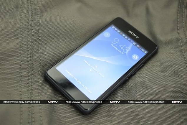
The Xperia E1 Dual (and its near-identical twin, the single-SIM E1) are small, chunky and plastic all over. There are definite similarities to Sony's higher-end models, most notably the two-tone body and the power button in the middle of the right side. This could easily be the best looking phone in this price range, and the build quality is fantastic.
The E1 Dual is surprisingly light at 120g, but its thickness and matte plastic back make it really comfortable to hold. The screen measures four inches diagonally but thanks to the use of on-screen buttons, there isn't much plastic above or below it. There's a large Sony logo above the screen, plus a earpiece cutout, sensors, and notification LED that's invisible unless lit up.
The notification LED is a bit odd because when it isn't red or green to show your battery charge status, its colour seems to change depending on the angle you're looking at it. It could be white, blue, cyan, purple or orange and we wouldn't be able to tell whether they mean different things. There's also another hidden LED below the screen which lights up briefly in a random colour when tracks begin playing in the Walkman app, for no apparent reason whatsoever.
The camera lens on the rear is nicely recessed so that it won't scratch easily. There's another printed Sony logo and a more subtle engraved Xperia logo on the rear, but the most noticeable thing is the enormous speaker grille across the device's entire width.
The power button is on the right edge in keeping with Sony's current "omnibalance" design direction, but it doesn't work at all on such a small device. It's hopelessly inconvenient to get to when needed, and there are no shortcuts such as double-tapping the screen, which would have make this easier to deal with. Sony has also decided to place a dedicated Walkman button on the top right edge, right where the power button should be. Making matters infinitely worse, pressing the Walkman button even lightly makes music start playing at whatever volume you left it - it's possible to trigger this even with the screen locked if the button is pressed twice. Needless to say, this led to some very awkward moments in our office during the review process.
There's a headset socket on the top and Micro-USB charging port on the left edge. The rear panel pops off to reveal the removable battery and microSD card slot. You have to pull the battery out to get to the two regular-sized SIM card trays, but microSD cards can be hot-swapped. You'll also notice that the speaker itself is a lot smaller than the grille makes it out to be.
Features, specifications and software
The E1 Dual is powered by a Qualcomm Snapdragon 200 SoC, with a 1.2GHz dual-core processor and Adreno 302 graphics. This is decidedly low-end, but it's modern enough and should perform better than phones in this price range which are based on MediaTek silicon. We shouldn't expect more than half a gigabyte of RAM, and internal data storage capacity is similarly limited to 4GB.
The screen measures 4 inches diagonally, and its 480x800-pixel resolution is just about enough. We have to keep reminding ourselves how inexpensive this phone is, since it really doesn't feel cheap.
The 3-megapixel camera doesn't have a flash, and it's probably for the best that there's no front camera. The battery also seems a bit puny at 1700mAh. On the bright side, there's Bluetooth 4.0 and Wi-Fi b/g/n along with FM radio, A-GPS and a digital compass. The E1 Dual officially supports microSD cards up to 32GB in capacity.
Sony's distinct Android skin makes an appearance here, on top of Android 4.3. It's one of our preferred custom interfaces, though it does feel quite cramped on such a low-resolution screen. You also lose a bit of screen space thanks to the use of soft buttons - until an update to Android 4.4 is released, several apps and games won't be able to run in full screen mode. There are other tradeoffs too, for example the keyboard is cramped and it's really easy to hit the navigation buttons when typing since they're right beneath it. At least there's a dedicated Recents key instead of the more common but redundant Menu key.
The interface should be familiar to anyone who has used a recent Sony smartphone. There's the usual excessive bloatware both on the home screens and in the app launcher menu. Sony bundles loads of apps including its Sony Select content showcase, the Walkman app, Movies and Album apps, TrackID, Xperia Care Support, and Smart Connect. Then there's the usual suite of Google apps, including Gmail Maps, Hangouts, YouTube, Google+, News & Weather, and the Play store.
That's a lot of preloaded apps; many of which have overlapping functionality and none of which are removable. These plus the multiple default homescreen widgets make the phone's software feel cluttered. While the Sony Xperia E1 Dual is a very affordable phone, all this confusion means it might not be the most suitable choice for first-time Android users. Sony could easily have toned down its software assault for this device.
Camera
Some things are scaled down, for example the camera app. Sony's usual plethora of filters, effects and modes are mostly missing. There's only an Auto Scene mode, a Manual mode, Sweep Panorama and Picture Effect. Auto mode is pretty self-explanatory, and there's almost nothing you can do other than point and shoot.
Manual allows you to adjust the exposure compensation, white balance, ISO, and photo/video resolution. There are 16 scene presets to choose from manually, such as low light, fireworks and snow, as well as a largely useless HDR setting. The Picture Effect options are just basic filters, and you can expect the phone to slow down significantly when using them.
The Xperia E1 Dual is definitely not going to help you take amazing spontaneous photos. For starters, the camera app is terribly slow - much more so than the rest of the UI - and there's way too much shutter lag. The camera itself has a fixed-focus lens - you can't tap to focus or compose images.
The photos we took with the E1 Dual during the course of our testing were all uniformly disappointing. You can forget about taking shots of any landscape or scenery; the camera only works on nearby subjects such as faces. The leaves on a tree, for example, just looked like an artificially generated texture. Edges were harsh and poorly defined, and exposure was completely off balance. Even with simpler subjects, the camera was underwhelming - don't expect to be able to read regular-sized text or see any subtle detailing.
(Click to see full size)
Performance
The Xperia E1 Dual isn't a speed demon by any stretch. It's good enough for basic everyday usage and a bit of music, social networking and Web browsing on the side. It takes a second or so to switch apps or move between screens and in some cases Sony's own animated transitions make the phone feel like it's slow to respond.
Benchmark results were quite average, though we were happy to note that graphics scores were around twice as high as those of even slightly higher-priced phones, thanks to the choice of a well-balanced Qualcomm SoC rather than a competing chip with more CPU cores but worse GPU performance.
The screen is not all that sharp, which means that text is just a bit blocky and colour gradients look grainy. This isn't really a problem unless you're used to higher-quality screens already. The backlight can get really bright but contrast is lacking. This also means legibility is poor in sunlight.
Sony is heavily pushing the E1 Dual's speaker, which we agree is surprisingly loud and clear. Even classical music doesn't sound terrible - though that isn't saying much for a phone's built-in mono speaker. The Sound page of the Settings menu has an option called Clear Phase which claims to improve quality (though we couldn't discern any change) and another called xLOUD which pushes the maximum volume level quite a bit.
Battery life was a bit disappointing at just over five hours in our video loop test. However call quality and network reception were good.
Verdict
The Sony Xperia E1 Dual competes with the Motorola Moto E, HTC Desire 210 Dual SIM, Asus Zenfone 4, and Nokia X Dual SIM, in addition to multiple options from local brands. We find that Sony, Motorola and Asus have the edge here, each with a different set of strengths and weaknesses.
The Moto E is a shade less expensive than the Xperia E1 Dual and will appeal to fans of stock Android, though in every other regard the two are very similar. We'd lean towards recommending the Motorola option for anyone new to smartphones, thanks to the E1's awkward button placement and cluttered software. The Zenfone 4 has an interesting advantage with 8GB of internal storage and we were very impressed with its larger sibling, the Zenfone 5. To be fair, its Intel Atom Z2520 processor is not yet proven, so we'll reserve judgment on the Zenfone 4 till we've tested it ourselves.
We do like the Sony Xperia E1 Dual (and by extension, its cheaper twin the E1) but it's a crowded market. Go for this phone if you're comfortable with Sony's Android skin and if its style appeals to you. Otherwise, the Moto E is a solid alternative.
Sony Xperia E1 Dual in pictures
Get your daily dose of tech news, reviews, and insights, in under 80 characters on Gadgets 360 Turbo. Connect with fellow tech lovers on our Forum. Follow us on X, Facebook, WhatsApp, Threads and Google News for instant updates. Catch all the action on our YouTube channel.
Related Stories
- Samsung Galaxy Unpacked 2026
- iPhone 17 Pro Max
- ChatGPT
- iOS 26
- Laptop Under 50000
- Smartwatch Under 10000
- Apple Vision Pro
- Oneplus 12
- OnePlus Nord CE 3 Lite 5G
- iPhone 13
- Xiaomi 14 Pro
- Oppo Find N3
- Tecno Spark Go (2023)
- Realme V30
- Best Phones Under 25000
- Samsung Galaxy S24 Series
- Cryptocurrency
- iQoo 12
- Samsung Galaxy S24 Ultra
- Giottus
- Samsung Galaxy Z Flip 5
- Apple 'Scary Fast'
- Housefull 5
- GoPro Hero 12 Black Review
- Invincible Season 2
- JioGlass
- HD Ready TV
- Latest Mobile Phones
- Compare Phones
- Moto G47
- Motorola Razr 2026
- Motorola Razr+ 2026
- Motorola Razr Ultra 2026
- Moto G37
- Moto G37 Power
- Moto G87
- OnePlus Ace 6 Ultra
- Dell XPS 16
- Dell XPS 14
- OnePlus Pad 4
- Redmi Pad 2 9.7 4G
- NoiseFit Diva Araya
- OPPO Watch X3 Mini
- Xiaomi TV S Mini LED 2026 (75-inch)
- Xiaomi TV S Mini LED 2026 (65-inch)
- Asus ROG Ally
- Nintendo Switch Lite
- Voltas 1 Ton 3 Star Inverter Split AC (183V Vectra Zenith Silver(4503752))
- Voltas 1 Ton 3 Star Inverter Split AC (123V Vertis Smart Elite Gold(4503704))


