- Home
- Mobiles
- Mobiles Reviews
- Samsung Galaxy S8 and Galaxy S8+ Review
Samsung Galaxy S8 and Galaxy S8+ Review
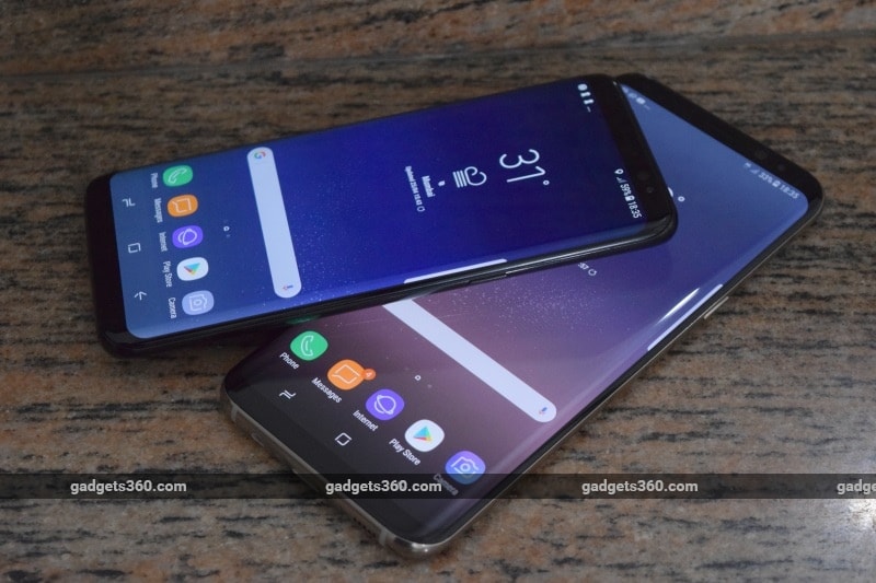
A lot has been made of Samsung's need to redeem itself after last year's Galaxy Note 7 battery fiasco. The company itself hasn't shied away from acknowledging that it needs to earn customers' trust again. The mistakes it made were inexcusable, and the danger to lives and property was very real. But Samsung handled the situation as responsibly as any multinational giant could, made its investigations and remedial steps public, and swallowed losses equivalent to the entire worth of some of its competitors.
The newly launched Galaxy S8 and Galaxy S8+ are being held up to intense scrutiny because there's a bigger void than usual to fill. There is no doubt a huge PR cloud over this launch, and we can well imagine how careful Samsung has been with the design and manufacturing these new phones. It's really a pity, because to frame the existence of the Galaxy S8 and S8+ only as some kind of test that Samsung needs to pass would be to miss the point of what these devices really achieve. These two devices reimagine, from the ground up, what an Android phone can and should be.
- Samsung Galaxy S26 Ultra for Content Creation
- Samsung Galaxy S26 Ultra's LOG Video Presets
- Samsung Galaxy S26 for Long-Term Use
- Samsung Galaxy S26 Ultra vs iPhone 17 Pro Max: Which one is more ergonomic?
- Samsung Galaxy S26 Ultra vs iPhone 17 Pro Max: Is Samsung's ecosystem Integration finally catching up?
It's a problem that could use a little reimagining. A little while ago, especially in India, Samsung was synonymous with Android. If you were buying a luxury phone that wasn't an iPhone, it was the current reigning Galaxy S model - or a Galaxy Note if you wanted to be different. Other options did exist, but mainly on the fringes of the market. However, brand power doesn't mean as much nowadays, with dozens of companies screaming about low prices and pushing out model after model that all look the same.
The Galaxy S8 and S8+ were designed to make people remember why ultra-premium phones exist, and to firmly establish Samsung at the top of the market as far as innovation, design and manufacturing are concerned. Very few companies could even attempt to pull something like this off - but has Samsung finally managed to out-Apple Apple? We've spent enough time with the new Galaxy S siblings to tell you.
Samsung Galaxy S8 and S8+ design
For at least the last few years, the holy grail of smartphone design has been to turn the entire device into a touchscreen with no borders. Rumours of an all-glass iPhone have been circulating for a while now, LG is on the same page with its G6, and we got some hands-on time with the stunning Xiaomi Mi Mix at CES earlier this year. Companies are definitely chasing this dream, but is it only because they've latched onto the idea - just like everyone rushed out to produce smartwatches when the "iWatch" was still just a rumour - or is there any real benefit for end users?
The defining feature of the Galaxy S8 twins is their oversized screens - Infinity Displays, as Samsung is marketing them. Just like last year's Galaxy S7 Edge (Review), the screens on these phones curve around the sides making for a border-free look. How these phones go further is by extending nearly to the top and bottom of both phones. There's still about 1cm of space on both sides, but while the earpiece, front camera and sensors can be squeezed into the top, Samsung made the decision to ditch its branding and the iconic physical Home button on the bottom.
With their screens off, both phones look beautifully minimalist. As soon as you see them, all you want to do is reach out, touch them, and turn them around in your hands. The level of polish that Samsung has achieved here is stunning, and we have to say that these phones blow even the Jet Black iPhone 7 and 7 Plus away. They just exude luxury.
The glass front and rear both curve at the sides to meet a metal frame forming an almost perfectly continuous surface. Samsung has been doing curved glass for multiple generations now, and is so confident of this design's merits that it decided not to even bother producing a flat version of the Galaxy S8. Both the S8 and the S8+ feel extremely smooth, but somehow Samsung has managed to avoid making them too slippery.
![]()
We received a Galaxy S8 in Midnight Black and a Galaxy S8+ in Maple Gold. Both are available in both colours, but the S8+ also gets an exclusive Coral Blue option. Maple Gold is more like a dual-tone finish with sand-coloured glass on the rear and a metallic champagne-gold rim. It isn't garish at all and actually looks quite distinguished, but we preferred the black, which is more monolithic and amplifies the slick, glossy look of the front. Both of them were fingerprint magnets, but that's the price you pay.
The only thing that makes gripping these phones a little uncertain is their narrow proportions, which takes some getting used to. The two phones are in fact so narrow that the Galaxy S8+ feels normal despite its phablet-sized screen, and the smaller Galaxy S8 feels like a "mini" variant after using both. We were surprised by how comfortable it was to hold and use the S8. Even with the larger S8+, it isn't terribly difficult to reach all four corners of the screen with one thumb - though we definitely wouldn't recommend doing so when there's any danger of having someone bump into you.
Other than physical size, both phones are identical. You'll find a power button on the right and a volume rocker on the left with a dedicated button for the new Bixby assistant right below it. We often found ourselves hitting this by mistake when we were reaching for the volume down button. There's a USB Type-C port and a 3.5mm audio socket on the bottom and a hybrid dual-SIM tray on the top. Both phones are also certified IP68 for protection against water and dust ingress.
We were happy to see that there's no camera bump at all on the back. The Galaxy S6 had a pretty ugly one, the S7 managed to tone it down a bit, and now it's gone completely. The flash and heart rate sensor are to one side of it, and in what is possibly the only unattractive feature of the S8 generation design, the fingerprint reader is on the other side. The arrangement is asymmetrical and just looks awkward.
This is a key point in the battle of aesthetics vs usability. With no physical button, the fingerprint reader had to be shunted out. By multiple accounts, Samsung wanted to engineer a fingerprint reader into the screen itself - something Apple is also reportedly struggling with - but had to settle for a traditional sensor on the back. It's extremely difficult to reach, especially if you're left-handed. There's also a small ring around the camera lens so that it doesn't get scratched easily, but it's far too easy to feel the ring and assume you've found the sensor, leading to even more frustration. If the sensor had to be on the back, it really should have been centred below the camera lens.
![]()
Samsung Galaxy S8 and Galaxy S8+ specifications
There are two versions of each model - the so-called international ones, which have been launched in India, are based on Samsung's own in-house Exynos 8895 SoC, while the ones sold in North America use Qualcomm's latest and greatest Snapdragon 835. The two chips are extremely similar - in fact both are manufactured by Samsung on its cutting-edge 10nm fabrication process. The Snapdragon name is well regarded, but buyers in India shouldn't feel as though they're getting second-best. Early reports have shown the Exynos matching or even exceeding Qualcomm's latest and greatest silicone.
The Exynos 8895 has four custom Samsung M2 CPU cores and four ARM Cortex-A53 cores running at up to 1.9GHz, balancing performance and power efficiency. There's also an integrated ARM Mali-G71 GPU which promises up to 60 percent better graphics performance than before. Samsung says that the Exynos 8895 supports cache coherency between CPU and GPU cores, reducing latency for complex tasks. There are also improvements to the media decoder, camera image signal processor, LTE modem and encryption subsystems, plus a new vision processing unit to enable object recognition and motion tracking. All of this benefits from the 10nm process in the form of better power efficiency and the ability to run for much longer before speeds are throttled because of heat. We'll see these capabilities put to use in the Galaxy S8 siblings.
Both phones have 4GB of RAM and 64GB of storage. They're dual-SIM capable with 4G at Gigabit speeds and VoLTE, but you want to add more storage using a microSD card, you'll lose one SIM slot. You also get Wi-Fi 802.11ac, the brand new Bluetooth 5.0 standard which improves speed and range, NFC, and GPS.
The Galaxy S8 has a 5.8-inch screen while the S8+ has a 6.2-inch screen. Both have the same resolution, 1440x2960, which gives the smaller model a slight edge in terms of pixel density. However, these screens have rounded corners, so you lose a tiny bit of real estate - Samsung measures the resulting rectangular area as 5.6 inches and 6.1 inches for the two models respectively. Because of the non-standard 18.5:9 aspect ratio, lots of apps run in a letterbox with black bars on the top and bottom, though Samsung uses some of that space for the Android navigation buttons.
Both phones have 12-megapixel rear cameras. That might not sound like a lot, but it's the sensors that matter, not the megapixel count. The Galaxy S8 and S8+ have 1.4-micron pixels on a 1/2.55-inch sensor, plus optical image stabilisation and a f/1.7 aperture. Interestingly, Samsung is one of the only companies not to go with dual cameras on its 2017 flagship devices, so we'll have to see if buyers lose out on anything. The front cameras on both phones have 8-megapixel sensors and f/1.7 apertures as well.
The smaller Galaxy S8 has a 3000mAh battery while its bigger sibling can fit in a 3500mAh unit. Wireless charging and quick charging are both supported.
![]()
Samsung Galaxy S8 and S8+ software
Anything less than Android 7.0 and we would have been disappointed. However, you'll hardly recognise it, thanks to Samsung's newly rechristened "Samsung Experience" UI. It's been reworked so that your fingers don't need to be able to reach the bottom of the screen all the time - by default, swiping up or down anywhere on the homescreen will take you to the app drawer. You swipe left or right to go between homescreens as well as app drawer pages, and both have the same icon grid positioning and spacing, so you might not always know which way you need to go.
You can choose to disable the app drawer and just have all icons out on the homescreens. You can also choose to launch the app drawer with a dedicated button. Quick settings and notifications are where you'd expect them to be, but the layout of these panels is a bit cramped. The main Settings app is completely rearranged, with a custom menu structure. There are helpful shortcuts that take you to other sections where related settings might be found, and we got used to this in a few days.
Samsung's launcher and in-house apps take full advantage of the taller display, and even the status bar is indented from both sides so that nothing is cut off by the screen's rounded corners. The corners match the physical shape of the phone itself, and the resulting look is very organic. You might not even notice it until you launch a third-party app for the first time. Without optimisation, most run with ugly black bars which make the sharp corners of the resulting 16:9 rectangle really stick out.
While both phones have a natural resolution of 1440x2960 pixels, they run at a downscaled 1080x2220 by default. Within the Settings menu is a slider that lets you adjust the effective resolution up to its natural level or down to 720x1480. While the lowest resolution definitely makes text look more jagged, there's very little difference between the two higher settings. You might notice some differences in the way apps scale, but in most cases the default should do fine. Most people won't even perceive that the screen isn't running at its full resolution.
![]()
Edge Panels appear when you swipe inwards from your preferred edge. The idea is to show shortcuts or information in a column so you can easily thumb through it and get what you need. There are loads of panels that you can choose from and even more that you can buy, including ones for app shortcuts, contacts, news, the clipboard, weather, sports scores, and even miniature apps and games. Because of how tall these phones' screens are, content might not actually be within a thumb's reach, and it becomes tedious to swipe through panels to get to the one you want. The more panels you have, the more the purpose is defeated.
There are quite a few preloaded apps, including Microsoft Office and Skype and assorted Google apps. Samsung has its own versions of all the basic apps - everything from the phone dialler and SMS interface to the photo gallery and default browser is customised. We usually don't like dealing with such apps especially since they duplicate Google's compulsory ones, but in this case at least they all run full-screen and look good. There's a lot of extra bloat like status updates and animated profile pictures in the contacts app, and several of them ask you to sign up for a Samsung account.
Samsung Members is a forum for product owners, and has useful support and service information plus diagnostic tests and a news feed of Samsung product launches. My Galaxy is a thoroughly confusing front for various Samsung and third-party services. It lets users book cabs, make doctor's appointments through Lybrate, order food from Zomato, locate a lost phone, talk to remote customer care operators, stream music from Wynk, book hotels and tickets from Goibibo, buy movie tickets with Bookmyshow, pay bills with ICICI Pockets, watch random Viu videos, get games from Omlet Arcade, and see deals from Amazon.
But the main attraction is Bixby, Samsung's new intelligent assistant. Every major tech company is racing to push out a product that can become users' preferred choice, because once tied in to an ecosystem, they're likely to stay there. Bixby has its own page to the left of the first homescreen, and you can call it up either with a swipe or by tapping the Bixby button on the left of the phone. Long-pressing should bring up a voice prompt, but this feature isn't yet ready and will be added in a later update.
As of now, Bixby lets you set context-aware reminders and alarms, and shows you your S Health information plus news, calendar appointments, and suggested apps. Of course, Samsung couldn't resist offering downloadable themes and wallpapers either. As of now, Bixby appears to have very limited functionality, and we've already got Google Assistant running in the background as well. It's supposed to learn your habits and tune itself to become more helpful, which means it will be some time before we can truly judge its value. Integration across Samsung's custom apps will also potentially make Bixby more useful when voice commands are available.
![]()
Samsung Galaxy S8 and S8+ usage and performance
It isn't very hard to get used to the screens on the Galaxy S8 and S8+. We expected that reflections would be tough to deal with, and we were constantly distracted while trying to watch videos. Indoor lighting is particularly harsh, and it's impossible to find an angle that's perfectly comfortable. Smudges and fingerprints are also a huge problem. The curved edges also caused a little trouble with apps and websites that have text running across the entire width of the screen or buttons at the edges. Because of the cropping, we had to stretch our thumbs to reach the controls in Dead Trigger 2. On the other hand, Asphalt 8 ran full-screen with no trouble.
The smaller Galaxy S8 can sometimes feel a little constricting when reading long pages of text, but that's only because the screen feels disproportionately narrow. On the other hand, holding it up to talk reminds us of pre-touchscreen candybar phones, and you'll feel the difference if you pick up a standard 5.5-inch Android phone after using it. When typing, you typically hold a phone near the bottom of its screen, and this makes both the S8 and S8+ a bit top-heavy.
Samsung touts the fact that pressing down on the soft Home button triggers a haptic vibration, making it feel like a physical button. However, you only very rarely press down because a tap suffices. There's also no differentiation between a long-tap and a hard tap, so you feel the vibration when launching Google Assistant. Android 7.0 supports split-screen multitasking, and getting two apps to run is as simple as hitting the Overview button and tapping an icon that appears on the thumbnails of compatible apps.
We tried Samsung's new face and iris recognition features, and we wouldn't consider either option a true alternative to a sensibly positioned fingerprint reader. You can only have one of them active at a time. Both need you to first wake the phone from sleep and then line your face up to it - if you're using iris recognition, a guide appears on screen with two circles for your eyes. When it works, it's instantaneous - but that isn't very often. If you're walking, or standing in a crowded area, you could look very strange waving the phone in front of your face for several seconds. If it times out, you have to tap the screen to try again. It's almost always quicker and easier just to tap in a passcode.
![]()
The built-in speaker is pretty good, but it's still mono and fires downwards. The sound isn't very rich, but it's clear even at high volumes and a group of people could enjoy a video without any problem. You get a nice-looking headset in the box. It has prominent AKG branding, though it's only tuned by the AKG, according to a Samsung representative. It has an inline remote and the cable is braided up to the Y-splitter. Sound is pretty good for all kinds of music.
Benchmark scores showed that the Exynos processor is an absolute beast. It tore through all our tests, posting the highest scores we've ever seen in many of them. Both phones did equally well, with the differences between them possibly attributable to differences in heat dissipation and the usual variance between runs. Starting with AnTuTu, we saw scores of 166,919 and 172,719 for the S8 and S8+ respectively. For the sake of comparison, the Google Pixel XL (Review) scored 133,650, the iPhone 7 Plus (Review) scored 179,724, and the OnePlus 3T (Review) scored 161,620 when we tested them. Geekbench's single- and multi-core tests, the S8 posted 1,991 and 6,665 respectively, while the S8+ gave us 2,015 and 6,574. The browser-based Basemark Web test gave the two phones 120.8 and 125.12 points respectively.
3DMark's Ice Storm Extreme test gave the two phones 12,793 and 13,039, while the more powerful Sling Shot Extreme gave them 3,278 and 3,230 respectively. Both phones maxed out GFXBench's T-rex scene at 60fps, so we ran the latest Car Chase scene and saw the phones post 21fps. Since this particular benchmark is resolution dependent, we raised the Galaxy S8+'s resolution from the default 1080x2220 to the native 1440x2960, and saw the Car Chase score dip to 13fps. In actual gaming, we noticed no significant quality differences at the two resolutions, so we'd stick with the lower one for smoother frame rates.
We were expecting groundbreaking battery life from both these phones, considering their flagship positioning and power-efficient 10nm SoCs. However, we only got 13 hours, 35 minutes with the Galaxy S8 and 13 hours, 8 minutes with the Galaxy S8+ in our HD video loop test. Last year's models both gave us over 16 hours of video playback time, though they were tested with a standard-resolution video. In everyday use, we pushed both phones with a lot of video streaming and some gaming, and they both lasted through a full day with a little left over. They also both charged from zero to 100 percent in just under two hours.
![]()
Samsung Galaxy S8 and S8+ camera performance
Flagship phones can't always boast of superior specifications and performance these days, but one things that still sets them apart is camera quality. Samsung's last few Galaxy S models have rivalled or beaten Apple's iPhone line, and now they have the Google Pixel and Pixel XL to compete with as well. The Galaxy S8 siblings are noteworthy in that they don't have dual cameras, something that nearly every other company has implemented in one way or another. The promise here is of quality alone, without gimmicks.
That said, the experience of using these phones' cameras is excellent. The Camera app is quick to launch, and focusing is near-instantaneous. The S8 and S8+ can handle quick pans, moving objects, and shifts from bright to dark areas very quickly. You get a Pro mode, and can adjust focus after shots are taken using the Selective Focus mode. More such features can be downloaded for free, including Sports Shot and Animated GIF modes. This avoids clutter like we've seen in the past (and lets Samsung sell you new features down the line), but it's easy to miss this mini-app store entirely.
The one annoying thing about the camera app is its integration with Bixby. The Bixby Vision feature claims to let you point your camera at anything and have the phone recognise it and then give you useful tools. We had to deal with an annoying popup every time we launched the camera, until we finally used the feature. We found that it's good for text and can deliver decently accurate OCR results when lighting and framing are good.
![]()
![]()
![]()
![]() Tap to see full-sized Samsung Galaxy S8 camera samples
Tap to see full-sized Samsung Galaxy S8 camera samples
However, several objects were not recognised at all, and at least half of all results were completely off base. One DVD cover was recognised and we were shown online shopping options, but from German websites. The app also seemed to think that everyday objects and even people's faces were wine bottle labels. You're also supposed to be able to get information about landmarks, but sometimes objects we shot indoors were recognised as such, and then we were shown information about restaurants and cafes in the area, most likely based on GPS location alone.
When it comes to ordinary photography, the S8 and S8+ are both joys to use. We took some stunning shots both in the daytime and at night. Depth of field was excellent, and macros showed incredibly sharp details. Textures on everything from flower petals to rusted bits of metal came out looking fantastic. Even at night, photos were clear and detailed, with lots of colours and very little noise. There was some motion blur in shots of moving subjects such as animals at night, but we can't fault that.
You can record 4K videos, but only for up to 10 minutes at a time. We noticed one odd thing, which is that the phone's display seemed to lag a little while recording at 4K or 1080p - the viewfinder couldn't keep up when we moved these phones rapidly, leading to a bit of inertial motion. Videos came out looking perfectly fine, however, so this is only something to consider while framing shots. We were also a little nervous about our grip on these phones when shooting videos in landscape. In terms of quality, videos taken in daylight and at night came out looking great. Although there is a slow-motion mode, we missed the ability to choose our preferred speed. The front cameras on both phones are also top-notch.
![]()
![]()
![]()
![]() Tap to see full-sized Samsung Galaxy S8+ camera samples
Tap to see full-sized Samsung Galaxy S8+ camera samples
Verdict
Samsung has certainly proven that it has the design and manufacturing strengths to pull off absolutely stunning devices. If you're going to spend this much on a smartphone, you're going to want it to feel special, and that's something that both these phones do very well. Everyone who sees you use one will want to know what it is.
The fingerprint sensor is as good as missing, the software seems stuffed with some unnecessary features, and not everyone will love the curved glass. We would have liked the option of a flat screen, but we suspect that this is how Samsung is now differentiating itself from the competition. If you can live with these things, you'll find that everything else is absolutely state-of-the-art.
Performance is phenomenal, and the cameras are right up there with the iPhone 7 Plus and Google Pixel XL, if not better. There's also the appeal of using either phone as a mobile workstation with the DeX desktop dock, which we haven't had the chance to review yet. All of these are excellent reasons to choose a Galaxy S8 in your preferred size. They're also reasons to seriously consider the fact that you can pay a lot less for a smartphone these days and not miss out on a whole lot. What it finally comes down to is how you see yourself and the image you want to project. This is how you stand out in 2017, and this is what you need to feel like you're on top of the world.
Get your daily dose of tech news, reviews, and insights, in under 80 characters on Gadgets 360 Turbo. Connect with fellow tech lovers on our Forum. Follow us on X, Facebook, WhatsApp, Threads and Google News for instant updates. Catch all the action on our YouTube channel.
Related Stories
- Samsung Galaxy Unpacked 2026
- iPhone 17 Pro Max
- ChatGPT
- iOS 26
- Laptop Under 50000
- Smartwatch Under 10000
- Apple Vision Pro
- Oneplus 12
- OnePlus Nord CE 3 Lite 5G
- iPhone 13
- Xiaomi 14 Pro
- Oppo Find N3
- Tecno Spark Go (2023)
- Realme V30
- Best Phones Under 25000
- Samsung Galaxy S24 Series
- Cryptocurrency
- iQoo 12
- Samsung Galaxy S24 Ultra
- Giottus
- Samsung Galaxy Z Flip 5
- Apple 'Scary Fast'
- Housefull 5
- GoPro Hero 12 Black Review
- Invincible Season 2
- JioGlass
- HD Ready TV
- Latest Mobile Phones
- Compare Phones
- OPPO Find X9 Ultra
- Redmi K90 Max
- Redmi A7 4G
- Redmi A7 Pro 4G
- Poco M8s 5G
- Huawei Pura X Max
- Tecno Spark 50 5G
- Vivo T5 Pro 5G
- Dell 15 (D15260)
- Asus Zenbook S14
- Redmi Pad 2 SE
- Moto Pad (2026)
- Huawei Watch Buds 2
- Huawei Watch Fit 5 Pro
- Xiaomi TV S Mini LED 2026 (75-inch)
- Xiaomi TV S Mini LED 2026 (65-inch)
- Asus ROG Ally
- Nintendo Switch Lite
- Haier 1.6 Ton 5 Star Inverter Split AC (HSU19G-MZAID5BN-INV)
- Haier 1.6 Ton 5 Star Inverter Split AC (HSU19G-MZAIM5BN-INV)


