- Home
- Mobiles
- Mobiles Reviews
- Samsung Galaxy S4: Hands on
Samsung Galaxy S4: Hands on

The Korean company revealed the S 4 for the first time Thursday at an event in New York, and provided reporters with some hands-on time with pre-production units. The final phones will be on sale in April to June period from Verizon Wireless, AT&T, Sprint Nextel, T-Mobile USA, US Cellular and Cricket, the company says. If history is any guide, even smaller phone companies will get it, if not right away. The phone companies will set the prices; expect this phone to start at $200 with a two-year contract.
Samsung has competent engineers, and hardware-wise the S4 is a solid successor to the III. The screen is slightly larger, at 5 inches on the diagonal compared to 4.8 inches for the III and 4 inches for the iPhone 5. It sports a resolution of 1920 by 1080 pixels, as much as you'd find on a high-definition TV set. This should mean that the resolution chase is over in the smartphone area: the eyes just can't discern any more pixels on these small screens. Competing top-line Android phones already have the same resolution, so Samsung isn't breaking new ground here.
The bigger screen is crammed into a chassis that's actually a hair narrower and thinner than the S III's. This is quite a feat. Samsung shrank the frame surrounding the screen to make room. Shrinking other internal components allowed it to make the battery 20 percent larger than III's, but Samsung isn't saying whether that translates into longer battery life - the added battery power could be eaten up by software and hardware changes.
The body is still dominated by softly molded plastic, and the S4 doesn't really advance the aesthetics of its predecessor the way competitors Apple, Sony and HTC have done with their latest phones. Apple and HTC, in particular, have put a lot of sweat into machining metal into jewel-like enclosures; Samsung doesn't seem to care all that much about looks.
Samsung does care about trying to push the envelope on what the phone does, but it may have poked through the envelope, tearing a hole or two in it. It's probably not a disaster, because most of its features can be turned off, but first-time users could be confused.
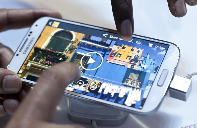
For one thing, Samsung is taking the whole "touch screen" thing further by now sensing when the user's finger is hovering over the screen. In other words, you don't even need to touch the phone to make it react. Hovering over a thumbnail of a picture in the Gallery will reveal a bigger thumbnail, and hovering over one email in a list will show a preview of its first lines.
The idea is similar to the "mouse hover" feature on a PC, which sometimes reveals things before the mouse is clicked. Implementing it on a smartphone is trickier, though. On the PC, you have to use the mouse, so you'll discover the hover functions in the normal course of use. But since the feature is new in a smartphone and there's normally no reason to have your finger hovering over the screen, users are likely to discover this feature by chance. That wouldn't be so bad if all applications responded to hovering in a consistent manner, but very few applications react to it all. On the S4, the "Email" app will show previews, but the "Gmail" app won't. The built-in "Gallery" app will show picture previews, but other photo apps won't. I suspect users will get tired of trying to hover with their fingers and give up on the whole thing.
The hovering feature also sets the phone up for another problem. In my testing, I found that the phone sometimes registered a close hover as a touch. In other words, the screen was overly sensitive, thinking I was touching it when I wasn't. This may be fixed by the time the phone is in production, but it's potentially an annoying issue.
The S 4 tries to divine your intentions in two additional ways. It has an infra-red sensor that looks for hand movements up to about 4 inches away from the phone, and it uses the front-side camera to figure out if it's front of the user's face. Thanks to the IR sensor, the phone's browser responds to an "up swipe" in the air above it with by scrolling up, and to a "side" swipe by jumping to another tab. This could be pretty useful when the smartphone is the lunchtime companion and you don't want to grease it up with foody fingers, but again, the "air swipe to scroll" shows up in only a few applications.
The camera is supposed to engage when you're watching a video, pausing playback if it thinks you're looking away. This didn't work in the preproduction unit I tested, but it's hard to imagine that this is a feature to die for.
The list of user interface innovations goes on, but they don't amount to a coherent new way of interacting with the phone. Nor do they turn the phone into something that's intelligently aware of what goes on around it. It's more like Samsung is throwing a bunch of technologies into the phone to see what sticks. Sometimes, that's how progress works, but consumers might not appreciate being guinea pigs.
The S4 presents an interesting contrast to the BlackBerry Z10, which is coming out in a few weeks. Research In Motion Ltd. jettisoned the old BlackBerry software and rebuilt it from the ground up. The phone's hardware isn't as impressive as Samsung's, but the software is easy to use, and it's based on a strong idea: taking the pain out of communicating across email, text messaging and social networks. The S4, unfortunately, doesn't have the same clarity of purpose.
Samsung Galaxy S IV launch in pictures
Get your daily dose of tech news, reviews, and insights, in under 80 characters on Gadgets 360 Turbo. Connect with fellow tech lovers on our Forum. Follow us on X, Facebook, WhatsApp, Threads and Google News for instant updates. Catch all the action on our YouTube channel.
Related Stories
- Samsung Galaxy Unpacked 2026
- iPhone 17 Pro Max
- ChatGPT
- iOS 26
- Laptop Under 50000
- Smartwatch Under 10000
- Apple Vision Pro
- Oneplus 12
- OnePlus Nord CE 3 Lite 5G
- iPhone 13
- Xiaomi 14 Pro
- Oppo Find N3
- Tecno Spark Go (2023)
- Realme V30
- Best Phones Under 25000
- Samsung Galaxy S24 Series
- Cryptocurrency
- iQoo 12
- Samsung Galaxy S24 Ultra
- Giottus
- Samsung Galaxy Z Flip 5
- Apple 'Scary Fast'
- Housefull 5
- GoPro Hero 12 Black Review
- Invincible Season 2
- JioGlass
- HD Ready TV
- Latest Mobile Phones
- Compare Phones
- Itel Zeno 200
- OnePlus Nord CE 6 Lite
- OnePlus Nord CE 6
- Honor Play 70C
- Honor Play 80 Plus
- Moto G47
- Motorola Razr 2026
- Motorola Razr+ 2026
- HP OmniBook 5 (2026)
- HP OmniBook Ultra 14 (Snapdragon, 2026)
- HP OmniPad 12
- Acer Iconia iM11-22M5G
- NoiseFit Halo 3
- NoiseFit Diva Araya
- Lumio Vision 9 (2026)
- Lumio Vision 7 (2026)
- Asus ROG Ally
- Nintendo Switch Lite
- Blue Star 1.5 Ton 5 Star Inverter Split AC (IA518ZXUS)
- Blue Star 1.5 Ton 3 Star Inverter Split AC (IA318ZXU)


