- Home
- Mobiles
- Mobiles Reviews
- Nokia Lumia 800 review
Nokia Lumia 800 review
By Sahil Mohan Gupta | Updated: 22 June 2012 10:55 IST
Click Here to Add Gadgets360 As A Trusted Source

Advertisement
How the mighty have fallen. Seriously, how the mighty have fallen! Nokia, once a dominant indefatigable force in the phone market, has now been relegated to the sidelines of both the budget and the high end segments. Even as the iPhone eata away Nokia's share in the high-end segment, Android devices are cannibalizing into its once undisputed dominance of all verticals if the market.
With MeeGo way behind schedule, Nokia's newly minted CEO Stephen Elop pulled the plug on the project in February and locked a special agreement with Microsoft, turning Windows Phone into the Finnish giant's premier smartphone platform. The Lumia 800 is a synthesis of this marriage.
Design
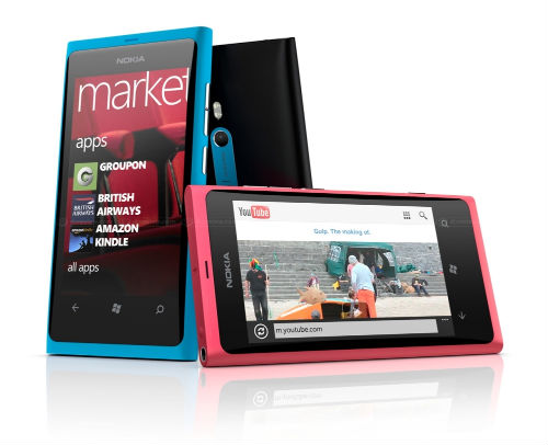
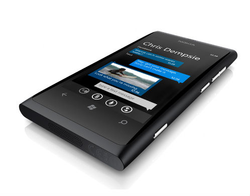
Words cannot describe how beautiful looking the Lumia 800 is. However, we can't help but make comparisons with the erstwhile Nokia N9, which basically shares the same chassis with the Lumia 800, dropping the button-less display for the Windows Phone capacitive buttons and adding a two stage camera shutter button.
Design wise, we will not say the Lumia 800 trumps the iPhone 4 because even a year later the iPhone 4 is stunning to look at. Where the Lumia 800 scores over the iPhone 4S is definitely durability. It is a well-known fact that the iPhone 4S is pretty fragile thanks to its glass exterior, but one will face no such problems with the Nokia Lumia 800. With its injection moulded unibody polycarbonate exoskeleton, the Lumia 800, like its twin the N9, is not only a showstopper but also an immovable rock.
Its curved glass clear black AMOLED display is a work of art and looks like the famous crystal crafted in Prague. The display floats on top of the body giving us an illusion of water on top of a surface.
At 3.7 inches, the display on the Lumia 800 is a tad smaller than the N9 and features a slightly lower WVGA resolution of 800x480 because of the hardware restriction enforced on Windows Phone Mango. This is also the reason for the smaller display as Nokia had to accommodate for the Windows Phone capacitive touch buttons and could not retain the button-less snazziness of the N9.
What we really liked about this particular design was the fact that Nokia does not even attempt to make the device an anorexic piece of plastic. At 12.1 mm, the Lumia 800 is chunky, as was the N9. Compare this to the Motorola Droid Razr, which is the thinnest phone at a meagre 7.1mm.
However, the fact is that Nokia was not gunning for size zero, instead they were aiming for a level of sophistication and ergonomic comfort that 99% of the planet's population would appreciate and that's exactly what this stunning industrial design delivers.
It will not be an overstatement if we say the Lumia 800 is a benchmark in terms of industrial design. But then again the N9 pips it by a smidgen because button-less was the original vision. The addition of Windows Phone buttons is just unnatural, no matter how much Nokia drives home their theory of the Lumia 800 being a refinement of the N9 design. It's not!
Other features of the industrial design are precisely milled speaker holes and magnetic lock doors for the micro-USB and micro-sim ports on the top and bottom ends of the device.
Initially, when we were playing around with the device, we had a bone to pick with these doors as they got stuck and we struggled to unlock them. This happened due to a strange design decision taken by Nokia where the micro-sim port would only reveal itself if the micro-USB door was open. However, it didn't take us long to get used to this eccentricity of the device.
Apart from these design niceties, the standard volume rockers and the power button is placed on the right hand side alongside an additional two stage camera shutter button, which was prominently absent in the N9.
Due to Windows Phone Mango not supporting native video chat, Nokia dropped the front facing camera. We didn't miss it because we consider it a fairly useless functionality given the state of 3G in the Indian market. That said, one would have liked it nonetheless and its absence will definitely come back to haunt Nokia internationally.
On the whole, we were very impressed with Nokia's industrial design and definitely this will be now the benchmark by which all Windows Phone devices are judged.
Display
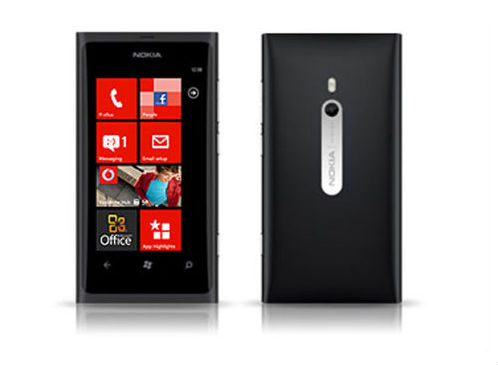
Nokia adopts their Clear Black AMOLED technology for the Lumia 800's 3.7-inch display. It is of the same type as on the N9, with the only variance being in the screen size and resolution. As mentioned above due to Windows Phone hardware cap, Nokia could only implement a WVGA 800x480 panel, but nonetheless it is a stunning panel.
The live tile based Metro UI came to life on this panel with deep blacks and superlative viewing angles. Obviously, it is not in the league of Apple's retina IPS panel or Samsung's SUPER AMOLED HD panel on the Galaxy Note but it is immensely satisfying.
Camera Quality
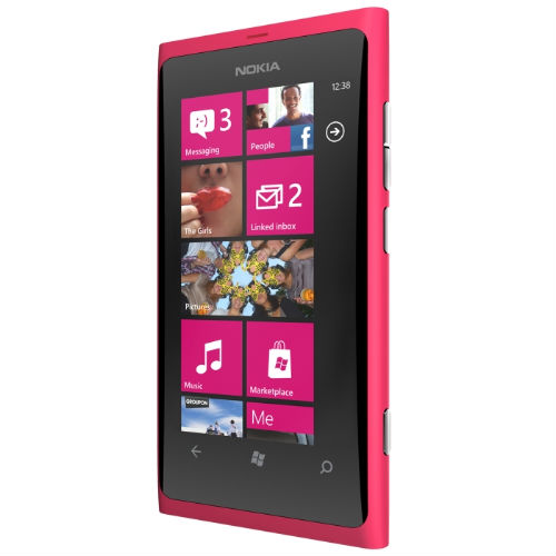
Nokia is one company which has always produced stunning camera phones. Nokia's N8, last year's flagship, was lambasted from all quarters but the one thing it had going for it was its 12-megapixel camera. It was so good that till date its camera is considered the best ever in a mobile phone.
The Lumia boasts of all standard camera jargons, such as an f/2.2 aperture, high performance optics courtesy Carl Zeiss and zero shutter lag, but let's get real - the 8 megapixel camera is no N8. Yes, it's a very good camera phone but it's not the best one in town by a long shot. Even the iPhone 4S boasts of a superior camera. Nevertheless, in the Windows Phone ecosystem the Lumia 800 is the king of camera phones.
On the video front the Lumia shoots crisp 720p HD video, but falls short in low light conditions. 1080p video is not supported by the single core chipset powering the device but since Windows Phone cannot support dual core chips, it's an issue more related to the software platform rather than Nokia's hardware chops.
OS and Interface
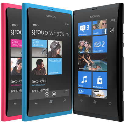
What really differentiates the Lumia 800 from the orphaned N9 is the software running under the hood. No MeeGo out here, Nokia welcomes you to the world of Metro!
When the Nokia-Microsoft deal was announced, a special differentiated Windows Phone experience was touted by both the companies. However we witnessed no such differentiation in the Lumia 800 as the device donned a pretty plane-Jane Windows Phone Mango experience barring a handful of Nokia apps designed for Windows Phone.
Windows Phone on its own is a fantastic operating system but we were left wanting more, especially after what we had seen with the MeeGo powered N9.
Don't get us wrong - Windows Phone works absolutely perfectly if not a tad smoother than on other devices, but the experience does not give the consumer a compelling reason to opt for the Lumia 800. More than this, one could not help but recall the N9 as the curved glass display was infact designed for its unique swiping interface. Unfortunately, here Windows Phone is not able to utilize the design subtleties of the curved glass display, which translates to sheer sadness.
While there is definitely a sense of disappointment with the underwhelming nature of Windows Phone experience on the Lumia 800, there is not even a shadow of doubt that the Metro UI blends well with the hardware especially the injection moulded plastic chassis and we can surely expect a solid differentiated experience on future Nokia devices when we have Windows Phone Tango and Apollo out in the mix.
Preloaded Software
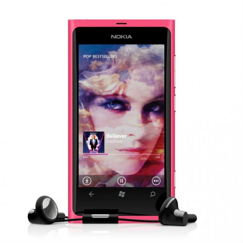
As mentioned above, there is not a lot of differentiation in the Lumia 800. There are only a handful of Nokia specific apps such as Nokia Drive, Nokia Maps and Mix Radio.
Nokia brings its legendary mapping technology to the table with Nokia Drive and Nokia Maps. NavTech, a company Nokia had acquired a few years ago powers this technology, and it provides a robust suite of mapping and navigation services. These include voice assisted turn-by-turn navigation and downloadable offline maps for over 700 cities in India and thousands abroad.
It fares very well against Google's suite of services running of Android and iOS platforms and brings Microsoft's ecosystem up to par in terms of these mapping and navigation features.
Mix Radio is a music app based on the lines of Pandora and Spotify. It's basically an Internet radio and offers a myriad of popular tracks from various genres though the Bollywood stuff is missing in action. It also offers downloadable playlists, a function we are sure music lovers will appreciate. While on the whole it may not offer a very comprehensive library of such in comparison to something like Spotify, it is definitely handy for Indian users as neither Pandora nor Spotify work in India.
On the whole, while all these apps were definitely handy and nice, they did not provide the users a compelling reason to opt for Nokia hardware over other manufacturers.
What's even more undermining for Nokia here is that these apps will not be exclusive to Nokia devices, though they will be free for Nokia users.
Performance
In our experience so far all Windows Phone devices have performed very smoothly - right on par with the likes of their Android and iOS counterparts, that too on slightly inferior hardware. The Lumia 800 is no different in this respect. All actions on the device perform at blistering speed and multitasking is a breeze with Mango's new webOS like app switching.
Unfortunately, with the hardware limitations of Windows Phone Mango all we get is a 1.4GHz snapdragon processor, which works in concert with 512MB of RAM, so Nokia devices are still to enter a dual-core world.
Besides this, the Lumia 800 also comes equipped with 16GB of memory but on paper it is an underwhelming spec sheet with buzz words like dual-core processing missing which can affect consumer psyche. Clearly, Nokia hopes the Lumia 800 can have a mystifying effect on the customers just like the iPhone 4, which also was rock solid performer.
Windows Phone Mango equips the Lumia 800 with a hardware accelerated Internet Explorer 9 which is a master of HTML 5 but sans the mobile Flash which Adobe is phasing out in any case.
In regular use, the browsing was super smooth and fluid but on the browsermark test it gave out an underwhelming score of 31433, which was much lower than Android smartphones with similar specs.
We take this result with a pinch of salt as most of these benchmarks are not optimized for Windows Phone Mango and in real world testing it was actually better than most Androids in the market.
The Lumia 800 delivered solid battery life and managed to make it through the day on a single charge. During testing we were always connected to a 3G networks, shifting to Wi-Fi whenever we found a network, and made our regular rounds of calls and messages.
As far as call quality went Lumia 800 lived up to the class leading legacy of the Nokia name.
This was one thing we expected not only because it was a Nokia but also because the marketing buzz around the Lumia 800 was its construction - where the company used the RF transparent injection moulded plastic for crystal clear reception. However, we could not help wondering if the Nokia marketing guys were taking a cheap shot at Apple's design team who faced a lot of flak after the iPhone 4's "antenna gate" fiasco.
Verdict
The Lumia 800 is the best Windows Phone on the market, but that does not mean it is the best smartphone or even the iPhone 4S killer that everyone had hoped for. It boasts of an absolutely tasty design and is a solid performer to boot, but it's hampered by limitations of the Windows Phone ecosystem. There are fewer apps (40,000 odd), out-dated hardware restrictions, limited differentiation from other WinMo devices and - so far - low mindshare. Apart from this, the design subtleties of the device are better suited to MeeGo's swipe interface and it basically feels like N9 running Windows Phone.
However there is a lot that's good here - it's not only the best Windows Phone but also the best Nokia out there. We get all the good things Nokia is famous for (battery life, design, reliability and call quality) without the unsavoury taste of Symbian, and that on a platform which has a lot of potential.
At the end of the day, pricing will be critical. We are told it will cost around $585 which puts it right up against the likes of the Galaxy S2, the HTC Sensation and the soon to be launched Galaxy Nexus. This might make things very tough for Nokia, but for those who can't do without Nokia this is the phone to pick and it's a damn good one.
Pros
Stunning Design
Super Display
Crystal clear call quality
Solid performance
Cons
Minimal differentiation form other Windows Phone devices
Poor apps ecosystem
Looks like the N9
Expected to be expensive
Ratings
Performance: 4
Price: 3
Features: 3.5
Ergonomics: 5
Wow Factor: 5
Overall: 4.1
With MeeGo way behind schedule, Nokia's newly minted CEO Stephen Elop pulled the plug on the project in February and locked a special agreement with Microsoft, turning Windows Phone into the Finnish giant's premier smartphone platform. The Lumia 800 is a synthesis of this marriage.
Design
Words cannot describe how beautiful looking the Lumia 800 is. However, we can't help but make comparisons with the erstwhile Nokia N9, which basically shares the same chassis with the Lumia 800, dropping the button-less display for the Windows Phone capacitive buttons and adding a two stage camera shutter button.
Design wise, we will not say the Lumia 800 trumps the iPhone 4 because even a year later the iPhone 4 is stunning to look at. Where the Lumia 800 scores over the iPhone 4S is definitely durability. It is a well-known fact that the iPhone 4S is pretty fragile thanks to its glass exterior, but one will face no such problems with the Nokia Lumia 800. With its injection moulded unibody polycarbonate exoskeleton, the Lumia 800, like its twin the N9, is not only a showstopper but also an immovable rock.
Its curved glass clear black AMOLED display is a work of art and looks like the famous crystal crafted in Prague. The display floats on top of the body giving us an illusion of water on top of a surface.
At 3.7 inches, the display on the Lumia 800 is a tad smaller than the N9 and features a slightly lower WVGA resolution of 800x480 because of the hardware restriction enforced on Windows Phone Mango. This is also the reason for the smaller display as Nokia had to accommodate for the Windows Phone capacitive touch buttons and could not retain the button-less snazziness of the N9.
What we really liked about this particular design was the fact that Nokia does not even attempt to make the device an anorexic piece of plastic. At 12.1 mm, the Lumia 800 is chunky, as was the N9. Compare this to the Motorola Droid Razr, which is the thinnest phone at a meagre 7.1mm.
However, the fact is that Nokia was not gunning for size zero, instead they were aiming for a level of sophistication and ergonomic comfort that 99% of the planet's population would appreciate and that's exactly what this stunning industrial design delivers.
It will not be an overstatement if we say the Lumia 800 is a benchmark in terms of industrial design. But then again the N9 pips it by a smidgen because button-less was the original vision. The addition of Windows Phone buttons is just unnatural, no matter how much Nokia drives home their theory of the Lumia 800 being a refinement of the N9 design. It's not!
Other features of the industrial design are precisely milled speaker holes and magnetic lock doors for the micro-USB and micro-sim ports on the top and bottom ends of the device.
Initially, when we were playing around with the device, we had a bone to pick with these doors as they got stuck and we struggled to unlock them. This happened due to a strange design decision taken by Nokia where the micro-sim port would only reveal itself if the micro-USB door was open. However, it didn't take us long to get used to this eccentricity of the device.
Apart from these design niceties, the standard volume rockers and the power button is placed on the right hand side alongside an additional two stage camera shutter button, which was prominently absent in the N9.
Due to Windows Phone Mango not supporting native video chat, Nokia dropped the front facing camera. We didn't miss it because we consider it a fairly useless functionality given the state of 3G in the Indian market. That said, one would have liked it nonetheless and its absence will definitely come back to haunt Nokia internationally.
On the whole, we were very impressed with Nokia's industrial design and definitely this will be now the benchmark by which all Windows Phone devices are judged.
Display
Nokia adopts their Clear Black AMOLED technology for the Lumia 800's 3.7-inch display. It is of the same type as on the N9, with the only variance being in the screen size and resolution. As mentioned above due to Windows Phone hardware cap, Nokia could only implement a WVGA 800x480 panel, but nonetheless it is a stunning panel.
The live tile based Metro UI came to life on this panel with deep blacks and superlative viewing angles. Obviously, it is not in the league of Apple's retina IPS panel or Samsung's SUPER AMOLED HD panel on the Galaxy Note but it is immensely satisfying.
Camera Quality
Nokia is one company which has always produced stunning camera phones. Nokia's N8, last year's flagship, was lambasted from all quarters but the one thing it had going for it was its 12-megapixel camera. It was so good that till date its camera is considered the best ever in a mobile phone.
The Lumia boasts of all standard camera jargons, such as an f/2.2 aperture, high performance optics courtesy Carl Zeiss and zero shutter lag, but let's get real - the 8 megapixel camera is no N8. Yes, it's a very good camera phone but it's not the best one in town by a long shot. Even the iPhone 4S boasts of a superior camera. Nevertheless, in the Windows Phone ecosystem the Lumia 800 is the king of camera phones.
On the video front the Lumia shoots crisp 720p HD video, but falls short in low light conditions. 1080p video is not supported by the single core chipset powering the device but since Windows Phone cannot support dual core chips, it's an issue more related to the software platform rather than Nokia's hardware chops.
OS and Interface
What really differentiates the Lumia 800 from the orphaned N9 is the software running under the hood. No MeeGo out here, Nokia welcomes you to the world of Metro!
When the Nokia-Microsoft deal was announced, a special differentiated Windows Phone experience was touted by both the companies. However we witnessed no such differentiation in the Lumia 800 as the device donned a pretty plane-Jane Windows Phone Mango experience barring a handful of Nokia apps designed for Windows Phone.
Windows Phone on its own is a fantastic operating system but we were left wanting more, especially after what we had seen with the MeeGo powered N9.
Don't get us wrong - Windows Phone works absolutely perfectly if not a tad smoother than on other devices, but the experience does not give the consumer a compelling reason to opt for the Lumia 800. More than this, one could not help but recall the N9 as the curved glass display was infact designed for its unique swiping interface. Unfortunately, here Windows Phone is not able to utilize the design subtleties of the curved glass display, which translates to sheer sadness.
While there is definitely a sense of disappointment with the underwhelming nature of Windows Phone experience on the Lumia 800, there is not even a shadow of doubt that the Metro UI blends well with the hardware especially the injection moulded plastic chassis and we can surely expect a solid differentiated experience on future Nokia devices when we have Windows Phone Tango and Apollo out in the mix.
Preloaded Software
As mentioned above, there is not a lot of differentiation in the Lumia 800. There are only a handful of Nokia specific apps such as Nokia Drive, Nokia Maps and Mix Radio.
Nokia brings its legendary mapping technology to the table with Nokia Drive and Nokia Maps. NavTech, a company Nokia had acquired a few years ago powers this technology, and it provides a robust suite of mapping and navigation services. These include voice assisted turn-by-turn navigation and downloadable offline maps for over 700 cities in India and thousands abroad.
It fares very well against Google's suite of services running of Android and iOS platforms and brings Microsoft's ecosystem up to par in terms of these mapping and navigation features.
Mix Radio is a music app based on the lines of Pandora and Spotify. It's basically an Internet radio and offers a myriad of popular tracks from various genres though the Bollywood stuff is missing in action. It also offers downloadable playlists, a function we are sure music lovers will appreciate. While on the whole it may not offer a very comprehensive library of such in comparison to something like Spotify, it is definitely handy for Indian users as neither Pandora nor Spotify work in India.
On the whole, while all these apps were definitely handy and nice, they did not provide the users a compelling reason to opt for Nokia hardware over other manufacturers.
What's even more undermining for Nokia here is that these apps will not be exclusive to Nokia devices, though they will be free for Nokia users.
Performance
In our experience so far all Windows Phone devices have performed very smoothly - right on par with the likes of their Android and iOS counterparts, that too on slightly inferior hardware. The Lumia 800 is no different in this respect. All actions on the device perform at blistering speed and multitasking is a breeze with Mango's new webOS like app switching.
Unfortunately, with the hardware limitations of Windows Phone Mango all we get is a 1.4GHz snapdragon processor, which works in concert with 512MB of RAM, so Nokia devices are still to enter a dual-core world.
Besides this, the Lumia 800 also comes equipped with 16GB of memory but on paper it is an underwhelming spec sheet with buzz words like dual-core processing missing which can affect consumer psyche. Clearly, Nokia hopes the Lumia 800 can have a mystifying effect on the customers just like the iPhone 4, which also was rock solid performer.
Windows Phone Mango equips the Lumia 800 with a hardware accelerated Internet Explorer 9 which is a master of HTML 5 but sans the mobile Flash which Adobe is phasing out in any case.
In regular use, the browsing was super smooth and fluid but on the browsermark test it gave out an underwhelming score of 31433, which was much lower than Android smartphones with similar specs.
We take this result with a pinch of salt as most of these benchmarks are not optimized for Windows Phone Mango and in real world testing it was actually better than most Androids in the market.
The Lumia 800 delivered solid battery life and managed to make it through the day on a single charge. During testing we were always connected to a 3G networks, shifting to Wi-Fi whenever we found a network, and made our regular rounds of calls and messages.
As far as call quality went Lumia 800 lived up to the class leading legacy of the Nokia name.
This was one thing we expected not only because it was a Nokia but also because the marketing buzz around the Lumia 800 was its construction - where the company used the RF transparent injection moulded plastic for crystal clear reception. However, we could not help wondering if the Nokia marketing guys were taking a cheap shot at Apple's design team who faced a lot of flak after the iPhone 4's "antenna gate" fiasco.
Verdict
The Lumia 800 is the best Windows Phone on the market, but that does not mean it is the best smartphone or even the iPhone 4S killer that everyone had hoped for. It boasts of an absolutely tasty design and is a solid performer to boot, but it's hampered by limitations of the Windows Phone ecosystem. There are fewer apps (40,000 odd), out-dated hardware restrictions, limited differentiation from other WinMo devices and - so far - low mindshare. Apart from this, the design subtleties of the device are better suited to MeeGo's swipe interface and it basically feels like N9 running Windows Phone.
However there is a lot that's good here - it's not only the best Windows Phone but also the best Nokia out there. We get all the good things Nokia is famous for (battery life, design, reliability and call quality) without the unsavoury taste of Symbian, and that on a platform which has a lot of potential.
At the end of the day, pricing will be critical. We are told it will cost around $585 which puts it right up against the likes of the Galaxy S2, the HTC Sensation and the soon to be launched Galaxy Nexus. This might make things very tough for Nokia, but for those who can't do without Nokia this is the phone to pick and it's a damn good one.
Pros
Stunning Design
Super Display
Crystal clear call quality
Solid performance
Cons
Minimal differentiation form other Windows Phone devices
Poor apps ecosystem
Looks like the N9
Expected to be expensive
Ratings
Performance: 4
Price: 3
Features: 3.5
Ergonomics: 5
Wow Factor: 5
Overall: 4.1
Comments
Get your daily dose of tech news, reviews, and insights, in under 80 characters on Gadgets 360 Turbo. Connect with fellow tech lovers on our Forum. Follow us on X, Facebook, WhatsApp, Threads and Google News for instant updates. Catch all the action on our YouTube channel.
Related Stories
Popular on Gadgets
- Samsung Galaxy Unpacked 2026
- iPhone 17 Pro Max
- ChatGPT
- iOS 26
- Laptop Under 50000
- Smartwatch Under 10000
- Apple Vision Pro
- Oneplus 12
- OnePlus Nord CE 3 Lite 5G
- iPhone 13
- Xiaomi 14 Pro
- Oppo Find N3
- Tecno Spark Go (2023)
- Realme V30
- Best Phones Under 25000
- Samsung Galaxy S24 Series
- Cryptocurrency
- iQoo 12
- Samsung Galaxy S24 Ultra
- Giottus
- Samsung Galaxy Z Flip 5
- Apple 'Scary Fast'
- Housefull 5
- GoPro Hero 12 Black Review
- Invincible Season 2
- JioGlass
- HD Ready TV
- Latest Mobile Phones
- Compare Phones
Latest Gadgets
- Vivo Y60
- Sony Xperia 1 VIII
- Itel Zeno 200
- OnePlus Nord CE 6 Lite
- OnePlus Nord CE 6
- Honor Play 70C
- Honor Play 80 Plus
- Moto G47
- Dell 14S
- Dell 16S
- Huawei MatePad Pro Max
- HP OmniPad 12
- Garmin Forerunner 170
- Garmin Forerunner 70
- Lumio Vision 9 (2026)
- Lumio Vision 7 (2026)
- Asus ROG Ally
- Nintendo Switch Lite
- Blue Star 1.5 Ton 5 Star Inverter Split AC (IA518ZXUS)
- Blue Star 1.5 Ton 3 Star Inverter Split AC (IA318ZXU)
© Copyright Red Pixels Ventures Limited 2026. All rights reserved.


