- Home
- Mobiles
- Mobiles Reviews
- Motorola Moto G (Gen 2) Review: Back in the Race
Motorola Moto G (Gen 2) Review: Back in the Race

Motorola, in its new incarnation, can be credited with reshaping the lower end of the Indian smartphone market. The Moto G, when launched earlier this year, was quite simply the best possible value you could get in a smartphone. It set off a massive chain reaction with companies launching competitive models and cutting prices to stay relevant.
Fortunately for consumers but unfortunately for Motorola, the momentum hasn't stopped yet. Many of the phone models that have launched since then have proven to be a little better, causing the original Moto G (Review | Pictures) to drop off our list of recommended smartphones which cost less than Rs. 15,000. Asus, Xiaomi and even local brands such as Xolo have begun selling models which are slightly better at one thing or another.
And the Moto G was not perfect - it had plenty of room for improvement, which its competition swooped in and grabbed. Most significantly, the original Moto G was one of the only phones in its class without a microSD card slot for storage expansion. You were limited to 8 or 16GB, and that was that.
Motorola has been quick to react, though. Unwilling to cede the ground it created for itself, the company has launched a second-generation Moto G (without a differentiating model number or suffix). The new model has a lot going for it - including the very good reputation of its predecessor - but is sufficiently different to be considered a whole new product.
Look and feel
This isn't just a refresh of the original Moto G. The Gen 2 model is significantly taller and wider, but is also a hair thinner and heavier. The new dimensions accommodate a larger screen - 5 inches as opposed to 4.5.
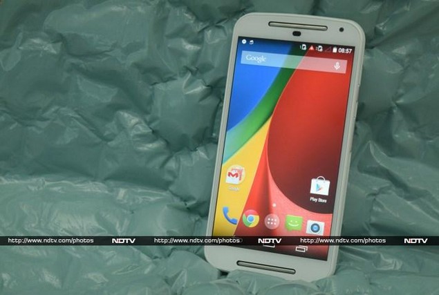
The original Moto G had a subtle, unassuming front face. The new one is anything but understated. Two thick metallic rods appear to be embedded in gaps above and below the screen. These are actually speaker cutouts, though their design is unlike any we've seen before. There's also a camera in one corner and a window for the proximity and light sensors above between the screen and the upper speaker. There isn't much plastic around the screen, so all these things are quite cramped. The front face is protected by Corning Gorilla Glass 3.
Most devices which use on-screen buttons aim for minimalism, so that all attention is on the user interface and the device itself takes a back seat. We couldn't help but be distracted by the speaker and patches on our white review unit. The new Moto G just looks awkward and uncomfortable. From what we've seen, the effect is less pronounced on the black version.
The phone gives off a more plasticky vibe than many others in this price range do. Our phone's rear panel got seriously scuffed and smudged even with moderate use over the course of a few days. The white material on the front, rear and sides are also of different shades and textures, which detracts from the device's overall look.
The rear panel pops off and can be swapped for others which are available in a veritable rainbow of colours. You can get plain plastic shells or ones with integrated flip covers. The two SIM card slots and the microSD card slot are beneath the panel, but unfortunately, the battery is still sealed into the Moto G. It appears that the rear cover is only removable for cosmetic reasons.
The new Moto G is easy to grip thanks to its curved rear, but isn't as comfortable to hold as the original was. That said, a lot of people will prefer the larger screen so the tradeoff doesn't seem too bad. The plastic rim around the screen glass protrudes a little and felt scratchy against our ears.
For some unfathomable reason, the new Moto G's charger has a fixed cable. You'll need to use your own Micro-USB cable to plug it into a computer.
Features and specifications
The Moto G (Gen 2) has been launched relatively soon after the original Moto G hit the market, so it's no surprise that there isn't a generational leap in any of its specifications. Think of this more as a refreshed incarnation of the same formula. The processor is still the same Qualcomm Snapdragon 400, with four cores running at 1.2GHz and an integrated Adreno 305 GPU. There's still 1GB RAM and 8GB or 16GB of storage space (though only the 16GB version has been launched here as of now).
The screen also retains its 720x1280-pixel resolution despite the half-inch size increase. This results in a minor, almost imperceptible dip in sharpness. The only really significant change, and one we're very happy about, is the inclusion of a microSD card slot. This one little change fixes the most significant shortcoming of the original Moto G and puts Motorola right back in the running.
You can take advantage of new Wi-Fi ac routers, since the latest standard is supported along with the usual b/g/n. There's also Bluetooth 4, A-GPS and FM radio. The Moto G (Gen 2) can act as a USB OTG host and its spec sheet is rounded out with an accelerometer, proximity sensor, ambient light sensor, gyroscope and digital compass.
Software
Motorola's rebirth came about as a way for Google to promote its ideal of a pure, unaltered Android user interface. Despite new ownership now, Motorola appears to have stuck to the same formula. The Moto G (Gen 2) has none of the bloat and ugliness that characterise phones sold by everyone from the biggest global brands to tiny local importers.
There are still a few preloaded in-house apps, but the rest of the interface is pure, stock Android. It's also the very latest version - 4.4.4. While third-party skins had a lot to offer in the past, Google's aesthetics and user interface design skills have improved drastically in recent times. The new Moto G's software is easy enough to use and honestly looks better than a lot of the "improvements" thrust upon us by assorted companies trying to differentiate themselves.
The only shortcuts available from the lockscreen are for the camera and Google Now. There are only two homescreens at the outset though you can create more. There is a glorious lack of unnecessary apps, widgets, and other branded spam. The app drawer is a simple grid of icons broken into pages, and there are no other gimmicks. Admittedly, Samsung, Sony and LG have made genuine improvements to some parts of the Android UI - quick toggle icons in the notifications shade and improved sorting in the Settings app come to mind - which we miss, to some extent. On the whole, we have to say the pros of Motorola's approach outweigh the cons.
The aforementioned in-house apps are called Alert, Assist, Help and Migrate. Alert can be set up to send your GPS coordinates to predefined contacts so they can check up on you. It can be used as an emergency tool, sending out continuous updates of your location, or as a geofencing tool to let people know when you arrive at a place or leave it. Motorola Assist helps you avoid interruptions while sleeping or busy at work, by changing your phone's notification behaviour and filtering out calls and messages from people not specifically in your inner circle. Help is just a guide to the Moto G's features, and Migrate helps you copy data over from an Android device or iPhone if you're upgrading.
Of course there are plenty of Google apps too - Maps, Play Games, Play Music, Play Newsstand, Quickoffice, Voice Search, YouTube, Drive and Hangouts, amongst others. The default browser is Chrome.
The additions are all minor and potentially useful - we have no complaints. Things you're likely to miss, such as better keyboards, can be added via the Google Play store. Even the on-screen buttons are not intrusive, thanks to improvements made with Android 4.4. We hope that post-post-acquisition Motorola won't be adopting Lenovo's custom UI anytime soon. The company has also guaranteed an upgrade to Android L when it is released, which will only amplify the benefits of using stock Android.
Camera
The Moto G (Gen 2)'s cameras get a bump up from a 5-megapixel sensor to an 8-megapixel one on the rear and from 1.3 to 2 megapixels on the front. Video recording resolution is still capped at 720p and all the software features are the same.
We were quite pleasantly surprised with the photos we were able to capture with the new Moto G. While not incredibly sharp or high quality, the photos had a warm, pleasant tone. HDR is enabled by default, contributed to this. Details are pretty impressive in close-ups, but don't expect to be taking very good landscapes. Low-light results were adequate, but the device takes a lot longer to lock focus. We had no complaints with the quality of video, though 1080p should have been possible.
(Click to see full size)
The camera app is not the easiest to use - all options are hidden until you swipe in from the left edge, and there's no hint to tell you that you can do that. Options are also very limited - you have a panorama mode and can toggle video slow-mo, geotagging, HDR and the flash. Photos are taken at 6-megapixel resolution in order to crop them to 16:9, but you can increase this to 8-megapixels in a 4:3 frame which makes a lot of sense. You can focus by dragging the reticle and then take photos by tapping anywhere on screen (or holding your finger down to take a burst of shots).
You can tap anywhere, but for some reason the Android navigation bar stays visible on screen and the Home button is right where we're used to having a shutter release button - so much for interface minimalism. We wound up exiting to the homescreen far too often when trying to take photos.
(Click to see full size)
Performance
We were quite happy with the Moto G (Gen 2) overall. There were minor lags now and then, but nothing severe. In some cases such as when opening and closing the app drawer, unnecessary animations make the device feel more sluggish than it actually is.
The new Moto G's hardware is not spectacular, and its test results were consistent with other current phones with the same specs. Scores were pretty much identical, for all practical purposes, to those of the original Moto G. However, they couldn't match the scores of the Asus Zenfone 5 (Review | Pictures). The Moto G (Gen 2) was able to achieve 5657 points and 10.8fps in 3D Mark Ice Storm and GFXbench respectively while the Zenfone 5 scored 7638 points and 17.3fps respectively. CPU scores weren't too far apart, with 8932 and 9,000 points in Quadrant respectively.
We were quite pleased with the new Moto G's battery life - it lasted 7 hours, 3 minutes in our video loop test. The screen was a little hard to read in direct sunlight, but clarity and viewing angles were otherwise good. We were eager to test the new speakers, but came away sorely disappointed. The sound is definitely more engaging when watching movies, but it just isn't very loud and tends to tear at anything above the 50 percent volume mark. Movie dialog was crisp, but music was horribly tinny and compressed.
1080p video files played flawlessly, including our most heavily encoded sample. Casual 3D games such as Temple Run 2 were also pretty smooth. Overall, we're quite happy with the performance of the Moto G (Gen 2).
Verdict
While not quite matching the raw performance of the Asus Zenfone 5, Motorola's latest effort is still a contender thanks to its features and software. The 16GB versions of both phones are priced at Rs. 12,999, but there's an 8GB Zenfone 5 option if you need to save a little money. For us, the choice ultimately comes down to whether you prefer Asus' Zen UI over stock Android KitKat (and soon, Android L). Xiaomi's Mi 3 (Review | Pictures) would have been a much bigger threat, but it isn't a true contender at the moment because it simply isn't available anymore.
The Moto G (Gen 2) isn't going to win any beauty contests but it's a solid, utilitarian phone that doesn't present too many confusing options and is free of pointless bloatware.
Motorola Moto G (Gen 2) in pictures
Get your daily dose of tech news, reviews, and insights, in under 80 characters on Gadgets 360 Turbo. Connect with fellow tech lovers on our Forum. Follow us on X, Facebook, WhatsApp, Threads and Google News for instant updates. Catch all the action on our YouTube channel.
Related Stories
- Samsung Galaxy Unpacked 2026
- iPhone 17 Pro Max
- ChatGPT
- iOS 26
- Laptop Under 50000
- Smartwatch Under 10000
- Apple Vision Pro
- Oneplus 12
- OnePlus Nord CE 3 Lite 5G
- iPhone 13
- Xiaomi 14 Pro
- Oppo Find N3
- Tecno Spark Go (2023)
- Realme V30
- Best Phones Under 25000
- Samsung Galaxy S24 Series
- Cryptocurrency
- iQoo 12
- Samsung Galaxy S24 Ultra
- Giottus
- Samsung Galaxy Z Flip 5
- Apple 'Scary Fast'
- Housefull 5
- GoPro Hero 12 Black Review
- Invincible Season 2
- JioGlass
- HD Ready TV
- Latest Mobile Phones
- Compare Phones
- Nord 6
- Honor X80i
- Honor Play 80 Pro
- Redmi Note 15 SE 5G
- Redmi A7 Pro
- OPPO K15 Pro
- OPPO K15 Pro+
- Lava Bold N2 Lite
- Xiaomi Book Pro 14
- MacBook Neo
- Vivo Pad 6 Pro
- Lenovo Legion Y700 Gen 5
- boAt Valour Watch 1R
- Xiaomi Watch S5
- Xiaomi QLED TV X Pro 75
- Haier H5E Series
- Asus ROG Ally
- Nintendo Switch Lite
- Haier 1.6 Ton 5 Star Inverter Split AC (HSU19G-MZAID5BN-INV)
- Haier 1.6 Ton 5 Star Inverter Split AC (HSU19G-MZAIM5BN-INV)


