- Home
- Mobiles
- Mobiles Reviews
- Motorola Moto E (Gen 2): First Impressions
Motorola Moto E (Gen 2): First Impressions

(Also see: Motorola Moto E (Gen 2) vs Motorola Moto E)
Overall, the Moto E (Gen 2) seems to have borrowed its design from the Moto X, except for the front speakers which were present in the original Moto E. To make this phone look a little more interesting, Motorola has used interchangeable Motorola Bands (essentially, removable sides) on the Moto E, which neither the Moto X nor the Moto G have. Each smartphone ships a body-coloured band (Black or White), and users can purchase additional bands (Golden Yellow, Turquoise, Blue, Raspberry, Purple, Red) which are priced at Rs. 999 for a pack of three. There are also Motorola Grip Shells (Golden Yellow, Charcoal, Turquoise, Blue, Raspberry), which cost Rs. 999 each.
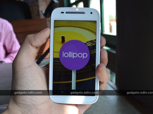
Coming to the performance of the device, the Motorola Moto E (Gen 2) packs a quad-core 1.2GHz Qualcomm Snapdragon 200 SoC with integrated Adreno 302 graphics, coupled with 1GB of RAM. In our limited time with the device, we found to our surprise that it performed quite well. With Android 5.0.2 Lollipop out-of-the-box, the Motorola Moto E (Gen 2) seems like a worthy competitor to the likes of popular models from Xiaomi and Lenovo in this price band. We will have more detailed observations about the device's specifications and performance very soon, so stay tuned.
The Motorola Moto E (Gen 2) packs a 5-megapixel rear camera and a VGA (0.3-megapixel) front camera. Neither camera looks good in terms of specifications, but the images taken with them are of average quality. Outdoor shots taken with the rear camera as well as indoor shots in good lighting conditions appeared quite decent to us, (see sample image). We are not betting a lot on the cameras, but we will test them thoroughly in our formal review, which is coming up soon.
To enhance the user experience Motorola has added a small trick to the camera app. With two flicks of the wrist, the device switches between its front and back cameras. Motorola calls this "Quick Capture".
Another feature of the Moto E that might come in handy for some people is that the time and notifications can be seen in black and white on the locked screen, when you pull the device out of a pocket.
Overall, the new Moto E (Gen 2) seems to be a decent budget device, compared to its current competitors. We will test the device thoroughly when we conduct our full review.
(Also see: Motorola Moto E (Gen 2) vs Lenovo A6000 vs Xiaomi Redmi 1S)
For the latest tech news and reviews, follow Gadgets 360 on X, Facebook, WhatsApp, Threads and Google News. For the latest videos on gadgets and tech, subscribe to our YouTube channel. If you want to know everything about top influencers, follow our in-house Who'sThat360 on Instagram and YouTube.
Related Stories
- Samsung Galaxy Unpacked 2025
- ChatGPT
- Redmi Note 14 Pro+
- iPhone 16
- Apple Vision Pro
- Oneplus 12
- OnePlus Nord CE 3 Lite 5G
- iPhone 13
- Xiaomi 14 Pro
- Oppo Find N3
- Tecno Spark Go (2023)
- Realme V30
- Best Phones Under 25000
- Samsung Galaxy S24 Series
- Cryptocurrency
- iQoo 12
- Samsung Galaxy S24 Ultra
- Giottus
- Samsung Galaxy Z Flip 5
- Apple 'Scary Fast'
- Housefull 5
- GoPro Hero 12 Black Review
- Invincible Season 2
- JioGlass
- HD Ready TV
- Laptop Under 50000
- Smartwatch Under 10000
- Latest Mobile Phones
- Compare Phones
- Moto G15 Power
- Moto G15
- Realme 14x 5G
- Poco M7 Pro 5G
- Poco C75 5G
- Vivo Y300 (China)
- HMD Arc
- Lava Blaze Duo 5G
- Asus Zenbook S 14
- MacBook Pro 16-inch (M4 Max, 2024)
- Honor Pad V9
- Tecno Megapad 11
- Redmi Watch 5
- Huawei Watch Ultimate Design
- Sony 65 Inches Ultra HD (4K) LED Smart TV (KD-65X74L)
- TCL 55 Inches Ultra HD (4K) LED Smart TV (55C61B)
- Sony PlayStation 5 Pro
- Sony PlayStation 5 Slim Digital Edition
- Blue Star 1.5 Ton 3 Star Inverter Split AC (IC318DNUHC)
- Blue Star 1.5 Ton 3 Star Inverter Split AC (IA318VKU)


