- Home
- Mobiles
- Mobiles Reviews
- Lenovo Vibe Z Review: Big and Bold
Lenovo Vibe Z Review: Big and Bold

Lenovo might be a respected name as far as laptops and PCs are concerned, but that doesn't mean that people will automatically take to its smartphones. In a crowded market with multiple choices at each price level, it will take a lot to convince buyers
Look and feel
The Lenovo Vibe Z, also known as the K910, arrives in a rather elaborate box. It's black on the outside with a neat matte finish, enclosed in a black sleeve with red accents and a cut-out logo. Inside, the accessories are all neatly packed in their own little boxes - unfortunately these aren't as high quality as the phone itself.
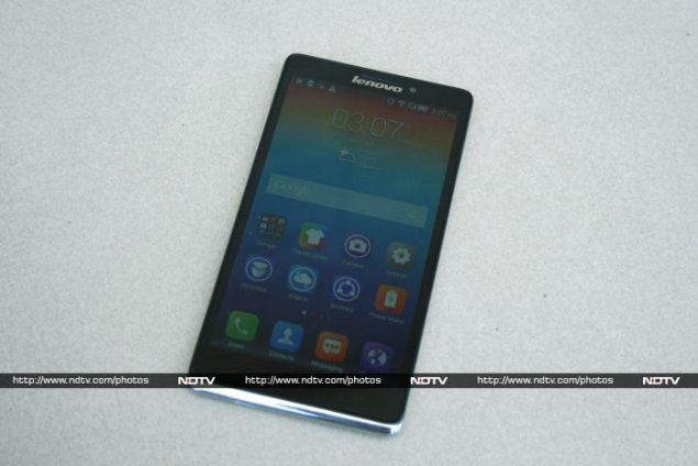
The Vibe Z looks like it's made of metal, but it's actually plastic all over. The front is nearly all black with a silver lip on the bottom where the bottom edge wraps around. There's a silver Lenovo logo on top, squashed up against the speaker grille and front camera. The Vibe Z uses capacitive touch buttons which are backlit, and thus mostly invisible when the screen is off.
Around the back, you'll see a lot more texture. The rear panel looks a bit retro, mainly thanks to the texture of the rear panel. You can't take the panel off to get to the battery, but it does provide a good grip. A big square camera lens and flash protrude quite a bit. The material is the same as that on the Lenovo Yoga Tablet 8, and looks just as good here as it did on that device. The same silver lip makes its way around the bottom rear, except that this time it's large enough to include a grille for the loudspeaker.
Despite being such a large device, the power button is on top. The volume rocker is on the left edge, while the right is blank apart from a retractable SIM card tray. There's a standard headset port on top and Micro-USB port on the bottom.
The Vibe Z is fairly light and easy enough to hold, though some people will find it just a bit too large. It's definitely blockier than most of the phones on the market right now. We quite like its look - at least it stands out in a crowd.
Specifications
Lenovo has aimed pretty high, and has more or less matched the specifications of last year's top-end phones. The Vibe Z is built around a Qualcomm Snapdragon 800 SoC with four CPU cores running at 2.2GHz, and an Adreno 330 graphics core alongside. You get 2GB of RAM and 16GB of internal storage space, but the Vibe Z does not support any form of expandable storage so that's what you're stuck with.
The 5.5-inch full-HD 1080p screen might be a bit too large for some people, but then again there are plenty of buyers who like devices with screens much larger, so it's entirely down to personal preferences. The screen is sufficiently crisp, but not especially vivid. Colours are washed out in daylight even at the highest brightness setting. The Vibe Z comes with Wi-Fi b/g/n/ac and Bluetooth 4.0, but no NFC or anything unusual. 4G LTE is supported, but not on the Indian 2.3GHz band.
Software
The majority of Lenovo's unique features come in the form of software tweaks on top of Android 4.3, and there are loads of them. In fact, Lenovo might even rival Samsung in terms of the level of customisation of its Android skin. For starters, there's no distinction between home screens and the app launcher. All app icons and widgets live on the home screens; that too in arbitrary positions. This can get confusing after a while, though the 16GB storage cap will limit how many app icons you have anyway. You can slide between screens easily, and long-tap on a blank space to pull up a screen that lets you quickly hop between screens and add widgets.
If you don't like the big, bright icons or overall colour scheme, you can change it via the Theme Center app. There are eight preloaded themes to choose from, though sadly stock Android isn't one of them. There are also multiple desktop transition effects and various other preferences. Lenovo also lets you define what happens when you swipe up, swipe down, or double-tap on the home screen.
You can toggle a multi-window mode and a one-touch shortcuts panel, each of which lives as a translucent tab floating on either side of the screen. The shortcuts panel looks exactly like the iOS AssistiveTouch feature, while the Multi-window button brings up a dialog which lets you launch up to two apps inside floating windows. Unlike other custom Android UIs, you can launch nearly any app alongside another. The two aren't tiled, but live in resizable floating windows which always stay in the native 16:9 proportion.
The app switcher is totally new, and includes a RAM usage meter and a button to close all apps. The notification shade has a row of shortcut icons up top which is scrollable, so you actually have 10 shortcuts in all, plus quick links to the Settings app and another whole page of options for the notifications shade itself. The Settings app is divided into three panels, one of which is dedicated exclusively to Lenovo's custom tweaks.
The dialer can change size and position to make one-handed use easier. You can shake the phone to unlock it, set it to sleep automatically when laid flat on any surface, have it stay active as long as you're looking at it, and dial numbers automatically when you raise it to your ear. There's even a "pocket" mode that prevents accidental unlocks and raises the ringer volume when the proximity sensor is covered.
Of course, there are also quite a few apps. SECUREit includes antivirus, child safety, privacy and anti-theft features; SYNCit can be used to back up and restore contacts, messages and call logs; and SHAREit lets you establish direct connections to other users to directly send and receive files. Power Manager provides multiple options for extending the life of your battery, plus detailed statistics about what's consuming the most power. Novice Tutorial is exactly what it sounds like, and there are also other utilities for sharing a PC's Internet connection via USB and mirroring your phone screen wirelessly.
Lenovo bundles UC Browser, Navigate 6, Skype, Twitter, Facebook, Accuweather, CamScanner, CamCard, Kingsoft Office, and a small selection of games including Asphalt 7 and Real Football 14.
On the downside, several of the apps appear to have been translated somewhat poorly into English, and odd bits of text abound. Lenovo has announced an update to Android 4.4, but there's no sign of it yet. When this happens, the capacitive Menu button will become redundant, and we hope Lenovo reassigns it to the app switcher.
Camera
We ran into quite a bit of trouble with the Vibe Z's camera. Initially, it just refused to focus on anything that wasn't a close-up. The Vibe Z actually seemed to lock on and then lose focus before we could hit the shutter release. Colours were off and photos also looked overcompressed. Tapping to focus didn't work, and even the shutter release was unresponsive at times. This didn't change after a few restarts, a factory reset, and trials with multiple third-party camera apps. However, these problems seemed to disappear for a while but then briefly popped up again during testing.
The problems we faced were extremely frustrating, but don't seem to be common. It's likely that our review unit was somehow damaged. From the samples we did manage to capture, we got the impression that the Vibe Z should be able to take decent photographs both indoors and outdoors, but isn't really as good as the competition in its price range.
Lenovo's camera app provides loads of options including multiple metering modes, contrast saturation and sharpness, ISO and white balance adjustment, and a "super night mode". There's an HDR mode, panorama, picture-in-picture, burst, smile shot, macro mode, and self timer. If that's not enough, there are also 24 effects ranging from a tilt-shift lens effect to a pop-art filter.
The front camera was surprisingly sharp and detailed, though photos tended to be just a little distorted at close range. 1080p videos taken with the rear camera (when it was behaving) came out surprisingly clear.
(Click to see full size)
Performance
We're very pleased with the Vibe Z's benchmark scores. It performs just as well as we expected, considering the high-end specifications. Graphics results were very good, with 22.9fps in GFXbench and 16,233 points in 3DMark's Ice Storm Unlimited run. We saw scores of 35,105 in AnTuTu and 21,048 in Quadrant, which were only very slightly behind scores of this year's new flagships powered by the Snapdragon 801.
The built-in speaker and bundled headset were frankly both quite awful; neither loud nor clear. Videos play very well though, and even our heaviest clips didn't stutter. However, the Vibe Z did get uncomfortably hot while gaming and running stressful benchmarks. The battery lasted 8 hours, 42 minutes in our rundown test, which was a little below expectations considering the 3,000mAh rating.
Verdict
The Vibe Z doesn't feel as though it was made by the same company that regularly produces some of our favourite laptops. It comes across as something entirely new. Lenovo has thrown in a fair number of powerful components and has given the Vibe Z a very distinctive style, but it's the brand name that will ultimately persuade people to give it a chance. Camera irregularities aside, this is a pretty good phone.
The Vibe Z is selling for around Rs. 30,000 online, which would have been competitive against last generation's flagships, but now feels just a bit too high, especially considering that the Samsung Galaxy S4 and Note 3 Neo are now both selling for less. If your main concern is a large screen, then you can go for this phone over those two. Everyone else should wait for a price cut.
Lenovo Vibe Z in pictures
Get your daily dose of tech news, reviews, and insights, in under 80 characters on Gadgets 360 Turbo. Connect with fellow tech lovers on our Forum. Follow us on X, Facebook, WhatsApp, Threads and Google News for instant updates. Catch all the action on our YouTube channel.
Related Stories
- Samsung Galaxy Unpacked 2026
- iPhone 17 Pro Max
- ChatGPT
- iOS 26
- Laptop Under 50000
- Smartwatch Under 10000
- Apple Vision Pro
- Oneplus 12
- OnePlus Nord CE 3 Lite 5G
- iPhone 13
- Xiaomi 14 Pro
- Oppo Find N3
- Tecno Spark Go (2023)
- Realme V30
- Best Phones Under 25000
- Samsung Galaxy S24 Series
- Cryptocurrency
- iQoo 12
- Samsung Galaxy S24 Ultra
- Giottus
- Samsung Galaxy Z Flip 5
- Apple 'Scary Fast'
- Housefull 5
- GoPro Hero 12 Black Review
- Invincible Season 2
- JioGlass
- HD Ready TV
- Latest Mobile Phones
- Compare Phones
- Redmi A7 Pro
- OPPO K15 Pro
- OPPO K15 Pro+
- Lava Bold N2 Lite
- Lava Bold N2 Pro
- Vivo X300 Ultra
- Vivo X300s
- Redmi 15A 5G
- Xiaomi Book Pro 14
- MacBook Neo
- Vivo Pad 6 Pro
- Lenovo Legion Y700 Gen 5
- boAt Valour Watch 1R
- Xiaomi Watch S5
- Xiaomi QLED TV X Pro 75
- Haier H5E Series
- Asus ROG Ally
- Nintendo Switch Lite
- Haier 1.6 Ton 5 Star Inverter Split AC (HSU19G-MZAID5BN-INV)
- Haier 1.6 Ton 5 Star Inverter Split AC (HSU19G-MZAIM5BN-INV)


