- Home
- Mobiles
- Mobiles Reviews
- Jolla Smartphone with Sailfish OS Review: A Taste of What Might Have Been
Jolla Smartphone with Sailfish OS Review: A Taste of What Might Have Been
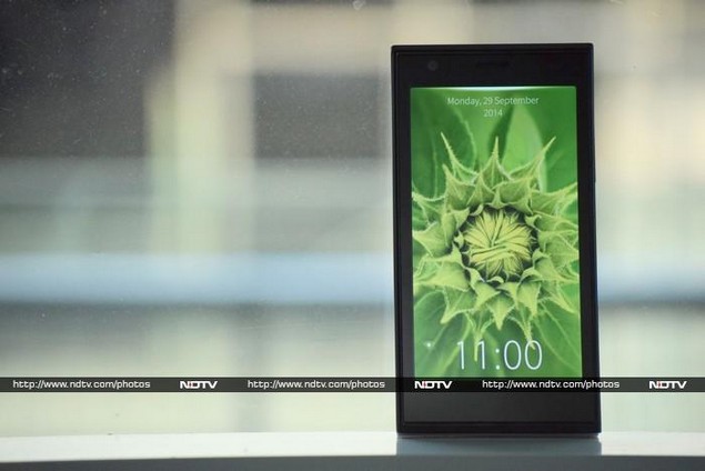
Nokia's rise and fall has been well documented by now, with the story punctuated by multiple missed opportunities and poor decisions. The unfortunate company, once a dominant force in the technology world and now owned by Microsoft, never managed to bring out a modern touch-friendly smartphone platform of its own and suffered as competition from Apple and Android manufacturers decimated it.
There was hope, for a brief while, in the form of Maemo, a new Linux-based platform which later became MeeGo. Nokia pulled the plug on it after just a few devices were released, most notably the innovative N9. While the company placed its next bet on Microsoft's Windows Phone platform, the team responsible for MeeGo left and started their own company in order to continue their work. The result is Jolla, and its first commercial smartphone of the same name, running the totally new Sailfish OS.
This is a unique phone, and has been designed as such. There really is no mistaking it for any other device. We're curious to see whether this works in its favour or against it, and whether we have a new viable alternative to Android in the mass-market space.
Look and feel
This is definitely one of the strangest-looking phones we've seen in a long time. It looks like a biscuit sandwich, with two distinct plastic halves laid up against each other. As part of the quirky design, the front half has rounded sides and is flat on the top and bottom, while the "other half" is the opposite. This creates a few uncomfortable corners which you'll feel when trying to stretch your thumb across the screen.
The front face is totally blank. There's a lot of plastic surrounding the screen despite the fact that there are no navigation buttons on the front. A notification LED is cleverly disguised on the lower front; you'll only see it when it lights up. The physical buttons and ports are all in predictable places on the top and right, but all software interaction happens using gestures.
This is definitely not the slimmest or lightest phone around, at 9.9mm and 141g, and you'll feel the difference if you're coming from anything relatively modern. As it turns out, the "other half" on the rear is a convex shell covering the front half's bulge; the whole thing doesn't split apart into two pieces. The shells aren't just there for colour; they have a purpose. Each one has an embedded NFC tag which is recognised by the Jolla when the shell is snapped on. You'll see a message on screen asking you if you want to act on it - initial shells will offer "ambiences", or themes comprising of a wallpaper, highlight colour and sound profile. Future versions might include Web links, bundled content, or anything an accessory maker can imagine.
Beneath the very plain-looking shell, you'll find a microSD card slot, a Micro-SIM slot (with a unique rubber flap to hold the card in place) and the battery. Jolla definitely wants users to have control over their devices, in the spirit of early Nokia smartphones. It looks like this phone will be easy to take apart and repair, which might appeal to some buyers more than slimness does.
Software
The former Nokia team might have had some robust open-source software at their disposal, but all the user-facing interface elements of MeeGo are still owned by Nokia and so the team had to come up with a whole new look and model for interaction. The results are fairly unique - little bits seem borrowed from here and there - but the overall effect is completely fresh. Those familiar with iOS and Android will find themselves struggling a little, but we eventually felt we could get used to the Sailfish way of doing things.
The lock screen looks fairly conventional - more like that of Windows Phone than any other OS. There's a large clock on the bottom and space on top for notifications. You'll see icons for Wi-Fi and Bluetooth if they're on, but for some reason the battery level and signal strength indicators are hidden. You unlock the phone by sliding upwards, at which point you see those two important indicators slide into view as if they were right below the fold.
The first homescreen looks very much like what we've seen on new BlackBerry devices running the BB 10 OS. There are tiles for up to nine running apps: most native apps use their space to display small snippets of information, but Android apps can only display thumbnails. You can of course tap any of them to jump to an app, but in an interesting twist, you can also swipe left or right to execute quick commands. For example, swipe to the right on the phone dialler's tile to go directly to the keypad, or swipe left to go to your contacts list. The Settings app's tile shows icons for Wi-Fi, Bluetooth, cellular data and airplane mode.
There is space for four icons at the bottom of the first homescreen - swipe upwards to scroll to subsequent pages, which are ordinary-looking icon grids. Android and native apps are mixed together and you can drag and drop to rearrange icons with the usual long-tap gesture.
Since there's no Home button, you'll have to learn a lot of gestures, shortcuts and cues. First of all, glowing bars at the top or bottom of the screen indicate that you can swipe up or down to reveal menus. These are called pulley menus, which means that as you pull them open, you'll drag each option past a highlight bar. If you release the drag gesture while an option is highlighted, it will immediately be selected. In this way, you can execute commands with one fluid swipe, rather than opening the menu, scrolling around and then selecting what you want. It takes a little while to get used to the motions, but once you do, pulley menus will feel like an idea that someone really should have had years ago.
If you're in an app and move from page to page, you'll see a series of dots in the upper left corner. This means you can swipe to go back to where you were (but you can't swipe in the opposite direction to go forward again, which is often disconcerting). You can swipe inwards from either side of the screen while within an app to reveal the first homescreen - release before a point to cancel the gesture, or follow through to minimise your app to the homescreen. This lets you quickly check information that might be displayed in an app's tile without disturbing whatever you're doing.
Swiping downwards from the top of the screen will quit the current app (you can disable this behaviour) or lock the screen if you're on any homescreen. Swiping upwards will bring up the Events view no matter where you are, even the lockscreen - this is equivalent to the notifications shade on other platforms.
All apps run fullscreen - there isn't a status bar or any on-screen controls. Only Android apps force a black band to accommodate a Back button, which can't always be replicated with gestures. The interface works pretty well, but it's often frustrating because so much of it goes against the conventions that other mobile OS platforms have tacitly standardised.
There is so much to discover, and as you go along you'll find a lot of things which make so much sense that you'll wonder why no one has thought of them before, but also a surprising number of things which don't make any sense at all. Pulley menus are absolutely fantastic, but are implemented inconsistently. There are no quick shortcuts for important settings such as Wi-Fi and Bluetooth, but you have neat ways to set alarms and full control over what gets backed up, where and when.
You can't simply change wallpapers; you have to create "ambiences" consisting of a wallpaper, accent colour and sound profile - this is the same package each "other half" shell can store and transmit in order to change your phone's appearance and behaviour.
Most of the built-in apps are very well designed, both in terms of appearance and usability. However, you'll always have to use neutral wallpaper images so that the pervasive transparency doesn't become irritating. The native keyboard is transparent and uses very thin key labels, so it's easy to lose them against busy wallpapers.
The browser is sparse - the address bar is hidden on the tab selection page, and the large toolbar disappears when you scroll around, leaving you with nothing but page content. The Media app can only handle music - you'll need to download an app for videos - and similarly, the Documents app seems to only be able to handle text. The People app has a neat sorting mechanism, and the calendar, notes and other built-in apps are also well designed.
The camera app is rather sparse - there are settings for the flash, on-screen grid, white balance, ISO, AF and timer. You have to dip into the menu overlay to switch to video recording or use the front camera, which seems unnecessary. To change the photo resolution, you have to go through the main Settings app.
Hardware
The physical aspects of the Jolla phone are considerably less exciting. There's a 1.4GHz dual-core Snapdragon 400 SoC, which is fairly commonplace, but the 4.5-inch 540x960-pixel screen is a disappointment. It's noticeably grainy and really doesn't offer the best quality. Other phones in this price range definitely feel a lot more appealing when you use them.
You get 1GB of RAM and 16GB of storage space which of course is expandable thanks to the microSD card slot. The rear camera is an 8-megapixel unit and the front one takes 2-megapixel images. There's Wi-Fi and Bluetooth, plus NFC. You get 3G connectivity but no LTE.
Usage and performance
We took a while to become accustomed to Sailfish OS's quirks, and getting around wasn't always intuitive. Over the course of a few days, we became more familiar with it but there were still plenty of times that we wished for a simple Home button. The live apps view is handy, but doesn't adequately replace an app switcher - and it really only works well with native apps, of which there aren't that many.
The Jolla store seems well populated, but not all the apps are useful. There are a few simple games and utilities. We found most of what we needed using third-party Android stores such as Apotide, which worked flawlessly. Android pps do have some limitations though - any data they need will have to be stored in a specific Android folder on the phone; they won't be able to see photos, music or other files you have in the general storage pool. Services that rely on Google APIs are also not guaranteed to work - this will be a familiar problem for BlackBerry users.
The Sailfish UI was fairly responsive during our test period. Some apps took a long while to load - there is an animation of the app jumping into place as a live tile on the first homescreen before it then fills the whole screen, which is extremely annoying. The Sailfish keyboard is laid out well and has a scrolling row of suggested words, though autocorrect accuracy is not at par with iOS or Android.
Interestingly, you can delete most of the built-in apps including the calculator, email client, clock and media player - this is in stark contrast to manufacturers who insist on preloading dozens of apps which waste space.
Battery life was quite good - in informal testing, the Jolla device lasted through a full day with heavy use of Wi-Fi and constantly jumping between apps. Our formal battery test uses an Android app to loop video - the Jolla lasted 5 hours, 33 minutes which might not be entirely indicative of its potential performance using an optimised native app. The same holds true for benchmark tests. The browser-based SunSpider and Kraken tests should hold up though, and we got scores of 1517.1 and 14320.3ms respectively. These are just about average, and you can get better raw performance from other devices in this price class.
Only one of the grilles on the device's bottom is a speaker, and we found that sound was just about adequate - not especially loud or rich, but at least it didn't distort. The screen suffered a bit in sunlight, and viewing angles were not all that impressive either.
The camera surprised us with its quality. We were happy with the images we were able to take both outdoors and indoors. Colours, textures and details were accurate for the most part. The autofocus took time and sometimes failed, and there was just a little shutter lag. Low-light performance was not that good, and the camera was nearly useless unless there was at least some light falling directly on our subjects. Videos also came out well.
Verdict
It takes a lot of guts to go up against dozens of major international and local Android manufacturers with something brand new and unfamiliar. We think Jolla's biggest challenge will be educating customers. As others have proved before (we're looking at the Nokia X platform in particular), it's very easy to go wrong. Buyers who like what they see at first but aren't necessarily familiar with smartphone terminology or features, will be extremely upset if they find they can't do simple things that everyone else can.
We always like having competition, but there might not be room in the Indian market (or any other market in the world) for an Android alternative right now. The Jolla device is different and fresh, but ultimately doesn't deliver the experience that Android has made possible at this price level. The hardware is quirky at best and awkward all around, while the software is often frustrating.
With an online-only sales route and a price of Rs. 16,499, it's likely that Jolla will only find customers who are explicitly searching for it, and that's a good thing. Gadget enthusiasts (or Maemo fans) who want to give the Jolla phone a try will probably enjoy using it for a while. As a primary device for everyday users, however, this might not be the best choice.
Jolla Smartphone in pictures
Get your daily dose of tech news, reviews, and insights, in under 80 characters on Gadgets 360 Turbo. Connect with fellow tech lovers on our Forum. Follow us on X, Facebook, WhatsApp, Threads and Google News for instant updates. Catch all the action on our YouTube channel.
Related Stories
- Samsung Galaxy Unpacked 2026
- iPhone 17 Pro Max
- ChatGPT
- iOS 26
- Laptop Under 50000
- Smartwatch Under 10000
- Apple Vision Pro
- Oneplus 12
- OnePlus Nord CE 3 Lite 5G
- iPhone 13
- Xiaomi 14 Pro
- Oppo Find N3
- Tecno Spark Go (2023)
- Realme V30
- Best Phones Under 25000
- Samsung Galaxy S24 Series
- Cryptocurrency
- iQoo 12
- Samsung Galaxy S24 Ultra
- Giottus
- Samsung Galaxy Z Flip 5
- Apple 'Scary Fast'
- Housefull 5
- GoPro Hero 12 Black Review
- Invincible Season 2
- JioGlass
- HD Ready TV
- Latest Mobile Phones
- Compare Phones
- Lava Bold N2 Pro
- Vivo X300 Ultra
- Vivo X300s
- Redmi 15A 5G
- iQOO Z11
- Samsung Galaxy A37 5G
- Samsung Galaxy A57 5G
- Vivo Y11 5G
- Xiaomi Book Pro 14
- MacBook Neo
- Vivo Pad 6 Pro
- Lenovo Legion Y700 Gen 5
- boAt Valour Watch 1R
- Xiaomi Watch S5
- Xiaomi QLED TV X Pro 75
- Haier H5E Series
- Asus ROG Ally
- Nintendo Switch Lite
- Haier 1.6 Ton 5 Star Inverter Split AC (HSU19G-MZAID5BN-INV)
- Haier 1.6 Ton 5 Star Inverter Split AC (HSU19G-MZAIM5BN-INV)


