- Home
- Mobiles
- Mobiles Reviews
- InFocus M680 Review
InFocus M680 Review

InFocus has been a player in India for less than a year now, but it has been releasing a steady stream of new models, most of which we have received well. The US-based company, which specialises in projectors and office communication equipment, is working with Chinese electronics giant Foxconn to put its name on a line of smartphones aimed at emerging markets. Through this relationship, InFocus is trying to carve out a space for itself, and it seems as though the periodic flash sales it holds are receiving quite a lot of attention.
It can't be easy to compete in the Indian smartphone market, where a disruptive new device comes along nearly every other week. Still, InFocus appears to be gunning for the budget segment with a combination of low prices and premium features. Let's see if the new M680 can take on existing low-cost champions and leave a good impression.
- InFocus Bingo 21
- (Don't Buy Anything From Snapdeal.com) My Personal Experience For InFocus M330
- (InFocus M330 Users) What Do You Think About The Update Rolled Out Today By InFocus?
- 13 Mp Front Cam Mobile - Help Please (am thinking go for Infocus M530) any other avail in world under 15k
- Micromax Yureka or MI4I or Meizu m1 note or infocus M530
Look and feel
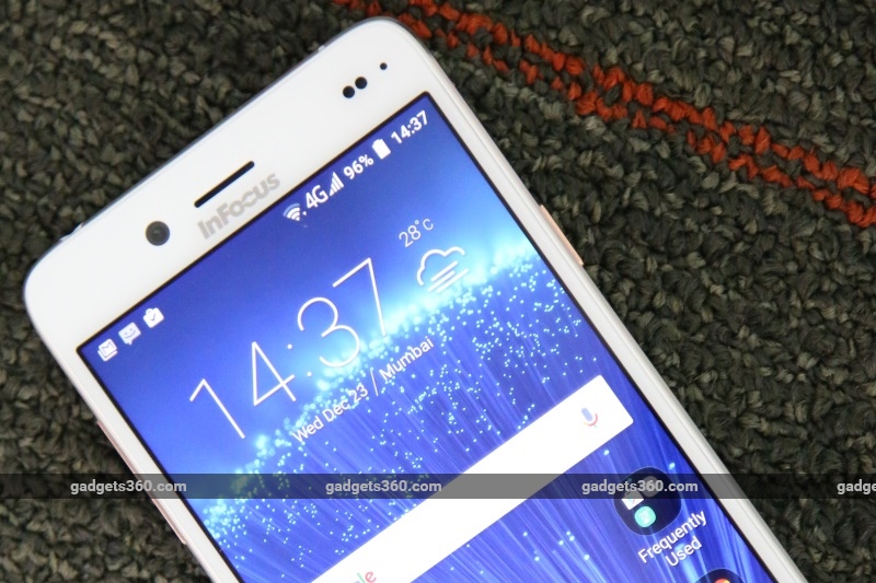
We liked looking at the InFocus M680 from pretty much every angle except head-on. The front face is really busy, with the earpiece, large black cutouts for the front camera, sensors and notification LED, and a prominent company logo all placed asymmetrically in the narrow space above the screen. The three capacitive buttons below the screen aren't backlit, but at least their labels are easy to see in daylight.
Our review unit was gold and white, but a silver and white version is also available. The rear has a matte metallic finish. It looks like there's a removable panel, but that isn't the case. Our review unit had a large, ugly label stuck on the back which picked up dirt almost immediately - we hope retail units don't come like this, because it really ruins the look. We also noticed minor scratches and scuffs on the metalafter just a few days in our front pocket and on our desk, so a cover is advisable no matter what.
The sides are also metallic and have distinctly iPhone 5-inspired chamfered edges. There's a speaker grille and a Micro-USB port on the bottom; a 3.5mm headset socket on top; volume buttons on the left; and the power button and SIM tray on the right. The M680 can work with two Nano-SIMs, but you'll have to choose between microSD storage expansion and a second SIM, thanks to the frustratingly popular "hybrid dual-SIM" slot design which only lets you use one at a time.
The phone certainly feels solid, thanks to its metallic touches. 7.25mm is quite thin, but this phone isn't petite with its 5.5-inch screen or light at 158g. We found the rim a bit scratchy in our hands and against our ears, but we had no other complaints with ergonomics.
Our review unit came with a SIM tray eject tool, a charger and a USB cable, the latter two of which seemed to be made of very cheap materials. There's supposed to be a headset, but we didn't get one to try out.
Specifications and software
InFocus is promising a packed spec list and we're pretty pleased by what we see, considering this phone's sub-Rs. 11,000 price tag. The M680 is based on a MediaTek MT6753 SoC, which has eight CPU cores running at 1.5GHz. There's 2GB of RAM and 16GB of storage which can be expanded by up to 64GB if you choose to forego dual-SIM functionality. 4G is supported on both SIMs and will work with Indian bands.
The 5.5-inch screen has a resolution of 1080x1920. Both the front and the rear cameras have 13-megapixel sensors, which is pretty impressive. InFocus also points out that the phone has an independent audio amplifier. The battery has a capacity of 2600mAh which is a bit low, but explains the phone's slimness. You also get Bluetooth 4.1, Wi-Fi b/g/n, and USB-OTG.
Android 5.1 is covered up by InFocus's Inlife UI and custom icon set. Most of the UI features expand on the capabilities of stock Android without being too loud. Once nice touch is the ability to switch between a single-layer UI (the default) and a two-layer mode with separate homescreens and an app drawer. The lock screen is also pretty useful, letting you drag docked icons upwards to launch those apps directly. You get four quick toggles for important settings in the notifications shade and can pull down further to reveal the full set of shortcuts.
The Settings app itself has been given a makeover. You can choose to scroll through the standard Android list orsee all options in a tabbed structure which is actually pretty easy to get around. On the flip side, you lose the ability to search for settings. There's a Task Manager section hidden in the homescreen customisation view which lets you purge apps from RAM and also encourages you to get rid of ones you don't use frequently.
The camera app is totally custom, with a variety of modes including Motion Track, Face Beauty and Multi Angle composition. Face Beauty is displayed more prominently when you switch to the front camera. You get controls for "wrinkle removal" and "whiteness" which both seem to make faces look very artificial. There are also creative filters ranging from the standard Mono and Sepia to Posterise, Negative, and Blackboard.
For some reason, InFocus has preloaded three additional camera apps. One has a Chinese name and interface, making it rather pointless for users in India. The second is called Beauty Cam, and it duplicates the camera app's functions but also adds more controls for things such as acne removal (a crude clone-stamp tool), far more filters, and animated effects such as floating hearts and stars. There's an additional section with a Chinese interface which appears to offer instructions of some sort, though we couldn't do much with it.
The third app is called MeituPic, and it's yet another layer of duplication. This one does nearly everything that the others do but then again it offers face slimming, leg lengthening, dark circle removal and eye enlargement. You can create collages and apply filters tailored specifically for shots of people, food, scenery or objects. If that's not enough, you can add effects such as a selective blur, text overlays, frames, and much more. There appear to be downloadable "materials" and "mini apps" but yet again these sections were in Chinese and so we couldn't proceed.
Beyond photography, there are a few other preloaded apps. Power Detective shows battery status and usage statistics, including how long Wi-Fi and GPS have been active in addition to apps themselves. You can also check the CPU and battery temperature. A lot of data is logged, which could be useful. App Traffic Control lets you firewall individual apps with separate toggles for Wi-Fi and cellular data. Safebox lets you hide files, apps and contacts behind a PIN or pattern lock. Backup Tool does as its name suggests: you can choose different kinds of data to package and back up to either local storage or a microSD card. Then there's WPS Office, Facebook, and Infocus's own Support and Customer Feedback apps.
Performance
We had no trouble with the InFocus M680, and in fact found it to be snappy and responsive. The screen is pretty crisp and colours are natural yet bright. The Inlife UI offers settings for colour temperature adjustment, a "dynamic mode", and a separate blue light filter with four intensity settings. We ignored the dynamic mode but found the filter to be useful, especially at night. We only wish there had been a quick toggle for it in the notification shade, instead of making us dig through the settings.
Sound was loud, but with such a tiny speaker it was bound to get distorted and compressed. We used our own earphones to judge InFocus's claims of enhanced sound quality with the dedicated amplifier. There was a bit more thump to the bass and overall depth to some of our sample tracks - pop and EDM did better than classical - though your mileage may vary depending upon the headsets you use.
Gaming was mostly pretty smooth, though we did feel the upper back of the unit heat up quite a bit within a few minutes of playing Dead Trigger 2. We felt warmth through other tasks, even when the phone was just lying for a while with its screen on, but it was much milder and easy enough to work around.
We ran our usual suite of benchmark tests, all of which delivered satisfactory results. AnTuTu 6.0 returned a score of 37,674 and Quadrant gave us 20,227 overall. 3DMark Ice Storm Extreme gave us 4,325 points and GFXBench ran at 12fps - this is the downside of the high-resolution screen.
We were able to capture some very nice photos with the M680. The camera was quick to lock focus and record shots. In daylight and even sometimes at night, pictures were detailed with great colour reproduction. There is a definite focus area and anything outside it loses definition, but for the most part images were good even when zoomed in. InFocus boasts of an f/2.2 aperture which has to contribute to the good low-light performance, though there's still quite a lot of motion blur in night-time shots.
The front camera left us a little less thrilled. Despite being a 13-megapixel unit just like the one on the back, we found details were less well defined, especially in details like hair. The beautification effects were rather crude and looked really obviously fake for the most part.
Battery life was just a shade underwhelming. We just about managed to last through a full day with quite a bit of photography, some gaming and heavy Internet usage over 4G, and our video loop test ran for only 7 hours, 11 minutes before the phone died on us.
Verdict
The InFocus M680 stands out for its metallic body, 13-megapixel front camera, and the wide selection of surprisingly useful apps. The device is quite polished overall, but it would be great if the company could iron out its few wrinkles - for example, the ugly sticker on the rear, the low-quality charger and the Chinese apps need to be rethought. We liked the overall look of this phone, though it's unfortunate that it's so easily scratched.
If you value style but aren't willing to compromise on the basics, this will be a good phone for you. It obviously isn't for the most demanding tasks, but should hold up very well in everyday use. We think InFocus might well be able to grab some of the value market with this model. However, there are plenty of choices: this phone competes with the Moto G (Gen 3) (Review) which has lower specs almost across the board, but a waterproof body and solid brand reputation, and the popular Lenovo K3 Note (Review | Pictures) which has a plastic body but slightly lower price tag and better performance.
InFocus M680 in pictures
Get your daily dose of tech news, reviews, and insights, in under 80 characters on Gadgets 360 Turbo. Connect with fellow tech lovers on our Forum. Follow us on X, Facebook, WhatsApp, Threads and Google News for instant updates. Catch all the action on our YouTube channel.
Related Stories
- Samsung Galaxy Unpacked 2026
- iPhone 17 Pro Max
- ChatGPT
- iOS 26
- Laptop Under 50000
- Smartwatch Under 10000
- Apple Vision Pro
- Oneplus 12
- OnePlus Nord CE 3 Lite 5G
- iPhone 13
- Xiaomi 14 Pro
- Oppo Find N3
- Tecno Spark Go (2023)
- Realme V30
- Best Phones Under 25000
- Samsung Galaxy S24 Series
- Cryptocurrency
- iQoo 12
- Samsung Galaxy S24 Ultra
- Giottus
- Samsung Galaxy Z Flip 5
- Apple 'Scary Fast'
- Housefull 5
- GoPro Hero 12 Black Review
- Invincible Season 2
- JioGlass
- HD Ready TV
- Latest Mobile Phones
- Compare Phones
- Honor 600
- Honor 600 Pro
- OPPO Find X9s
- OPPO Find X9s Pro
- OPPO Find X9 Ultra
- Vivo Y6t
- Redmi K90 Max
- Redmi A7 4G
- Asus ExpertBook P5 G1
- Asus ExpertBook P3 G1
- Redmi K Pad 2
- OPPO Pad Mini
- NoiseFit Diva Araya
- OPPO Watch X3 Mini
- Xiaomi TV S Mini LED 2026 (75-inch)
- Xiaomi TV S Mini LED 2026 (65-inch)
- Asus ROG Ally
- Nintendo Switch Lite
- Haier 1.6 Ton 5 Star Inverter Split AC (HSU19G-MZAID5BN-INV)
- Haier 1.6 Ton 5 Star Inverter Split AC (HSU19G-MZAIM5BN-INV)


