- Home
- Mobiles
- Mobiles Reviews
- Gionee Elife S7 First Impressions: Slim Yet Sturdy
Gionee Elife S7 First Impressions: Slim Yet Sturdy

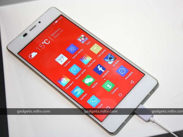
The Elife S7 may no longer be the slimmest smartphone anymore around but it is still quite slim. The S7 does not have a starkly different design compared to its predecessors, but at the launch, Gionee claimed that the U-shaped design of the aviation-level aluminium magnesium alloy infused frame around the phone helps in maintaining the structural integrity of the body.
What this essentially means is that despite the slim profile Gionee has managed to engineer a phone that is sturdy. In our limited time with the device, we actually found this to be true. The Elife S7 had absolutely no flex and it felt quite sturdy. Having said that, using the phone for more than just half an hour might actually help us form a more concrete opinion on this claim.
The front and the back of the device are both protected by Corning's Gorilla Glass. The black and the light blue variant of the Elife S7 are potential fingerprint magnets. At 126.5g, the phone is also pretty light. It has a larger 5.2-inch 1080p display that takes up most of the front, but thanks to the fairly slim bezels around the edges it isn't too wide; the ergonomics of the phone are actually comparable to the Motorola Moto X (Gen 2) (Review | Pictures). The screen itself is bright, vivid, and full of colours. Viewing angles looked pretty good too.
Under the hood, Gionee includes a MediaTek MT6572 octa-core chip clocked at 1.7GHz per core. It has 2GB of RAM alongside and an internal storage space of 16GB. In order to retain the slimness of the phone, Gionee has decided to not include a microSD card slot and this might be a deterrent for potential buyers. The Elife S7 accepts two Nano-SIM cards, which actually makes it one of the thinnest Dual-SIM smartphones around. A 2750mAh battery provides the juice for the phone to function.
The most important change to the Elife S7 comes in the form of the Amigo UI 3.0 skin on top of Android 5.0 Lollipop. It is snappier, lighter and could potentially see all our complaints with previous versions of Amigo UI addressed. Use of pastel shades all across the system, like the top bars of apps, is really attractive. An app called chameleon assess the nearby surroundings and picks up the unique colours automatically to create a distinctive colour scheme for the entire operating system.
The multitasking menu and the on-screen capacitive buttons implementation is the same as stock Android Lollipop. The UI still doesn't have an app drawer by default. We will explore all the other tweaks to the UI by Gionee when we actually get to use the device for longer closer to the April 4 India launch date.
Gionee has added a 13-megapixel primary camera and an 8-megapixel front-facing one to the Elife S7. We captured shots with the primary camera under incandescent light and noticed that the sample images had a great amount of detail to them but the colours were slightly over-saturated, though that could just be the phone's display.
Also, it had a slight problem with white balancing accurately but this could be because of the conditions around us. We will reserve our final judgements for the review.
The Elife S7 is probably the right direction for Gionee considering it is not concentrating on making the slimmest smartphone. While we were quite satisfied with the build quality and the software tweaks, keep reading NDTV Gadgets for our comprehensive review which should be able to determine if the phone is worth the price tag of EUR 399 (approximately Rs. 24,000). That's the price for the phone in European markets and the Gionee Elife S7 price in India is yet to announced.
Disclosure: Gionee made the announcement at an event on the sidelines of MWC in Barcelona. MediaTek sponsored the correspondent's flights and hotel for Barcelona.
Get your daily dose of tech news, reviews, and insights, in under 80 characters on Gadgets 360 Turbo. Connect with fellow tech lovers on our Forum. Follow us on X, Facebook, WhatsApp, Threads and Google News for instant updates. Catch all the action on our YouTube channel.
Related Stories
- Samsung Galaxy Unpacked 2026
- iPhone 17 Pro Max
- ChatGPT
- iOS 26
- Laptop Under 50000
- Smartwatch Under 10000
- Apple Vision Pro
- Oneplus 12
- OnePlus Nord CE 3 Lite 5G
- iPhone 13
- Xiaomi 14 Pro
- Oppo Find N3
- Tecno Spark Go (2023)
- Realme V30
- Best Phones Under 25000
- Samsung Galaxy S24 Series
- Cryptocurrency
- iQoo 12
- Samsung Galaxy S24 Ultra
- Giottus
- Samsung Galaxy Z Flip 5
- Apple 'Scary Fast'
- Housefull 5
- GoPro Hero 12 Black Review
- Invincible Season 2
- JioGlass
- HD Ready TV
- Latest Mobile Phones
- Compare Phones
- Vivo Y60
- Sony Xperia 1 VIII
- Itel Zeno 200
- OnePlus Nord CE 6 Lite
- OnePlus Nord CE 6
- Honor Play 70C
- Honor Play 80 Plus
- Moto G47
- HP OmniBook 5 (2026)
- HP OmniBook Ultra 14 (Snapdragon, 2026)
- HP OmniPad 12
- Acer Iconia iM11-22M5G
- Garmin Forerunner 170
- Garmin Forerunner 70
- Lumio Vision 9 (2026)
- Lumio Vision 7 (2026)
- Asus ROG Ally
- Nintendo Switch Lite
- Blue Star 1.5 Ton 5 Star Inverter Split AC (IA518ZXUS)
- Blue Star 1.5 Ton 3 Star Inverter Split AC (IA318ZXU)


