- Home
- Mobiles
- Mobiles Reviews
- BlackBerry Z3 Review: Sticking to What It Does Best
BlackBerry Z3 Review: Sticking to What It Does Best

There's no denying the fact that BlackBerry (the company formerly known as Research In Motion) has serious problems. Five years ago, everyone from students to housewives to businessmen was willing to pay a lot of money to own a BlackBerry. Three years ago, Android and the iPhone began to make QWERTY phones feel seriously clunky and old-fashioned. Two years ago, we were hoping that the new BlackBerry 10 platform and devices based on it would reinvigorate the company, but ridiculous pricing and questionable decisions at every level destroyed any chance of that happening.
Ever since the launch of the Z10 a year and a half ago, we've been waiting for lower-priced models that might offer better value for money and wouldn't be completely overshadowed by Android. As it stands, there are very few BlackBerry loyalists left, and the majority of those who have moved on to Android or iOS are not going to give the company another chance without a lot of very good reasons. Let's find out if the new BlackBerry Z3 delivers.
Look and feel
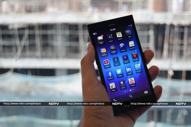
BlackBerry really does know how to build beautiful phones. The Z3 is ridiculously good looking and its construction quality is impeccable. As of now, it's only available in black but we wouldn't be surprised to see a white edition in the future. The front is all smooth glass, and there really isn't much bezel space around the screen itself. The rear is made of a texturised soft-touch plastic with the classic BB logo in the centre. For better or worse, the battery is non-removable.
The camera and flash are in the top-left corner of the rear, much like they are on the older Z10. A plastic flap on the phone's right edge covers the SIM and microSD card slots, while the power button is placed towards the top of the left edge with the volume controls and voice command shortcut button below it. The Micro-USB port is on the bottom and 3.5mm headset port is on the top. The Z3 doesn't have a mini-HDMI port, which sets it apart from its higher-end siblings.
The Z3 feels good in the hand even if it is just a bit too heavy. It's slim, slick, and very well put-together. In fact it could put several high-end phones to shame in this regard.
Features, specifications and software
There's good news and bad news - while the Z3 is brand new and undoubtedly good-looking, it's built with mostly utilitarian components. The processor is a Qualcomm Snapdragon 400 with integrated Adreno 305 graphics, but there's a generous 1.5GB of RAM to keep things humming along. The screen is a bit of a letdown at 540x960 pixels despite its large size. There's Wi-Fi b/g/n and Bluetooth 4.0 along with A-GPS, FM radio, an accelerometer and a proximity sensor. There's only 8GB of internal storage space, but microSD cards of up to 32GB are supported (and 64GB cards might work unofficially).
The main attraction is of course the BlackBerry 10 OS. The Z3 comes with version 10.2.1 which is considerably improved over the version that originally shipped with the Z10. The phone might be physically similar to pretty much every other touchscreen smartphone out there, but the BlackBerry OS takes quite a bit of time and effort to get used to, even for users of older non-touch BlackBerrys.
For starters, there are no buttons of any sort to help you move through the OS; you have to remember to use gestures instead. This is problematic because things aren't always laid out as you might expect them to be, making navigation unpredictable at times. For example, there's no universal "back" or "home" gesture, and getting in or out of the Hub (described later on) isn't the same as launching and quitting apps. Moreover, you have to move your thumb quite a lot over the large screen which takes longer and requires more effort than a simple button press would have.
The Z3's lock screen is pretty plain. There is of course a large clock, plus assorted status indicators. You'll see a list of notification icons down the left, and tapping on any of them will bring up details of your missed calls, messages, emails or social network alerts - you can choose not to display these details in the security settings. There's also a pull-down shade which takes you into bedside mode. This dims the screen and displays a large illuminated clock on which you can easily drag dots indicating the times each of your alarms will ring.
On unlocking the screen, you'll see four large thumbnails representing your most recently used apps. A swipe to the right will bring up the BlackBerry Hub, and swipes to the left will take you through as many pages of app icons as you have. The thumbnail page isn't like conventional app switchers - it shows only four apps - and so its utility is rather limited. You can never be sure that an app you want is going to be there - in fact it gets in the way when you need to get to the app shortcuts.
This is also when we really miss having a home screen or at least a tray that frequently used apps can be pinned to. Of course you can rearrange app icons in the grid any way you like, but the grid itself is always at least one level away from whatever you're doing. You have to go through the recent apps screen to reach it. Android lets you pin shortcuts and widgets to home screens and even iOS has at least a dock that stays constant on all menu pages.
Exiting any app (with a swipe upwards from below the edge of the screen to above its middle point) brings you back to the page of recent apps. While performing the gesture, you'll notice a column of notification icons just like the ones on the lock screen. It's a great way to constantly be aware of things you might have missed. Incidentally, swiping down from the top of the screen brings up a set of quick shortcuts, but there are no notifications here. This is something every other platform has standardised on, so not finding them here is a little disorienting at first. The settings aren't consistent - sometimes you'll see the system-wide panel, sometimes you'll see app-specific controls, and sometimes you'll get nothing at all - which means you can't always quickly get to things like the screen brightness or Bluetooth.
You can get to the BlackBerry Hub by swiping to the right from the screen of thumbnails or by swiping up and then right from within any app (except if you're in landscape mode, in which the swipe-up motion is awkward and the swipe-up-and-right gesture doesn't work at all). The Hub is truly unique amongst all smartphone platforms, but like everything else, it takes a while to get used to.
This is where all your email, messages, app notifications and even missed call alerts can be found. You can add your Facebook, Twitter, LinkedIn, Evernote and calendar accounts as well. There is no separate email app; the hub is baked into the foundations of the phone's OS itself. For some reason, though, there's still a shortcut icon for Text Messaging in the launcher which leads you to the Hub. You just have to remember that you can't exit the Hub like it's a regular app; you can only swipe to the left.
BBM is still a major part of the BlackBerry ecosystem and there are more features for BlackBerry 10 users than there are for iPhone and Android users. It's also integrated into the Hub as a first-class citizen, whereas some other app alerts are just lumped under Notifications. BBM has several strong features compared to today's dominant messaging apps, especially in allowing you to control who can message you. Even so, none of this is enough to drive anyone to choose a BlackBerry phone over the competition. BBM just isn't the powerful draw it once was.
BlackBerry is also very proud of the keyboard it has developed for all-touch BlackBerry 10 devices. We found that in regular usage it was just a bit too large for comfortable typing. Either the company hasn't scaled it appropriately for this screen and resolution, or it's just too spaced out. Each row is separated by a thick bar reminiscent of the ones on the old BlackBerry Bold phones, which is just unnecessary. One very nice touch is that special characters are arranged exactly as they would be on a desktop keyboard.
The two major keyboard features are the Hinglish dictionary and the swipe-to-autocomplete gesture. Hinglish is pretty neat, since it mixes in transliterated Hindi words and suggests them in context as you type. You can scatter Hindi words into English sentences or just type as usual. If you've ever felt that your natural style was hampered by English autocorrect, you'll love this. Swiping to complete becomes natural fairly quickly.
The Z3 comes with a number of useful apps: FourSquare, Evernote, DocsToGo, Facebook, Twitter, LinkedIn, Adobe Reader, YouTube and DropBox. Most of the built-in apps are quite polished - the Calculator, for instance, has a built-in unit convertor and even a tip calculator.
The BlackBerry World app is a bit of a pain to nagivate, and searching for anything will throw up app, music and game titles as results. Many common apps can be found natively for BB 10, but the appeal is that a huge number of Android apps will work as well. You can use third-party app stores such as Amazon or SildeMe, or find installable APK files anywhere on the Internet (if you're sure the source is safe). Installing is as simple as tapping the file name in the browser's Downloads list or in the File Manager app.
The voice search and command feature isn't as capable of deciphering plainly spoken instructions as Siri or Google are, and will often search for exactly what you say. It's possible to tell the Z3 to compose a message, set alarms, get directions, and read your email out to you. The Z3 didn't do very well at filtering out noise to decipher commands (and of course had trouble with Indian names), but it's pretty versatile overall.
Annoyingly, you can't plug the Z3 into a PC and access its internal storage space. A microSD card will show up as a removable drive if you're using one, but the only way to get media onto or off the phone itself is to use BlackBerry's included desktop software (or use the File Manager app to manually copy files to the microSD card or share them via email, BBM, etc).
Camera
The Z3 is a budget phone and it shouldn't be surprising that its camera isn't anything to get excited about. Still, shots are decent enough when the lighting is good, and you can post them to social networks without any problem. At full size, it's obvious that the camera struggles with details and that there's a lot of compression going on. We noticed that the camera had trouble focusing in low light, but the flash is surprisingly powerful. Video is again not spectacular, and the front camera is entirely forgettable.
(Click to see full size)
The camera app is a bit too simplistic. You can't really compose shots or do anything but wait and hope that the camera focuses on what you want it to, since tapping anywhere on the screen takes a photo - presumably, the decision not to have a tappable button on screen was made more for aesthetics than usability. You can choose between a normal shooting mode, image stabilisation mode, burst, and HDR. There are also hardly any options - you can turn the flash on and off, choose between three image aspect ratios (but not sizes), and use one of only four scene modes (action, whiteboard, night and beach/snow). There is no manual control whatsoever, not even exposure, ISO or white balance.
Performance
Day-to-day usage was marked by occasional jitters, and there were sometimes momentary pauses on black screens while transitioning from one task to another. Despite looking and feeling like a high-end phone, the Z3 definitely does not deliver a premium experience. The gestures also frankly add a delay to getting things done, especially since they don't always work. Gestures might give BB 10 devices a clean look, but there's nothing as quick and simple as hitting a Home button.
Not all our Android benchmarks are available for the BlackBerry 10 platform. The browser-based tests, SunSpider and Mozilla Kraken, indicated performance on par with that of entry-level smartphones such as the Nokia Lumia 630. Quadrant scores were equally disappointing, although it should be noted that we ran the Android APK in the absence of a native BB 10 version.
The built-in speaker is pretty loud and works well for voice, but music is just too thin and tinny. Predictably, 1080p videos were jittery but 720p versions of the same clips seemed to play much better. We did notice that the phone got a bit warm when playing HD content. This is also when the low screen resolution really becomes apparent.
The battery test result was massively disappointing - the Z3 lasted only 4 hours and 55 minutes in our video loop test. For a phone that claims over 15 hours of talktime, this is not a good sign. With ordinary usage, consisting of sporadic calls, messages, Web browsing and a bit of gaming, we noticed that the Z3 lasted comfortably through a full day and night.
Verdict
The BlackBerry Z3 is priced just slightly lower than the now-ancient Z10 (Review), but thanks to rapid improvements in both hardware and design it's quite a bit better than its predecessor in some ways. Awkwardly for the company, it's also very competitive with the more recent Z30 (Review) which costs around twice as much. In terms of value for money, this is the best all-touch BlackBerry available right now.
But it's unclear who exactly would be interested in buying this phone - surely not the legions of former BB fans who have defected to Android and iOS over the past year or two, and surely not those still sticking with older BlackBerrys because of their keyboards.
It's too expensive to be most people's first smartphone, so that rules out another potential audience - BlackBerry has missed out on a potentially crucial market there, at least till the inevitable price cuts hit.
Could it be anyone's second phone? One dedicated to work, alongside an iPhone or Samsung Galaxy for personal use and entertainment? Perhaps. The Z3 is fantastic for hardcore email and messaging - as long as you don't demand a physical keyboard. Notifications are top-notch and there are loads of useful shortcuts everywhere. The ability to prioritise, stay aware of and respond to communications is quite unmatched on other platforms. Those who have switched and miss having that kind of power might be tempted to give the Z3 a try.
There's an even bigger question: will this be the device that finally saves BlackBerry? Of the few phones launched in the past two years, this one stands the best chance. All the company has to do is actually launch it outside of core developing markets, which for some reason is currently not the plan.
We wish BlackBerry had hit this price point right from the beginnings of the all-touch BB 10 platform. It will be really interesting to see how the upcoming Classic and Passport devices with keyboards turn out, in terms of pricing and usability.
In that context, the BlackBerry Z3 is a solid phone. Comparing specifications and capabilities, it doesn't look good next to Android-based phones in its price range. On the other hand, if you value build quality, deal with hundreds of emails per day and don't have any use for multimedia features, it comes out on top. This phone delivers on the classic BlackBerry promise, finally updated for our century, for those few who still want that.
BlackBerry Z3 in pictures
Get your daily dose of tech news, reviews, and insights, in under 80 characters on Gadgets 360 Turbo. Connect with fellow tech lovers on our Forum. Follow us on X, Facebook, WhatsApp, Threads and Google News for instant updates. Catch all the action on our YouTube channel.
Related Stories
- Samsung Galaxy Unpacked 2026
- iPhone 17 Pro Max
- ChatGPT
- iOS 26
- Laptop Under 50000
- Smartwatch Under 10000
- Apple Vision Pro
- Oneplus 12
- OnePlus Nord CE 3 Lite 5G
- iPhone 13
- Xiaomi 14 Pro
- Oppo Find N3
- Tecno Spark Go (2023)
- Realme V30
- Best Phones Under 25000
- Samsung Galaxy S24 Series
- Cryptocurrency
- iQoo 12
- Samsung Galaxy S24 Ultra
- Giottus
- Samsung Galaxy Z Flip 5
- Apple 'Scary Fast'
- Housefull 5
- GoPro Hero 12 Black Review
- Invincible Season 2
- JioGlass
- HD Ready TV
- Latest Mobile Phones
- Compare Phones
- Honor 600
- Honor 600 Pro
- OPPO Find X9s
- OPPO Find X9s Pro
- OPPO Find X9 Ultra
- Vivo Y6t
- Redmi K90 Max
- Redmi A7 4G
- Asus ExpertBook P5 G1
- Asus ExpertBook P3 G1
- Redmi K Pad 2
- OPPO Pad Mini
- NoiseFit Diva Araya
- OPPO Watch X3 Mini
- Xiaomi TV S Mini LED 2026 (75-inch)
- Xiaomi TV S Mini LED 2026 (65-inch)
- Asus ROG Ally
- Nintendo Switch Lite
- Haier 1.6 Ton 5 Star Inverter Split AC (HSU19G-MZAID5BN-INV)
- Haier 1.6 Ton 5 Star Inverter Split AC (HSU19G-MZAIM5BN-INV)


