- Home
- Mobiles
- Mobiles News
- Nokia's new typeface: Nokia Pure
Nokia's new typeface: Nokia Pure
By Sameer Mitha | Updated: 5 June 2012 02:17 IST
Click Here to Add Gadgets360 As A Trusted Source

Advertisement
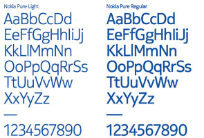
After announcing a new CEO and a partnership with Microsoft, Nokia is all set to change the way it looks too. The omnipresent Nokia Sans font is all set to be replaced by Nokia's new typeface, Nokia Pure.
You may recognise Nokia Sans as the font which reads "Nokia - Connecting People" in the Nokia logo. The Nokia Pure typeface has rounder letters, that are supposed to create better legibility on small screen devices. So far the font has just been seen on posters presented by Nokia and will soon become visible on millions of Nokia mobile phones.
Nokia developed the font with London-based typographic designer Bruno Maag, founder and MD of Dalton Maag. "It was a balancing act," admits Bruno Maag on Nokia brand book blog. "An elegantly simple typeface that doesn't draw attention to itself but is still distinctive and different. For me, it's the rhythm of the typeface and the relationship between characters that's critical. After all, when it's set in Arabic, you still need to know that it's Nokia, and this is achieved by creating a recognisable rhythm."
The new font will come in three variants - light, regular and bold.
Comments
Get your daily dose of tech news, reviews, and insights, in under 80 characters on Gadgets 360 Turbo. Connect with fellow tech lovers on our Forum. Follow us on X, Facebook, WhatsApp, Threads and Google News for instant updates. Catch all the action on our YouTube channel.
Further reading:
mobile font, nokia, nokia font, nokia mobile font, nokia pure, nokia sans, windows phone 7
Popular on Gadgets
- Samsung Galaxy Unpacked 2026
- iPhone 17 Pro Max
- ChatGPT
- iOS 26
- Laptop Under 50000
- Smartwatch Under 10000
- Apple Vision Pro
- Oneplus 12
- OnePlus Nord CE 3 Lite 5G
- iPhone 13
- Xiaomi 14 Pro
- Oppo Find N3
- Tecno Spark Go (2023)
- Realme V30
- Best Phones Under 25000
- Samsung Galaxy S24 Series
- Cryptocurrency
- iQoo 12
- Samsung Galaxy S24 Ultra
- Giottus
- Samsung Galaxy Z Flip 5
- Apple 'Scary Fast'
- Housefull 5
- GoPro Hero 12 Black Review
- Invincible Season 2
- JioGlass
- HD Ready TV
- Latest Mobile Phones
- Compare Phones
Latest Gadgets
- Vivo Y60
- Sony Xperia 1 VIII
- Itel Zeno 200
- OnePlus Nord CE 6 Lite
- OnePlus Nord CE 6
- Honor Play 70C
- Honor Play 80 Plus
- Moto G47
- Dell 14S
- Dell 16S
- Huawei MatePad Pro Max
- HP OmniPad 12
- Garmin Forerunner 170
- Garmin Forerunner 70
- Lumio Vision 9 (2026)
- Lumio Vision 7 (2026)
- Asus ROG Ally
- Nintendo Switch Lite
- Blue Star 1.5 Ton 5 Star Inverter Split AC (IA518ZXUS)
- Blue Star 1.5 Ton 3 Star Inverter Split AC (IA318ZXU)
© Copyright Red Pixels Ventures Limited 2026. All rights reserved.


