- Home
- Laptops
- Laptops Opinion
- Tablets Aren't Killing Laptops Laptop Manufacturers Are Killing Laptops
Tablets Aren't Killing Laptops - Laptop Manufacturers Are Killing Laptops
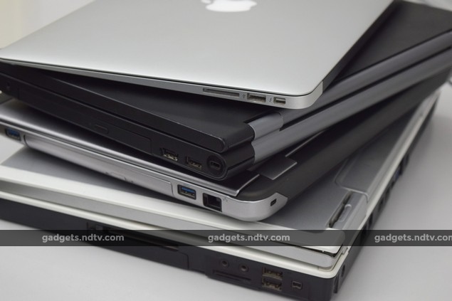
The current laptop I am speaking of, by the way, is a nine-year-old Dell Inspiron E1505. It's been battered, the hinge is weak, and the battery keeled over years ago. It's easily twice as thick as today's thickest. I've bumped up the RAM, changed the hard drive, and reinstalled Windows more than a few times - and it works just fine. It's missing a few current-generation conveniences, but I hold that it is superior to anything available today in all the ways that count for me.
This nine-year-old laptop won't win any beauty contests today, but it should remind a lot of companies why things used to be better.
It all begins with the screen. No matter the size, an overwhelming majority of the laptops sold in the past decade have the same resolution: 1366x768 pixels. That's terrible for two reasons: first, it's extremely low, which means you have less information and fewer controls than you need on screen. Second, the aspect ratio (width to height) works out to 16:9, which is utterly unsuitable for work.
The 16:9 aspect ratio wasn't always common for computer screens. It was panel manufacturers that forced a move from 16:10 to the much shorter and narrower 16:9 to keep costs down after flat-panel TVs became affordable, because that's what TV broadcast standards dictated.
Manufacturers said at the time that we'd all love watching movies without ugly black bands on screen, but what they didn't say was that turning the lowest common denominator into a standard helped them save a lot of money. As a result, we lost a lot of vertical screen space that is incredibly useful when working with text and spreadsheets, surfing the Web, editing photos and doing pretty much anything other than watching a movie. Only Apple has stuck with 16:10 (except on the 11-inch MacBook Air) which goes to show that panels are available to any manufacturer that doesn't prioritise cost over usability.
Windows 8.1 still cannot handle scaling well - some UI elements are tiny while others are magnified but blurred.
Until just a few months ago, it was next to impossible to find a better screen on any reasonably priced laptop in India - some manufacturers have been selling such models abroad but have refused to do so here because of perceived price sensitivity. It took Apple's Retina MacBooks to give them a jolt, and so what we now have is the other extreme - 2560x1440 at 13 inches, chosen because it scales down to 1280x720. Everything looks sharp but that's actually less working space than even 1366x768, unless you're willing to deal with Windows 8.1's temperamental scaling behaviour.
The ancient Dell's resolution? 1280x800, for a 16:10 aspect ratio. Oh and it isn't excessively reflective in order to make colours 'pop'. If you find yourself struggling to angle a laptop screen just so that lights don't reflect off it, remember that the manufacturer made a choice that wasn't based on usability, and that this wasn't always normal.
Distinct, clickable trackpad buttons. Media shortcuts right under your thumb. Large front-firing speakers.
Then there are laptop keyboards. As of now, it is impossible to find one that isn't "island-style" or "chiclet-style". That's because slimness has become the number one priority, and manufacturers don't care that keys actually need some height to travel when you type. Nope, all keyboards have been flattened out and all the laptops I've tried to use of late have made me alter my typing style and slow down.
I type a lot. Several thousand words per week, in fact. Writing and editing are the core functions of my job, and I guess I was wrong for expecting to be able to do that work on a laptop. I can easily top 72 words per minute on a good keyboard, but both speed and accuracy plummet if the keybed is too shallow.
I also constantly need to reach for the cursor block and the paging block - Insert, Delete, Home End, Page Up and Page Down. I can do this blindly on a standard keyboard, along with Ctrl and Shift combos to move and select text, but each time I have look down and hunt around on a laptop keyboard is a break in concentration.
The Lenovo ThinkPad X1 Carbon (2014) - quite likely the worst keyboard layout ever to have been inflicted upon laptop users.
Looks being the priority, all keys are shoehorned into a neat rectangle. The first casualty of this is the paging block, with keys either sprinkled all over or consigned to secondary functions. Other keys are also routinely moved around - there is no standard layout. We've seen the entire Fn key row omitted or converted into Windows shortcuts, the Ctrl key displaced (goodbye, copy/paste flicks), and various other atrocities committed. The inverted-T arrow keys are now almost always smooshed into a block (spreadsheets be damned). And it's become common to simply leave off keys such as Pause/Break and the Windows menu key - sorry, power users.
Now I don't expect product designers to magically conjure up enough space for a full desktop layout, but there is still scope for improvement. I know this because whoever crafted my old E1505 did it so much better so long ago. Just take a look at this layout. It's phenomenal, and you won't find anything like it in the market today - it's clearly possible, but it mustn't have been pretty enough. The sole improvement to laptop keyboards in the past decade has been backlighting, which, I concede, I would love to have.
The keyboard might not be a visually appealing rectangle, but it's incredibly easy to work with. Bonus: the virtual number pad on the right.
I romanticise many things about the E1505, but at 2.8kg, hauling it around every day was never one of them. I'm happy that laptops can now be so much lighter. That said, I never had a problem with it being 3.5cm thick. Before laptops became fashion statements, it was possible to have a variety of ports and slots (in convenient places, too), and it was normal to have easy access to the innards. The E1505 has four USB ports, FireWire, an SD card reader, audio in and out, VGA and S-Video outputs, Ethernet, a dial-up modem, a DVD-RW drive and even an ExpressCard slot. Try finding that much flexibility on any laptop today, even accounting for modern standards.
I've been able to get so much life out of it because it is absurdly easy to upgrade and repair. The hard drive and RAM are accessible without even opening the lid - upgrades took mere seconds. Twice, I took it apart to get rid of dust and dog fur which had clogged up its vents. I popped the battery out with a fingernail when a warning LED started flashing all the time. More importantly, I know that if the core components ever fail I'll be able to pull the hard drive out and retrieve all my data.
The hard drive is externally accessible. It only takes two screws to liberate all your data.
My beautiful old E1505 cost $849 with taxes in May 2006. That worked out to approximately Rs. 38,000 back then, and would be Rs. 54,500 today. I think I've gotten phenomenal value out of my (well, my parents') investment. No laptop at this price today will do as much for as long. It feels wrong to even think of spending this much money on something that would in so many ways be a downgrade.
Lenovo has had some decent ThinkPads and Dell has had some Latitudes that came close to being acceptable, but ultimately failed for one reason or another. It's also worth noting that these lines are aimed at businesses and are not easily available in retail - so on some level both companies do recognise that business users need good machines, and still convince themselves that everyone outside an office (including students and the self-employed) will be thrilled with shiny plastic instead.
The RAM is just as easy to swap. Also seen, the modem module. A flap in the battery compartment conceals the optional Bluetooth module.
And so it didn't feel wrong to bypass all available options, and spend almost as much on an iPad just a little while ago. The iPad does new things, it's convenient in different ways, and it adds perceptible quality to my life. I did exactly what PC manufacturers have been afraid of for years: I spent my PC upgrade money on something other than a PC upgrade. Perversely, everything that manufacturers did to make laptops more like tablets to prevent this from happening has made it happen all the more.
Speeds and standards aside, today's laptops are just not as good as the ones that were available a decade ago. Even though mine isn't fast enough anymore, the pros of using it outweigh the cons of upgrading. This has been the case for millions of people who have bought smartphones and tablets instead of new PCs over the past few years.
The Dell Inspiron E1505's lid is as thick as a current-day 13-inch MacBook Air.
PC companies still worry about the death of the PC, but they've been the ones tightening the noose all along. They pinned all their hope on Windows 8 driving demand for touchscreens, and they're doing it again with Windows 10.
It won't matter if the hardware isn't good enough. We need our computers to get better so that we can get better. We won't spend on new ones until we can be sure of that happening again. PC manufacturers dropped the ball and as a result they've almost allowed themselves to be driven out of business. It shouldn't be hard at all for them to step up raise the bar from where it is right now. If they do, buyers will come in droves, and I'll be at the front of the line.
Catch the latest from the Consumer Electronics Show on Gadgets 360, at our CES 2026 hub.
Related Stories
- Samsung Galaxy Unpacked 2025
- ChatGPT
- Redmi Note 14 Pro+
- iPhone 16
- Apple Vision Pro
- Oneplus 12
- OnePlus Nord CE 3 Lite 5G
- iPhone 13
- Xiaomi 14 Pro
- Oppo Find N3
- Tecno Spark Go (2023)
- Realme V30
- Best Phones Under 25000
- Samsung Galaxy S24 Series
- Cryptocurrency
- iQoo 12
- Samsung Galaxy S24 Ultra
- Giottus
- Samsung Galaxy Z Flip 5
- Apple 'Scary Fast'
- Housefull 5
- GoPro Hero 12 Black Review
- Invincible Season 2
- JioGlass
- HD Ready TV
- Laptop Under 50000
- Smartwatch Under 10000
- Latest Mobile Phones
- Compare Phones
- OPPO Reno 15 FS
- Red Magic 11 Air
- Honor Magic 8 RSR Porsche Design
- Honor Magic 8 Pro Air
- Infinix Note Edge
- Lava Blaze Duo 3
- Tecno Spark Go 3
- iQOO Z11 Turbo
- Lenovo Yoga Slim 7x (2025)
- Lenovo Yoga Slim 7a
- Lenovo Idea Tab Plus
- Realme Pad 3
- Moto Watch
- Garmin Quatix 8 Pro
- Haier H5E Series
- Acerpure Nitro Z Series 100-inch QLED TV
- Asus ROG Ally
- Nintendo Switch Lite
- Haier 1.6 Ton 5 Star Inverter Split AC (HSU19G-MZAID5BN-INV)
- Haier 1.6 Ton 5 Star Inverter Split AC (HSU19G-MZAIM5BN-INV)


![[Sponsored] Haier C90 OLED TV | Dolby Vision IQ, 144Hz OLED and Google TV in Action](https://www.gadgets360.com/static/mobile/images/spacer.png)
