- Home
- Laptops
- Laptops Features
- Windows 9 Preview: What the Next Microsoft OS Will and Should Bring
Windows 9 Preview: What the Next Microsoft OS Will - and Should - Bring
Microsoft did something very...er... interesting in October 2012. It launched Windows 8, the operating system that would "unify" Microsoft's platforms across PCs, phones and tablets. Except, there was a fairly large flaw in the plan.
Microsoft's vision of unification wasn't just from an engineering perspective. The company also wanted a unified user interface across all its devices.
Now let's think about that for a second. Traditional PC users (both desktop and laptop) were used to mice and keyboards. They had been using these two devices pretty much since the advent of the PC. Various companies had also managed to add support for other input devices over the years, but no one was really using a touchscreen on the desktop.
Microsoft's presence in the tablet market was non-existent, for all intents and purposes. Very few "tablet PCs" existed, running full versions of Windows 7 with the lowest power Intel Core processors available at the time. They were heavy, didn't have great battery life, and only seemed to be useful for designers and artistic folk, who'd use a stylus to draw.
Most people were either using iOS or Android tablets, and few people were clamouring for a Windows equivalent of these two.
Finally, let's consider the phone market, where Microsoft had slight success with Windows Phone 7 and has since had a little more with Windows Phone 8 and 8.1. Its market share was fairly insignificant, and the company would have really needed something special to make things work out.
There were, at the time, around 1 billion Windows PCs in the world, 99 percent not using a touchscreen monitor. Less than 5 percent of smartphones ran any version of Windows Phone, and there were barely any tablet PCs. In that backdrop, Microsoft's decision to release an OS that was optimised for touch-screen devices, rather than traditional input methods, seems premature to say the least.
What's worse is that the UI was aesthetically, and in many cases functionally, seen as a regression from Windows 7, which is still the most popular PC operating system. Bringing back the Start Menu is an example that Microsoft is backing down from its aggressive way of teaching users new behaviour.
After two years of bug fixes, patches, question marks over the future of Windows RT, and an awkward operating system that was arguably a bigger flop than Vista in terms of adoption and user satisfaction (despite being technically more sound), Microsoft has slowly come around to accepting the reality.
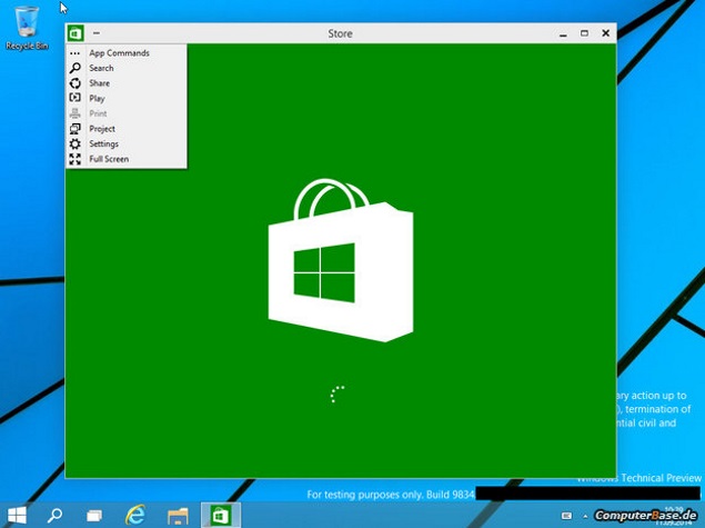
September 30 is the speculated date for the "preview" version of Windows "Threshold", also informally called Windows 9 by most of the tech press. Sites have generously leaked videos and screenshots of a legit-looking preview build of Threshold.
Looking at the videos, you'll be able to see that the interface is still mostly flat and boring like Windows 8. I'm curious as to why they made an OS as pretty as Windows 7 and then went back to the flatness of the Windows 3.1 days, though that's down to personal taste.
Moving on, we see the return of the start menu , just with tiles thrown in. If you compare this start menu to the present one of Windows 7, it strikes me as less useful, as it simply links to fewer things. The entire right column is filled with tiles. What used to be in the right column (Control Panel, Documents, etc.) end up as pinned items, quite obviously taking up space used for pinned programs in Windows 7.
Of course, when compared to Windows 8, this is much better than making obscure "charm" gestures, or receiving a face full of that jarring start screen.
Metro (or Modern) UI apps can now be (mercifully) run in windowed mode, and can be minimised. While some may question the utility of these in the PC version of the OS, the main complaint with Windows 8.x was not having a choice, so I guess this is step in the right direction. The same goes for the existence of "PC Settings" when the Control Panel exists, and two different calculators, one for touch screens and the other being the old one we're used to on Windows 7. Of course these are still early days, and all this may yet be fixed before Windows 9 reaches the consumers.
We'll also most likely see virtual desktops, like on Linux systems and OS X. You can switch between different desktops, and have different windows on each. This would, in theory, allow you to switch between multiple workflows. The actual implementation looks a bit sketchy, however. I'm specifically talking about window management; the creation, removal and navigation of virtual desktops looks good enough.
Long story short, from whatever we've seen so far, Threshold seems like a mixed bag. It's sort of Microsoft saying, "Hey, we made really bad decision with that Modern UI stuff but here's a compromise." But it's clear that the company still hasn't quite let go of those tiles, which suggests the company is continuing to walk the tightrope between listening to user feedback and going ahead with what it believes is the future of Windows.
Microsoft must keep in mind that the function of a good operating system is to provide a stable and secure environment for applications and users to interact in, not sell itself as one giant overblown "app".
Unifying the interfaces of PCs, tablets and phones wasn't a good plan either, as Windows 8 proved. Three different type of devices and two different input models can't be fitted into one box. Even Apple and Google keep PC and mobile separate, so one wonders if Microsoft is on the right track with its one size fits all policy. Kernel code sharing doesn't mean having a common UI. And blindly sharing features is known as taking a shortcut.
Tablets, convertibles and 2-in-1s are devices that can benefit from both: ecosystem support and a touchscreen interface. Microsoft should focus on smoothening out the experience for these users while at the same time leaving the traditional PC market alone, as far as the interface is concerned.
After all, Sun Tzu did say, "Victorious warriors win first and then go to war, while defeated warriors go to war first and then seek to win".
Windows 8 was an example of Microsoft going to war and then seeking to win. It was also an attempt at besieging a walled city, while bafflingly leaving the gates to its own fort wide open. Windows 9 must change that.
Disclaimer: The opinions expressed within this article are the personal opinions of the author. NDTV Gadgets is not responsible for the accuracy, completeness, suitability, or validity of any information on this article. All information is provided on an as-is basis. The information, facts or opinions appearing in the article do not reflect the views of NDTV Gadgets and NDTV Gadgets does not assume any responsibility or liability for the same.
Get your daily dose of tech news, reviews, and insights, in under 80 characters on Gadgets 360 Turbo. Connect with fellow tech lovers on our Forum. Follow us on X, Facebook, WhatsApp, Threads and Google News for instant updates. Catch all the action on our YouTube channel.
Related Stories
- Samsung Galaxy Unpacked 2026
- iPhone 17 Pro Max
- ChatGPT
- iOS 26
- Laptop Under 50000
- Smartwatch Under 10000
- Apple Vision Pro
- Oneplus 12
- OnePlus Nord CE 3 Lite 5G
- iPhone 13
- Xiaomi 14 Pro
- Oppo Find N3
- Tecno Spark Go (2023)
- Realme V30
- Best Phones Under 25000
- Samsung Galaxy S24 Series
- Cryptocurrency
- iQoo 12
- Samsung Galaxy S24 Ultra
- Giottus
- Samsung Galaxy Z Flip 5
- Apple 'Scary Fast'
- Housefull 5
- GoPro Hero 12 Black Review
- Invincible Season 2
- JioGlass
- HD Ready TV
- Latest Mobile Phones
- Compare Phones
- Realme C100 4G
- AI+ PulseTab
- AI+ Nova 2 5G
- AI+ Nova 2 Ultra 5G
- Ai+ Nova Flip 5G
- Honor X5d
- Honor X5d Plus
- Moto G Stylus (2026)
- MSI Prestige 13 AI+ (2026)
- MSI Raider 18 Max HX
- Moto Pad (2026)
- Vivo Pad 6 Pro
- boAt Valour Watch 1R
- Xiaomi Watch S5
- Xiaomi QLED TV X Pro 75
- Haier H5E Series
- Asus ROG Ally
- Nintendo Switch Lite
- Haier 1.6 Ton 5 Star Inverter Split AC (HSU19G-MZAID5BN-INV)
- Haier 1.6 Ton 5 Star Inverter Split AC (HSU19G-MZAIM5BN-INV)


