- Home
- Internet
- Internet News
- Spot the Difference: Did Google Really Change Its Logo?
Spot the Difference: Did Google Really Change Its Logo?

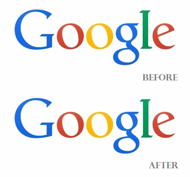
We've made a gif image that highlights the change, before and after, which can be seen above. Take a look to see if you can spot the difference.
As you can see, the small 'g' seems to have moved one pixel to the right and 'l' one pixel down and another pixel to the right. We wonder just what Google hopes to have achieved with the redesign - is it just a practical joke to see if users can spot the difference, or if it was correcting a stylistic mistake it had originally made.
Google has been using its logo as the canvas to commemorate events deemed worthy of global attention, with its rather interesting Google doodles that can be either interactive, or static, such as the most recent one for American biologist Rachel Louise Carson, and another for palaeontologist Mary Anning. A recent interactive one was to mark the invention of Rubik's cube.
If you're looking for actual redesigns, Google's biggest revamp to its homepage occurred around the same time it launched Google+, in mid-2011. The company had then said, "Constant revision and improvement is part of our overarching philosophy," and described the new Google homepage to feature a smaller logo and links moved to the top and bottom edges of the browser for a cleaner look.
Google's last major redesigns for its other web services include when it revamped Gmail last year, adding a tabbed interface, as well as YouTube, with its redesigned comments feed. YouTube's biggest redesign was back in December 2012, and the web property has been only slightly tweaked since then.
So, while it's not clear why Google edited its logo last week, if you can think of a reason for this minor change, do speak up in the comments section below.For the latest tech news and reviews, follow Gadgets 360 on X, Facebook, WhatsApp, Threads and Google News. For the latest videos on gadgets and tech, subscribe to our YouTube channel. If you want to know everything about top influencers, follow our in-house Who'sThat360 on Instagram and YouTube.
Related Stories
- Samsung Galaxy Unpacked 2025
- ChatGPT
- Redmi Note 14 Pro+
- iPhone 16
- Apple Vision Pro
- Oneplus 12
- OnePlus Nord CE 3 Lite 5G
- iPhone 13
- Xiaomi 14 Pro
- Oppo Find N3
- Tecno Spark Go (2023)
- Realme V30
- Best Phones Under 25000
- Samsung Galaxy S24 Series
- Cryptocurrency
- iQoo 12
- Samsung Galaxy S24 Ultra
- Giottus
- Samsung Galaxy Z Flip 5
- Apple 'Scary Fast'
- Housefull 5
- GoPro Hero 12 Black Review
- Invincible Season 2
- JioGlass
- HD Ready TV
- Laptop Under 50000
- Smartwatch Under 10000
- Latest Mobile Phones
- Compare Phones
- Moto G15 Power
- Moto G15
- Realme 14x 5G
- Poco M7 Pro 5G
- Poco C75 5G
- Vivo Y300 (China)
- HMD Arc
- Lava Blaze Duo 5G
- Asus Zenbook S 14
- MacBook Pro 16-inch (M4 Max, 2024)
- Honor Pad V9
- Tecno Megapad 11
- Redmi Watch 5
- Huawei Watch Ultimate Design
- Sony 65 Inches Ultra HD (4K) LED Smart TV (KD-65X74L)
- TCL 55 Inches Ultra HD (4K) LED Smart TV (55C61B)
- Sony PlayStation 5 Pro
- Sony PlayStation 5 Slim Digital Edition
- Blue Star 1.5 Ton 3 Star Inverter Split AC (IC318DNUHC)
- Blue Star 1.5 Ton 3 Star Inverter Split AC (IA318VKU)


