- Home
- Internet
- Internet News
- New 'Gravity' font makes reading easier for dyslexic people
New 'Gravity' font makes reading easier for dyslexic people
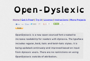
The font 'OpenDyslexic' created by a New Hampshire-based designer makes it less likely that the brain will rotate them and confuse sufferers, the BBC News reported.
"Your brain can sometimes do funny things to letters.
OpenDyslexic tries to help prevent some of these things from happening," said Abelardo Gonzalez.
"Letters have heavy weighted bottoms to add a kind of 'gravity' to each letter, helping to keep your brain from rotating them around in ways that can make them look like other letters," Gonzalez said.
"Consistently weighted bottoms can also help reinforce the line of text. The unique shapes of each letter can help prevent flipping and swapping," Gonzalez added.
The 28-year-old had also released OpenWeb a free web browser based on the font earlier this year.
Get your daily dose of tech news, reviews, and insights, in under 80 characters on Gadgets 360 Turbo. Connect with fellow tech lovers on our Forum. Follow us on X, Facebook, WhatsApp, Threads and Google News for instant updates. Catch all the action on our YouTube channel.
- Samsung Galaxy Unpacked 2026
- iPhone 17 Pro Max
- ChatGPT
- iOS 26
- Laptop Under 50000
- Smartwatch Under 10000
- Apple Vision Pro
- Oneplus 12
- OnePlus Nord CE 3 Lite 5G
- iPhone 13
- Xiaomi 14 Pro
- Oppo Find N3
- Tecno Spark Go (2023)
- Realme V30
- Best Phones Under 25000
- Samsung Galaxy S24 Series
- Cryptocurrency
- iQoo 12
- Samsung Galaxy S24 Ultra
- Giottus
- Samsung Galaxy Z Flip 5
- Apple 'Scary Fast'
- Housefull 5
- GoPro Hero 12 Black Review
- Invincible Season 2
- JioGlass
- HD Ready TV
- Latest Mobile Phones
- Compare Phones
- Honor Play 80
- Nord 6
- Honor X80i
- Honor Play 80 Pro
- Redmi Note 15 SE 5G
- Redmi A7 Pro
- OPPO K15 Pro
- OPPO K15 Pro+
- Xiaomi Book Pro 14
- MacBook Neo
- Vivo Pad 6 Pro
- Lenovo Legion Y700 Gen 5
- boAt Valour Watch 1R
- Xiaomi Watch S5
- Xiaomi QLED TV X Pro 75
- Haier H5E Series
- Asus ROG Ally
- Nintendo Switch Lite
- Haier 1.6 Ton 5 Star Inverter Split AC (HSU19G-MZAID5BN-INV)
- Haier 1.6 Ton 5 Star Inverter Split AC (HSU19G-MZAIM5BN-INV)


