- Home
- Internet
- Internet News
- Google redesigns search results on desktop for a 'cleaner look'
Google redesigns search results on desktop for a 'cleaner look'

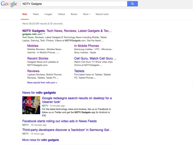
The tweaks to the way Google's search results appear on desktop and laptop computers mirror a makeover on smartphones and tablets introduced a few months ago.
The new presentation increases font sizes and removes the underlines below the blue links of each search result on PCs. Ads appearing along the top and the right-hand panel of the results page no longer are presented in boxes shaded in blue and yellow. The marketing pitches are now marked by small ad tags to distinguish them from the rest of the results.
- Google Releases New AI Agents to Challenge OpenAI and Anthropic
- Google Vids
- Google offering up to 5TB storage with AI Pro plan!
- Google Pixel 10a or iPhone 16e. Which is a better value for money?
- OpenAI ChatGPT Images 2.0 is here, and it will directly compete with Google Nano Banana 2.0. Which one do you think is b
Google Inc. rolled out the new design on PCs with little fanfare, even though it will be seen by almost everyone who searches for information on personal computers. That's because Google processes about two out of every three search requests made on PCs.
The company's lead search designer, Jon Wiley, announced the makeover Wednesday with a post on his Google Plus page.
The changes are meant to make it easier to scroll through Google's search results and present a "cleaner look," Wiley wrote in his post.
Google's decision to transfer a design originally tailored for mobile devices to PCs also underscores the company's increasing emphasis on smartphones and tablets.
"Improving consistency in design across platforms makes it easier for people to use Google search across devices, and it makes it easier for us to develop and ship improvements across the board," Wiley wrote.?
Google, based in Mountain View, California, didn't immediately respond Thursday to requests for further comment about the new look.
As with any redesign of a popular Internet service, some users were expressing their dismay and frustration with Google's new search design on PCs. There were also compliments mixed in with the complaints on Twitter's short-messaging service and the comments section below Wiley's Google Plus post.
The main gripes about the makeover seemed to center on the larger and different font and the lack of color on the results page.
Google, though, typically faces much louder protests when its engineers complete a radical overhaul of the formula that determines rankings of search results. Those revisions can dramatically reduce the traffic of websites exiled to the back pages of the search results after a new formula is introduced.
In this case, Google is tinkering with the style of the search results, and not the substance.
Get your daily dose of tech news, reviews, and insights, in under 80 characters on Gadgets 360 Turbo. Connect with fellow tech lovers on our Forum. Follow us on X, Facebook, WhatsApp, Threads and Google News for instant updates. Catch all the action on our YouTube channel.
Related Stories
- Samsung Galaxy Unpacked 2026
- iPhone 17 Pro Max
- ChatGPT
- iOS 26
- Laptop Under 50000
- Smartwatch Under 10000
- Apple Vision Pro
- Oneplus 12
- OnePlus Nord CE 3 Lite 5G
- iPhone 13
- Xiaomi 14 Pro
- Oppo Find N3
- Tecno Spark Go (2023)
- Realme V30
- Best Phones Under 25000
- Samsung Galaxy S24 Series
- Cryptocurrency
- iQoo 12
- Samsung Galaxy S24 Ultra
- Giottus
- Samsung Galaxy Z Flip 5
- Apple 'Scary Fast'
- Housefull 5
- GoPro Hero 12 Black Review
- Invincible Season 2
- JioGlass
- HD Ready TV
- Latest Mobile Phones
- Compare Phones
- Infinix GT 50 Pro
- Vivo Y6 5G
- Vivo Y05 5G
- Poco C81x
- Poco C81
- Honor 600
- Honor 600 Pro
- OPPO Find X9s
- Honor Win H9 Gaming Laptop
- Honor Win H7 Gaming Laptop
- Honor MagicPad 3 Pro 12.3
- Redmi K Pad 2
- NoiseFit Diva Araya
- OPPO Watch X3 Mini
- Xiaomi TV S Mini LED 2026 (75-inch)
- Xiaomi TV S Mini LED 2026 (65-inch)
- Asus ROG Ally
- Nintendo Switch Lite
- Haier 1.6 Ton 5 Star Inverter Split AC (HSU19G-MZAID5BN-INV)
- Haier 1.6 Ton 5 Star Inverter Split AC (HSU19G-MZAIM5BN-INV)


