- Home
- Internet
- Internet News
- Google Redesigns Its Logo
Google Redesigns Its Logo

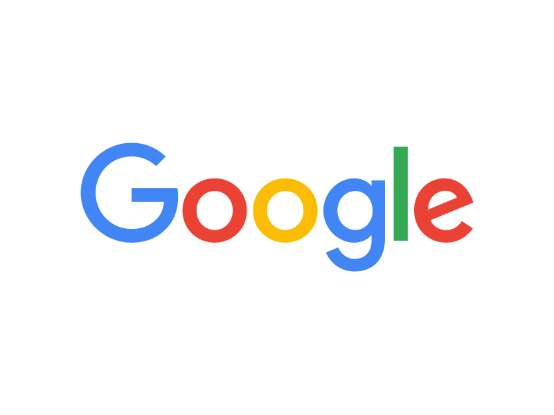
Following its corporate reorganisation last month, Google is making another major change - the company on Tuesday unveiled a new logo.
Google's new logo epitomises the company as it stands today, present on myriad devices rather than its humble roots of a single browser page. Apart from the redesign of the full logo, which while retaining the same colours for the letters features a new font, Google has also reimagined its little blue 'g' icon to a four-colour 'G'.
The updated logo features a sans-serif typeface, similar to the one being used by Google's newly created holding company, Alphabet. The new logo is already visible on its Search home page, and will roll out across products soon. It is the fifth such logo redesign since Google started in 1998.
The Mountain View firm announced the new logo in a blog post, and said it will be visible in various forms across devices and interfaces, such as a new four-colour mic symbol (seen below) and a four-dot loading symbol.
The new logo comes three weeks after the company's surprise move to create a holding company called Alphabet to pool its many subsidiaries and separate the core Web advertising business from newer ventures like driverless cars.
The new brand identity "aims to make Google more accessible and useful to our users", the firm explains on its blog, adding that it has taken the 'best of Google' - simple, uncluttered, colourful, friendly - and embodied it in the logo.
Once upon a time, Google was one destination that you reached from one device: a desktop PC. These days, people interact with Google products across many different platforms, apps and devices-sometimes all in a single day. You expect Google to help you whenever and wherever you need it, whether it's on your mobile phone, TV, watch, the dashboard in your car, and yes, even a desktop!
Today we're introducing a new logo and identity family that reflects this reality and shows you when the Google magic is working for you, even on the tiniest screens. As you'll see, we've taken the Google logo and branding, which were originally built for a single desktop browser page, and updated them for a world of seamless computing across an endless number of devices and different kinds of inputs (such as tap, type and talk).
It doesn't simply tell you that you're using Google, but also shows you how Google is working for you. For example, new elements like a colourful Google mic help you identify and interact with Google whether you're talking, tapping or typing. Meanwhile, we're bidding adieu to the little blue "g" icon and replacing it with a four-colour "G" that matches the logo.
This isn't the first time we've changed our look and it probably won't be the last, but we think today's update is a great reflection of all the ways Google works for you across Search, Maps, Gmail, Chrome and many others. We think we've taken the best of Google (simple, uncluttered, colorful, friendly), and recast it not just for the Google of today, but for the Google of the future.
Written with inputs from Reuters
Get your daily dose of tech news, reviews, and insights, in under 80 characters on Gadgets 360 Turbo. Connect with fellow tech lovers on our Forum. Follow us on X, Facebook, WhatsApp, Threads and Google News for instant updates. Catch all the action on our YouTube channel.
Related Stories
- Samsung Galaxy Unpacked 2026
- iPhone 17 Pro Max
- ChatGPT
- iOS 26
- Laptop Under 50000
- Smartwatch Under 10000
- Apple Vision Pro
- Oneplus 12
- OnePlus Nord CE 3 Lite 5G
- iPhone 13
- Xiaomi 14 Pro
- Oppo Find N3
- Tecno Spark Go (2023)
- Realme V30
- Best Phones Under 25000
- Samsung Galaxy S24 Series
- Cryptocurrency
- iQoo 12
- Samsung Galaxy S24 Ultra
- Giottus
- Samsung Galaxy Z Flip 5
- Apple 'Scary Fast'
- Housefull 5
- GoPro Hero 12 Black Review
- Invincible Season 2
- JioGlass
- HD Ready TV
- Latest Mobile Phones
- Compare Phones
- Infinix GT 50 Pro
- Vivo Y6 5G
- Vivo Y05 5G
- Poco C81x
- Poco C81
- Honor 600
- Honor 600 Pro
- OPPO Find X9s
- Honor Win H9 Gaming Laptop
- Honor Win H7 Gaming Laptop
- Honor MagicPad 3 Pro 12.3
- Redmi K Pad 2
- NoiseFit Diva Araya
- OPPO Watch X3 Mini
- Xiaomi TV S Mini LED 2026 (75-inch)
- Xiaomi TV S Mini LED 2026 (65-inch)
- Asus ROG Ally
- Nintendo Switch Lite
- Haier 1.6 Ton 5 Star Inverter Split AC (HSU19G-MZAID5BN-INV)
- Haier 1.6 Ton 5 Star Inverter Split AC (HSU19G-MZAIM5BN-INV)


