- Home
- Internet
- Internet News
- Google Music Timeline unveiled, plots the history of modern music
Google Music Timeline unveiled, plots the history of modern music

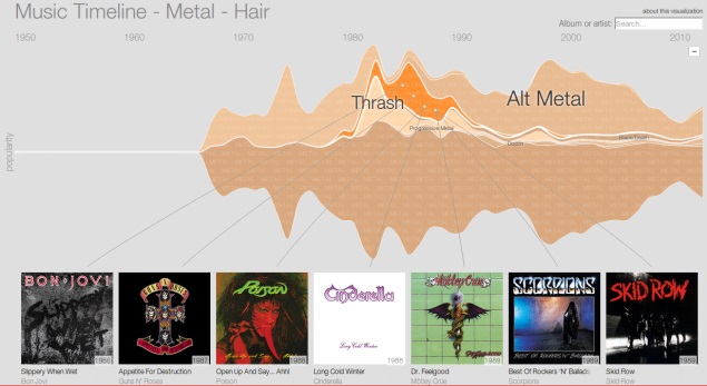
Search engine giant, Google, has been tracking music downloads and uploads for a while now. But what it is doing, rather unexpectedly of course, is mapping the course of modern music through this. The interactive maps are charted through the Play Music users' libraries. The Google Research blog details the work done on the research as a visualisation (the Music Timeline) to show which music has stood the test of time, and how artists have risen and fallen in popularity.
The Music Timeline uses aggregated data from Google Play Music to show the changes over the last few decades. It shows which albums are still in our playlists over the years. For example, by clicking on metal, users can see the changes from classic metal to alt metal and others, apart from popular artists in each genre. The overall scene of each music genre is showcased. Even changes in vocabulary used to name artistes and their works can be scene. Another interesting aspect that the blog details is the search for an artist to see the trajectory of their works. For example, one can check the chart of U2 as a band from the 80s to the one hit wonder, like Los del Rio's Macarena from 1995.
There are more examples regarding how the visualisation can make complex data accessible to users and even make it fun at the same time. The Big Picture project, which is working on the music mapping, does so on a weekly basis. Google says this is one of the many collaborative efforts between the Music Recommendations and Discovery TeamsGet your daily dose of tech news, reviews, and insights, in under 80 characters on Gadgets 360 Turbo. Connect with fellow tech lovers on our Forum. Follow us on X, Facebook, WhatsApp, Threads and Google News for instant updates. Catch all the action on our YouTube channel.
Related Stories
- Samsung Galaxy Unpacked 2026
- iPhone 17 Pro Max
- ChatGPT
- iOS 26
- Laptop Under 50000
- Smartwatch Under 10000
- Apple Vision Pro
- Oneplus 12
- OnePlus Nord CE 3 Lite 5G
- iPhone 13
- Xiaomi 14 Pro
- Oppo Find N3
- Tecno Spark Go (2023)
- Realme V30
- Best Phones Under 25000
- Samsung Galaxy S24 Series
- Cryptocurrency
- iQoo 12
- Samsung Galaxy S24 Ultra
- Giottus
- Samsung Galaxy Z Flip 5
- Apple 'Scary Fast'
- Housefull 5
- GoPro Hero 12 Black Review
- Invincible Season 2
- JioGlass
- HD Ready TV
- Latest Mobile Phones
- Compare Phones
- Honor Play 70C
- Honor Play 80 Plus
- Moto G47
- Motorola Razr 2026
- Motorola Razr+ 2026
- Motorola Razr Ultra 2026
- Moto G37
- Moto G37 Power
- Dell XPS 16
- Dell XPS 14
- OnePlus Pad 4
- Redmi Pad 2 9.7 4G
- NoiseFit Diva Araya
- OPPO Watch X3 Mini
- Xiaomi TV S Mini LED 2026 (75-inch)
- Xiaomi TV S Mini LED 2026 (65-inch)
- Asus ROG Ally
- Nintendo Switch Lite
- Blue Star 1.5 Ton 5 Star Inverter Split AC (IA518ZXUS)
- Blue Star 1.5 Ton 3 Star Inverter Split AC (IA318ZXU)


