- Home
- Internet
- Internet Features
- Why BookMyShow Turned to Magazines for Its New Look
Why BookMyShow Turned to Magazines for Its New Look
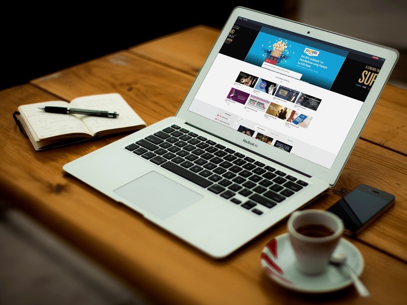
"I'm always looking to take inspiration from whoever is solving problems through design", says Anish Tripathi, AVP Product Design, BookMyShow, adding, "and while I don't want to name any names, I see that mostly in sites that are from outside India." Tripathi has been working in the field well over a decade, and interestingly enough, worked as a Lead Designer at Paper Plane Solutions in 2007 - the company Cleartrip Founder and Director Hrush Bhatt had started in 1999.
As Bhatt told Gadgets 360 earlier, design can be a differentiator in a crowded market, and he believes the ease of use and the smooth flow of the Cleartrip app is one of the reasons why so many people use it. At the other end of the spectrum, you still have sites like IRCTC, which feature the most basic visual aesthetics, but are designed to load quickly, and remain stable under the load of 7,200 ticket bookings per minute. That might not look as appealing, but it is also designed as per the needs of the platform and the user.
By and large though, we're seeing a clear trend as websites and apps shift from more basic, utilitarian design, to photo-centric, visually "heavy" websites. Design does mean more than just good looking pages, but as Internet connections get faster, you're certainly seeing more, and larger, images being used in a bid to catch your eye.
"Our philosophy for design is three-fold," says Tripathi, "as you 'discover', 'decide', and 'book'. For us, when we measure engagement, we're looking at transactions, ticket bookings. So discover is when, for example, you send a notification to let users know that a new movie is out, or when they come to the site, you show them what's running."
"Decide means giving the user the tools to quickly so, if you go to the website, you'll see that there are a lot of tools in place to help a user to filter through the content, and find exactly what they want without wasting their time," Tripathi adds. "And the Book phase is all about doing it as quickly and frictionlessly as possible, so you can book your ticket in seconds."
This philosophy sounds very utilitarian, but actually visiting the BookMyShow website shows that it's also following a very visually rich style. Tripathi agrees, and says that design should not be purely about utility either.
"Of course, there are some goals about how the funnel should be, but you also have to make the content pleasing for the user, and this includes a lot of conversational design elements," he says. What this means, he explains, is that there are many small visual flourishes to make the site look more engaging, without getting in the way of a smooth flow.
"So for example, when you're on the app and you're booking your tickets, there's the slider for the number of tickets, and this changes from a bike to a car to a minibus depending on the number of tickets you want, and the same is there on the website too," he adds as an example.
According to Tripathi, a big difference between BookMyShow and other popular sites such as Flipkart or Amazon is that it does not have a physical product to sell, and therefore it has to make the experience as conversational and instant as possible to keep the user engaged.
"Earlier our content was very static, now it has much more of a magazine like feel to it, while still being frictionless," says Tripathi. "So you'll see now that we use a lot more of the creatives of the content we're selling tickets to - whether it is movie posters, or it is the posters for concerts and events, because the design teams behind them have also spent a lot of time and effort to make something engaging."
"We sell tickets for entertainment, and there are some great creatives available to us. Look at Airbnb, it has such a fast flow as well, but it is also very image heavy," he adds. "It's different when you want to do something more utility-based, like booking a flight. You can't show the interior of an airplane, right?"
He gets excited and starts to wax poetic about the specific elements of the page, saying that design is a hugely iterative process that involves a lot of collaboration and testing. "You know how on the front page we used to have an all-white background and now there are these bands of grey on it?" he asks. "That provides a nice way to highlight some of the content, and also to act as a pleasing visual contrast. Now, you can't have the whole page be dark too, because that wouldn't look nice either, but if you go to the trailers tab, the whole background is dark, to give you the cinema hall feel. I can't reach out of the screen and turn off your lights," he laughs, "but this gives the trailers a more striking look."
But does moving to an image rich, "magazine-like" format not mean using an older paradigm of interaction that doesn't fit well on the Web? Not so, believes Tripathi. "We've retained the best of the Web," he says, "so for example, if you go to the home page, you'll see these great visuals, and if you bring the mouse over them, you'll see the Buy Ticket button, to instantly get the tickets without any extra layers."
"The core principle of design we follow at BookMyShow is that you have a simple, frictionless flow. So for events, there aren't so many filters and a very simple flow," he explains. "On the other hand, movies, there are so many movies that you have to introduce many more options, which can be difficult for the user. So we try and simplify this flow, and provide the tools that can make it easier for them to find what they want, without dictating their flow."
This can mean adding shortcuts through the flow, so you could browse through a listing, watch a trailer, and book a ticket if you were feeling undecided, or jump straight into a payment window without any further steps if you're so inclined. And above all, Tripathi tells us, his personal philosophy is to always remember that anything can be redesigned, nothing is set in stone.
Get your daily dose of tech news, reviews, and insights, in under 80 characters on Gadgets 360 Turbo. Connect with fellow tech lovers on our Forum. Follow us on X, Facebook, WhatsApp, Threads and Google News for instant updates. Catch all the action on our YouTube channel.
- Samsung Galaxy Unpacked 2026
- iPhone 17 Pro Max
- ChatGPT
- iOS 26
- Laptop Under 50000
- Smartwatch Under 10000
- Apple Vision Pro
- Oneplus 12
- OnePlus Nord CE 3 Lite 5G
- iPhone 13
- Xiaomi 14 Pro
- Oppo Find N3
- Tecno Spark Go (2023)
- Realme V30
- Best Phones Under 25000
- Samsung Galaxy S24 Series
- Cryptocurrency
- iQoo 12
- Samsung Galaxy S24 Ultra
- Giottus
- Samsung Galaxy Z Flip 5
- Apple 'Scary Fast'
- Housefull 5
- GoPro Hero 12 Black Review
- Invincible Season 2
- JioGlass
- HD Ready TV
- Latest Mobile Phones
- Compare Phones
- Vivo T5 Pro 5G
- OPPO F33 5G
- OPPO F33 Pro 5G
- Redmi A7 Pro 5G
- Redmi R70m 5G
- Redmi R70 5G
- OPPO A6s Pro
- Realme Narzo 100 Lite 5G
- Asus Zenbook S14
- Asus Vivobook 16 (2026)
- Moto Pad (2026)
- Vivo Pad 6 Pro
- boAt Valour Watch 1R
- Xiaomi Watch S5
- Xiaomi TV S Mini LED 2026 (75-inch)
- Xiaomi TV S Mini LED 2026 (65-inch)
- Asus ROG Ally
- Nintendo Switch Lite
- Haier 1.6 Ton 5 Star Inverter Split AC (HSU19G-MZAID5BN-INV)
- Haier 1.6 Ton 5 Star Inverter Split AC (HSU19G-MZAIM5BN-INV)


