- Home
- Internet
- Internet Features
- Crystal clear: Using design as a differentiator in a crowded market
Crystal clear: Using design as a differentiator in a crowded market

The Indian online travel industry is as crowded as platform number one of the New Delhi Railway Station on a Saturday evening. According to comScore, Inc, a global leader in measuring the digital world, as many as 82 travel websites were visited by at least 1 lakh Indians in December 2013. Only 48 websites listed under the general news category can say the same. When you think of the news websites that are present everywhere you look, you get a sense of the competition in the travel sector.
Two names - Indian Railways (thanks to IRCTC, Indian Rail and other websites) and MakeMyTrip - stand out well above the crowd in terms of comScore numbers. While Indian Railways obviously benefits from being the official source of ticketing and information for India's preferred means of transport, MakeMyTrip is backed by the financial muscle of NASDAQ-listed MakeMyTrip Limited. For everyone else, it's a struggle to stand out in this crowded market.
Not too long ago, a visit to the homepage of any travel portal meant being bombarded by the latest cash back offers, holiday packages, and everything else under the sun, as part of the philosophy that no doubt involved throwing everything at the customer and hoping something sticks. MakeMyTrip was as guilty of this as anyone else, and the rest, perhaps feeling compelled to copy the leader, followed suit. As an end user and someone looking at the market from the outside, one company stood out with its minimalistic design philosophy - Cleartrip.
While all players now seems to be learning the importance of design and moving away from cramming every possible thing on to their home page, and Cleartrip's website is not as minimalistic as it used to be, the company is one of the few in India to not only have a distinct design philosophy, but have the gumption to stick with it through thick and thin.
A chance beginning
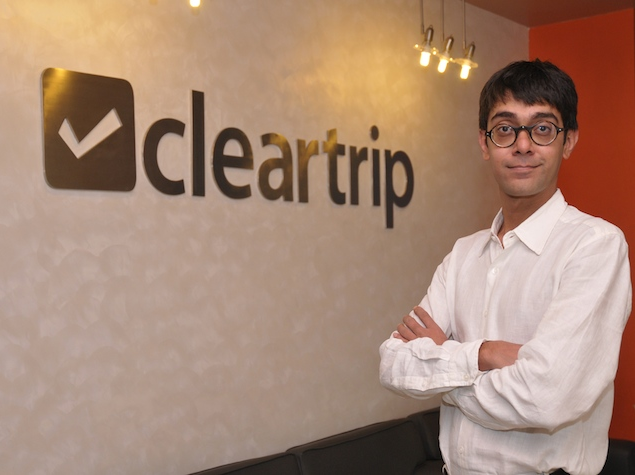
The Cleartrip story begins nine years ago. Before that, co-founder and Director, Product and Strategy, Hrush Bhatt worked in a company called Plexus Technologies, which had built large chunks of the original indiatimes.com. From there, he launched a company called Paper Plane, a boutique consulting firm focussed on business strategy and design in the online space, whose first client was the travel company Thomas Cook.
If Plexus was the seed that initiated the Cleartrip idea, Paper Plane paved the route. The firm would help Bhatt sharpen his design skills and learn the importance of user experience, and it also helped him to learn about the travel business from Thomas Cook.
At Paper Plane, Bhatt worked on the realisation of the product, but in the early half of the new millennium companies were still skeptical about online businesses - Thomas Cook would not invest the resources or the infrastructure into the online space.
For Bhatt and Stuart Crighton (now the CEO at Cleartrip), the disappointment would lead to a fresh beginning. "We designed everything ourselves. But when we realised that they (Thomas Cook) weren't going to invest a lot we decided to take the plunge ourselves," says Bhatt. The problem was raising funds - banks wouldn't give money to a startup, especially one that made its base on the Internet.
"ICICI was not going to give us any money and neither was anyone else. The big question was, how do we pull it off? We had taken the plunge but were running low on options," Bhatt remembers.
Now at their lowest point, the duo got a helping hand from luck. A friend of Bhatt's was visiting Mumbai along with her husband Sandeep Murthy, who worked for IAC, the parent company of Expedia. Four months after this first meeting, Murthy came back to Bhatt with an investment offer.
With that, Bhatt and Crighton got underway with Cleartrip; they were joined by Matthew Spacie from Magic Bus. He would work with the company for just one year before leaving, but in that time, Bhatt says things started to fall in place, some as planned, and some unexpectedly.
Until their funding came in, the founders worked on Cleartrip alone. The workforce came when the ability to pay the workforce came in - "It wasn't like we could convince anyone to come and work without any salary," Bhatt quips.
Designing a success story
Bhatt takes inspiration from non-conformists; asked about his heroes, he launches into an anecdote about George Mallory gaining a seat at Oxford because he scaled a 28-foot wall to get into the campus after arriving late for an interview. Not taking no for an answer is a big theme for him, and he relates another anecdote, this one about Clint Eastwood.
Bhatt says, "He was sale-able from the start and he knew it. So he used his clout with movie studios to let him direct the movies, if they wanted him to star in it. And he began as a director very early on. First directing himself, then others."
Another major inspiration for Bhatt was Steve Jobs. His mantra "think different", and his minimalistic product design and high level of precision, were as important as Mallory's tenacity and Eastwood's 'I-know-I-am-bloody-good' attitude.
At the same time, Bhatt's background in design stood Cleartrip in good stead in getting the site's user-experience design right. Bombarding a user with too much information usually overwhelms them. This is a known fact, which has still continued to skeet under the radar for most website designers in India. Making it user-friendly would involve improving the fluidity of the design.
"It is very much a part of the company now," Bhatt says, speaking about the design culture, and the importance of marrying aesthetics and functionality.
Bhatt says corporate design "colossus" Joe Duffy - who Bhatt had a chance to work with in the US before he decided to head back home because he wanted to be his own boss - was a big influence on his work. "Another guy who inspired me was Clement Mok. He used to be the creative director at Apple at one point in time. He then started his own studio called Studio Architect."
Another design influence for Bhatt and Cleartrip is the "extremely opinionated" Roger Black who's worked with everyone important enough in the print business, to paraphrase Bhatt, from Rolling Stones to Newsweek, and more. And when you look at his website, similarities with the Cleartrip site can be seen.
Black once said, "all you need in design is red and black. And if you need to add something else, maybe you add a little bit of yellow." His website is done up in the two colours. Cleartrip might not use the same shade of red for their fonts (they use orange) but the subtlety of the designs is very evident. "He (Black) made it work because print media is exclusively black and white," says Bhatt. The attention to typography and the kind of type-faces that Black used in his work were also an inspiration, he admits.
Good designers are cursed
Bhatt attribute Cleartrip's success to the fact that they recruit designers that are "cursed" - the ones that "look at something and say why does it work like that, it should work better... I'm gonna make it better". But every designer's journey at Cleartrip begins with unlearning.
At the heart of the design synthesis is the 'go back to basics' work culture where Bhatt and the senior designers tell the new guys to junk the wire-frame models and go back to sketching designs on paper using a pencil. "They want to work on high-fidelity wire frames, Visio, OmniGraffle and the likes. But that is not going to work at the conception stage," he says.
"The truth is we have to un-train them. We have to tell them that the efforts spend at the end of the day will wind up in a dustbin. So the only way to get faster is by going back to basics - paper and pencil."
Those with design backgrounds might not appreciate the idea but Bhatt says that it brings in unnecessary details and "people start caring too much" about them.
While Bhatt underlines the importance of the text you see on the website by saying "copy is part of the design", he insists wireframes are not the stage to be worrying about copy, which tends to happen if you are using software. "The writing part in a design might just be represented by a squiggle for text [when designing using pen and paper]."
Another important attribute for any designer at Cleartrip is the ability to code. "If you can't code, all you are doing is making pretty pictures," says Bhatt.
The future's mobile
While India has traditionally been seen as a place where functionality takes precedence over design, Bhatt insists saying there are people who care about design, especially since smartphones started gaining popularity. He believes if the mobile revolution hadn't happened things wouldn't have changed for the next 15 years. But the fact that people now have access to really good apps from all over the world, has made them sit up and demand the same from Indian players. "I think that is where the design sensibilities changed so much in the recent past," he says.
Is mobile the next big thing then? "Definitely. For starters that is where a big chunk of the tricky designing is going to be in the coming future," he says. The fast availability of 3G, the drop in the prices of smartphones and their easy accessibility now means, that handheld devices have replaced desktops and are the first ever window to people in the country to surf the Internet. It also highlights the importance of developing good apps for the devices. The Windows, Apple and Android app stores now house apps that are not just great to look at but are also fully functional and in modern terms utilitarian. Mobile is where Cleartrip, Bhatt says, has been fielding most of their design expertise.
Sunit Singh, Lead Designer at Cleartrip, says that they build their design strategies from everything that is scalable. Borrowing concepts to create something for another platform (desktop to mobile and vice-versa) and not selling out to market considerations are just some of the aspects. He also says that there is a wrong notion that designers need to work in isolation. He feels rather that it is outright the opposite that works. "A good designer doesn't add things, but removes the unnecessary parts. Hard decisions are a part and parcel of every business but we rely on market data to minimise the friction that designers feel, as much as possible," he says.
On a parting note he gets very candid about the success that Cleartrip has enjoyed so far, from its humble beginnings, from Mallory and Eastwood, Jobs and Black, and Plexis, Paper Plane and Thomas Cook. "I have often been asked the secret of our success," he says. "The truth is there is none."
Get your daily dose of tech news, reviews, and insights, in under 80 characters on Gadgets 360 Turbo. Connect with fellow tech lovers on our Forum. Follow us on X, Facebook, WhatsApp, Threads and Google News for instant updates. Catch all the action on our YouTube channel.
Related Stories
- Samsung Galaxy Unpacked 2026
- iPhone 17 Pro Max
- ChatGPT
- iOS 26
- Laptop Under 50000
- Smartwatch Under 10000
- Apple Vision Pro
- Oneplus 12
- OnePlus Nord CE 3 Lite 5G
- iPhone 13
- Xiaomi 14 Pro
- Oppo Find N3
- Tecno Spark Go (2023)
- Realme V30
- Best Phones Under 25000
- Samsung Galaxy S24 Series
- Cryptocurrency
- iQoo 12
- Samsung Galaxy S24 Ultra
- Giottus
- Samsung Galaxy Z Flip 5
- Apple 'Scary Fast'
- Housefull 5
- GoPro Hero 12 Black Review
- Invincible Season 2
- JioGlass
- HD Ready TV
- Latest Mobile Phones
- Compare Phones
- Infinix GT 50 Pro
- Vivo Y6 5G
- Vivo Y05 5G
- Poco C81x
- Poco C81
- Honor 600
- Honor 600 Pro
- OPPO Find X9s
- Honor Win H9 Gaming Laptop
- Honor Win H7 Gaming Laptop
- Honor MagicPad 3 Pro 12.3
- Redmi K Pad 2
- NoiseFit Diva Araya
- OPPO Watch X3 Mini
- Xiaomi TV S Mini LED 2026 (75-inch)
- Xiaomi TV S Mini LED 2026 (65-inch)
- Asus ROG Ally
- Nintendo Switch Lite
- Haier 1.6 Ton 5 Star Inverter Split AC (HSU19G-MZAID5BN-INV)
- Haier 1.6 Ton 5 Star Inverter Split AC (HSU19G-MZAIM5BN-INV)


