- Home
- Apps
- Apps Reviews
- Facebook for iPad
Facebook for iPad
By Sahil Mohan Gupta | Updated: 6 June 2012 17:32 IST

Click Here to Add Gadgets360 As A Trusted Source

Advertisement
If there's an app that qualifies as the Holy Grail of iPad apps, then this is it. Facebook was the one app that iPad users wanted and didn't get - till just recently. The official version isn't a whole lot different from the one that tech journos found hidden in the iPhone app code last June. Rumours of a product delay because of iOS 5 integration - which didn't happen - notwithstanding, the app is finally here and so are we with our review.
Usability:
At the core, Facebook for iPad offers very similar functionality to its sister iPhone and Android apps, but what separates it from its small screen siblings is that the user-interface is optimized for the iPad 9.7-Inch IPS display.
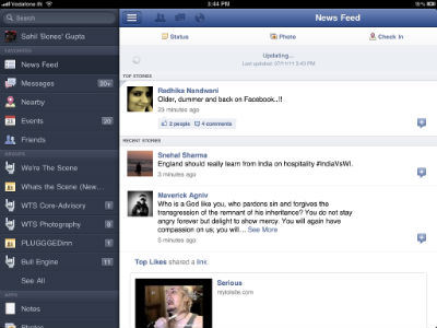
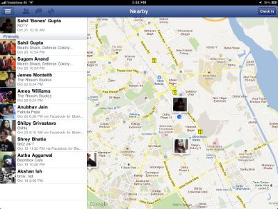
At the heart of the user interface Facebook has applied elements reminiscent of the iPad Twitter application. Just like Twitter on the iPad, we get a homescreen pane of the left hand side of the display, which displays options such as News Feed, Messages, Nearby, Events, Friends, Groups, Apps and Account settings. This whole pane can be hidden once we swipe the chosen option towards the pane which would then overlay it, hence hiding it. However, with equal ease, we can get it to return to its normal view with a swipe towards the right hand side.
It's quite evident Facebook decided to use swiping gestures to give the interface a cleaner and simplistic feel.

On the top header we get the standard Notifications, Messages and Friend Request drop down menus alongside one button which hides the left menu pane, a secondary option for many who would rather not use the swiping gestures. On the top right corner of the header we noticed an option specific button: for instance, in the News Feed we were offered the All Stories option, while in Messages it gave us options for writing new messages or marking old messages as spam, unread or archiving them. While all these are expected standard Facebook features, presentation is key and Facebook for iPad nails it.

Indeed, the interface is sublimely intuitive and reminds us of the website itself. With this, Facebook has ensured that its users are already familiar with the app, because it's so much like the website.
Yes, Facebook has still not managed to transition its Timeline interface to the app, but that is something, which Facebook can achieve via an update. While this disappointed us as we were early adopters of Facebook's Timeline interface, there are many people yet to make the jump and we think Facebook will wait till most of its user base shifts to Timeline before they update the app with it.
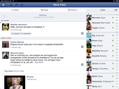
Previously, iPad users resorted to using third party Facebook chat apps or the iPhone app for Facebook chat as the java script for Facebook chat was not available on the mobile Safari on the iPad. Facebook has expectedly added chat to the iPad which is not too dissimilar from the iPhone functionality.

With Photo Galleries, all we need to do is swipe through images and the app offers buttons on the top right corner for us to comment on or like the images. All this is very simple, perhaps simpler than browsing the website itself, and certainly way simpler than the mobile apps which are limited by screen real estate.
Verdict:
It was in the works for more than a year, and in spite of Mark Zuckerberg calling the iPad non-mobile device when it came out in January 2010, we have an app dedicated to the device. That fact in itself says volumes about the worthiness of this app. It brings no innovative functionality to the table, not even Facebook's game-changing Timeline interface, but to put it simply it is the simplest way to access the social networking giant, perhaps even the best way to do so, especially if the iPad is your primary device.
Ratings:
Price: 5
Usability: 5
Wow factor: 4
Usability:
At the core, Facebook for iPad offers very similar functionality to its sister iPhone and Android apps, but what separates it from its small screen siblings is that the user-interface is optimized for the iPad 9.7-Inch IPS display.
At the heart of the user interface Facebook has applied elements reminiscent of the iPad Twitter application. Just like Twitter on the iPad, we get a homescreen pane of the left hand side of the display, which displays options such as News Feed, Messages, Nearby, Events, Friends, Groups, Apps and Account settings. This whole pane can be hidden once we swipe the chosen option towards the pane which would then overlay it, hence hiding it. However, with equal ease, we can get it to return to its normal view with a swipe towards the right hand side.
It's quite evident Facebook decided to use swiping gestures to give the interface a cleaner and simplistic feel.
On the top header we get the standard Notifications, Messages and Friend Request drop down menus alongside one button which hides the left menu pane, a secondary option for many who would rather not use the swiping gestures. On the top right corner of the header we noticed an option specific button: for instance, in the News Feed we were offered the All Stories option, while in Messages it gave us options for writing new messages or marking old messages as spam, unread or archiving them. While all these are expected standard Facebook features, presentation is key and Facebook for iPad nails it.
Indeed, the interface is sublimely intuitive and reminds us of the website itself. With this, Facebook has ensured that its users are already familiar with the app, because it's so much like the website.
Yes, Facebook has still not managed to transition its Timeline interface to the app, but that is something, which Facebook can achieve via an update. While this disappointed us as we were early adopters of Facebook's Timeline interface, there are many people yet to make the jump and we think Facebook will wait till most of its user base shifts to Timeline before they update the app with it.
Previously, iPad users resorted to using third party Facebook chat apps or the iPhone app for Facebook chat as the java script for Facebook chat was not available on the mobile Safari on the iPad. Facebook has expectedly added chat to the iPad which is not too dissimilar from the iPhone functionality.
With Photo Galleries, all we need to do is swipe through images and the app offers buttons on the top right corner for us to comment on or like the images. All this is very simple, perhaps simpler than browsing the website itself, and certainly way simpler than the mobile apps which are limited by screen real estate.
Verdict:
It was in the works for more than a year, and in spite of Mark Zuckerberg calling the iPad non-mobile device when it came out in January 2010, we have an app dedicated to the device. That fact in itself says volumes about the worthiness of this app. It brings no innovative functionality to the table, not even Facebook's game-changing Timeline interface, but to put it simply it is the simplest way to access the social networking giant, perhaps even the best way to do so, especially if the iPad is your primary device.
Ratings:
Price: 5
Usability: 5
Wow factor: 4
Comments
Get your daily dose of tech news, reviews, and insights, in under 80 characters on Gadgets 360 Turbo. Connect with fellow tech lovers on our Forum. Follow us on X, Facebook, WhatsApp, Threads and Google News for instant updates. Catch all the action on our YouTube channel.
Related Stories
Popular on Gadgets
- Samsung Galaxy Unpacked 2026
- iPhone 17 Pro Max
- ChatGPT
- iOS 26
- Laptop Under 50000
- Smartwatch Under 10000
- Apple Vision Pro
- Oneplus 12
- OnePlus Nord CE 3 Lite 5G
- iPhone 13
- Xiaomi 14 Pro
- Oppo Find N3
- Tecno Spark Go (2023)
- Realme V30
- Best Phones Under 25000
- Samsung Galaxy S24 Series
- Cryptocurrency
- iQoo 12
- Samsung Galaxy S24 Ultra
- Giottus
- Samsung Galaxy Z Flip 5
- Apple 'Scary Fast'
- Housefull 5
- GoPro Hero 12 Black Review
- Invincible Season 2
- JioGlass
- HD Ready TV
- Latest Mobile Phones
- Compare Phones
Latest Gadgets
- Vivo Y60
- Sony Xperia 1 VIII
- Itel Zeno 200
- OnePlus Nord CE 6 Lite
- OnePlus Nord CE 6
- Honor Play 70C
- Honor Play 80 Plus
- Moto G47
- Alienware 15 (2026, AMD)
- Alienware 15 (2026, Intel)
- Huawei MatePad Pro Max
- HP OmniPad 12
- Garmin Forerunner 170
- Garmin Forerunner 70
- Lumio Vision 9 (2026)
- Lumio Vision 7 (2026)
- Asus ROG Ally
- Nintendo Switch Lite
- Blue Star 1.5 Ton 5 Star Inverter Split AC (IA518ZXUS)
- Blue Star 1.5 Ton 3 Star Inverter Split AC (IA318ZXU)
© Copyright Red Pixels Ventures Limited 2026. All rights reserved.


