- Home
- Apps
- Apps Opinion
- For Apps, Less is More, and Layout from Instagram Proves This Point
For Apps, Less is More, and Layout from Instagram Proves This Point
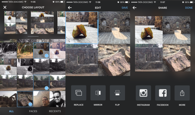
I have developed a compulsive need to share images I capture to Instagram, Facebook, and Twitter. Most of the times, these are single uploads of different images taken at the same event, and they just line up on the Facebook timeline, because creating albums on Facebook from a phone is really cumbersome.
Creating a collage is a good compromise, but requires you to fiddle with third-party apps and these are usually full of advertisements, and loaded with an intimidating range of features that make it hard to simply make a good looking collage and share it.
Instagram's newest app, Layout by Instagram, tries to tackle this problem and mostly succeeds. Much like Instagram, Layout is also a great looking app with an engaging, yet simple user interface. It boils your choices down to bare minimum thereby allowing you to put together something that looks good. Layout doesn't really give you too many options, but this barebones approach also prevents you from going overboard, and making a mess of your photos.
Come to think of it, I probably warmed up to Instagram pretty fast because of similar reasons.
Using Layout is easy. All you need to do is choose images from the photo library (the app allows a total of nine) and slot them into pre-defined collage options. Layout also bunches images using a facial recognition tool in the selection page, something that should come in handy for selfie aficionados. Unlike other apps, Layout doesn't give you the option of adding borders, writing captions, or applying filters. This might seem like a negative compared to other apps with more features, but if you look at the collages being shared, you quickly see that Layout has distilled the tool down to what a majority of people actually need.
The fact is that most of us are simply not great artists. The genius of apps like Instagram or Paper by FiftyThree - at least when it first launched - is that they constrain your choices, unlike competing apps. By narrowing your options, these apps make it easier for us to work with simplistic tools and create finished products that don't look amateurish.
That's why simplicity in UI and functionality is vital for an app. Secret's co-founder and head designer, Chrys Bader, told Gigaom that "when a user opens an app, they should be able to understand within five seconds what the next thing is that they're supposed to do, and it should be like that every step of the way." It's a pity really that Secret itself lost sight of this incredibly important advice with a recent major overhaul.
Instagram, on the other hand, has nailed this ideology with Layout. In fact, the app doesn't even have callouts that explains how the app works. Instead, it has a slideshow that comes up when you fire the app for the first time and on long pressing the icon afterwards. With such a robust start, Instagram can concentrate on adding more Layout options for future updates without worrying about the functionality too much.
Get your daily dose of tech news, reviews, and insights, in under 80 characters on Gadgets 360 Turbo. Connect with fellow tech lovers on our Forum. Follow us on X, Facebook, WhatsApp, Threads and Google News for instant updates. Catch all the action on our YouTube channel.
Related Stories
- Samsung Galaxy Unpacked 2026
- iPhone 17 Pro Max
- ChatGPT
- iOS 26
- Laptop Under 50000
- Smartwatch Under 10000
- Apple Vision Pro
- Oneplus 12
- OnePlus Nord CE 3 Lite 5G
- iPhone 13
- Xiaomi 14 Pro
- Oppo Find N3
- Tecno Spark Go (2023)
- Realme V30
- Best Phones Under 25000
- Samsung Galaxy S24 Series
- Cryptocurrency
- iQoo 12
- Samsung Galaxy S24 Ultra
- Giottus
- Samsung Galaxy Z Flip 5
- Apple 'Scary Fast'
- Housefull 5
- GoPro Hero 12 Black Review
- Invincible Season 2
- JioGlass
- HD Ready TV
- Latest Mobile Phones
- Compare Phones
- Honor Play 80
- Nord 6
- Honor X80i
- Honor Play 80 Pro
- Redmi Note 15 SE 5G
- Redmi A7 Pro
- OPPO K15 Pro
- OPPO K15 Pro+
- Xiaomi Book Pro 14
- MacBook Neo
- Vivo Pad 6 Pro
- Lenovo Legion Y700 Gen 5
- boAt Valour Watch 1R
- Xiaomi Watch S5
- Xiaomi QLED TV X Pro 75
- Haier H5E Series
- Asus ROG Ally
- Nintendo Switch Lite
- Haier 1.6 Ton 5 Star Inverter Split AC (HSU19G-MZAID5BN-INV)
- Haier 1.6 Ton 5 Star Inverter Split AC (HSU19G-MZAIM5BN-INV)


