Uber Rolls Out New Logo, Introduces Custom Design Framework
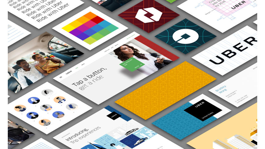
In case you're wondering what's wrong with the Uber Icon, we can tell you it's not a glitch with your phone. Uber updated its logo and refreshed the look of its rider and partner apps and its website on Tuesday, introducing a design framework known as the 'bit'.
"Have you ever looked at someone's hairstyle and thought "oh my, you peaked in the 1990s?" Well that's a bit how I feel about Uber's look today," wrote Travis Kalanick, CEO of Uber in a blog post announcing the new look. The new look celebrates the company's technology, and is customised for the cities it serves, he said.
"The old Uber was black and white, somewhat distant and cold. This belied what Uber actually is -- a transportation network, woven into the fabric of cities and how they move," He adds.
Uber's website now shows customised colours and patterns, drawn from the team's research of architecture, textiles, scenery, art, fashion, people, and more to come up with authentic identities for each of the 68 countries where it operates. The blog post illustrates different colours and patterns drawn from locales in China, India, Mexico. India's colours are shown to adapted from the Gateway of India, with shades of green, blue, yellow, and ochre.
Uber has also introduced a new logo type, which cuts the curls in the font, to enhance readability. With a larger logistics play in mind, Kalanick writes that Uber moves more than just people, but foods and goods as well, and the new icons for the rider and driver apps are a result of their new design thinking.
Get your daily dose of tech news, reviews, and insights, in under 80 characters on Gadgets 360 Turbo. Connect with fellow tech lovers on our Forum. Follow us on X, Facebook, WhatsApp, Threads and Google News for instant updates. Catch all the action on our YouTube channel.
Related Stories
- Samsung Galaxy Unpacked 2026
- iPhone 17 Pro Max
- ChatGPT
- iOS 26
- Laptop Under 50000
- Smartwatch Under 10000
- Apple Vision Pro
- Oneplus 12
- OnePlus Nord CE 3 Lite 5G
- iPhone 13
- Xiaomi 14 Pro
- Oppo Find N3
- Tecno Spark Go (2023)
- Realme V30
- Best Phones Under 25000
- Samsung Galaxy S24 Series
- Cryptocurrency
- iQoo 12
- Samsung Galaxy S24 Ultra
- Giottus
- Samsung Galaxy Z Flip 5
- Apple 'Scary Fast'
- Housefull 5
- GoPro Hero 12 Black Review
- Invincible Season 2
- JioGlass
- HD Ready TV
- Latest Mobile Phones
- Compare Phones
- Moto G47
- Motorola Razr 2026
- Motorola Razr+ 2026
- Motorola Razr Ultra 2026
- Moto G37
- Moto G37 Power
- Moto G87
- OnePlus Ace 6 Ultra
- Dell XPS 16
- Dell XPS 14
- OnePlus Pad 4
- Redmi Pad 2 9.7 4G
- NoiseFit Diva Araya
- OPPO Watch X3 Mini
- Xiaomi TV S Mini LED 2026 (75-inch)
- Xiaomi TV S Mini LED 2026 (65-inch)
- Asus ROG Ally
- Nintendo Switch Lite
- Voltas 1 Ton 3 Star Inverter Split AC (183V Vectra Zenith Silver(4503752))
- Voltas 1 Ton 3 Star Inverter Split AC (123V Vertis Smart Elite Gold(4503704))


