Instagram Overhauls Apps, Logo With Latest Update

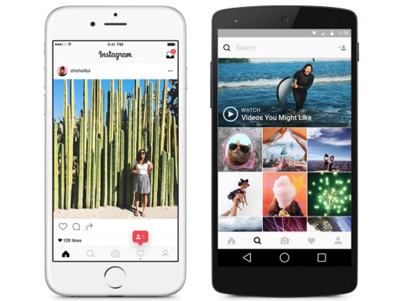
The updated Instagram apps have arrived on the App Store and Google Play. Beginning with the logo, Instagram has kept the idea behind the old logo alive in the new logo - retaining the camera and the rainbow. It is now more colourful, and the the brown coloured camera is completely gone, replaced with rainbow gradient in the background with just a white outline of the camera.
Ian Spalter, head of design at Instagram, explains in a Medium post why the company felt the need to change the logo. It was "beginning to feel, well... not reflective of the community, and we thought we could make it better."
The interface of the apps also saw a major overhaul in terms of design. Instagram has got rid of all the blue, and a new black and white theme now dominates the entire app. The blue bar on top that housed the direct message icon on the right, and the blackish bar at the bottom that had all the navigation options, are now both white. The fonts throughout are now solid black and the background is stark white.
There is no change in navigation, so the experience of browsing through the app is not dramatically different. Instagram reasons the black and white theme as an effort to "put more focus on users' photos and videos".
Instagram has grown a lot since its inception in 2010. The social app now has around 80 million photos and videos being uploaded to its app every day.
Get your daily dose of tech news, reviews, and insights, in under 80 characters on Gadgets 360 Turbo. Connect with fellow tech lovers on our Forum. Follow us on X, Facebook, WhatsApp, Threads and Google News for instant updates. Catch all the action on our YouTube channel.
Related Stories
- Samsung Galaxy Unpacked 2026
- iPhone 17 Pro Max
- ChatGPT
- iOS 26
- Laptop Under 50000
- Smartwatch Under 10000
- Apple Vision Pro
- Oneplus 12
- OnePlus Nord CE 3 Lite 5G
- iPhone 13
- Xiaomi 14 Pro
- Oppo Find N3
- Tecno Spark Go (2023)
- Realme V30
- Best Phones Under 25000
- Samsung Galaxy S24 Series
- Cryptocurrency
- iQoo 12
- Samsung Galaxy S24 Ultra
- Giottus
- Samsung Galaxy Z Flip 5
- Apple 'Scary Fast'
- Housefull 5
- GoPro Hero 12 Black Review
- Invincible Season 2
- JioGlass
- HD Ready TV
- Latest Mobile Phones
- Compare Phones
- Vivo T5 Pro 5G
- OPPO F33 5G
- OPPO F33 Pro 5G
- Redmi A7 Pro 5G
- Redmi R70m 5G
- Redmi R70 5G
- OPPO A6s Pro
- Realme Narzo 100 Lite 5G
- Asus Zenbook S14
- Asus Vivobook 16 (2026)
- Moto Pad (2026)
- Vivo Pad 6 Pro
- boAt Valour Watch 1R
- Xiaomi Watch S5
- Xiaomi TV S Mini LED 2026 (75-inch)
- Xiaomi TV S Mini LED 2026 (65-inch)
- Asus ROG Ally
- Nintendo Switch Lite
- Haier 1.6 Ton 5 Star Inverter Split AC (HSU19G-MZAID5BN-INV)
- Haier 1.6 Ton 5 Star Inverter Split AC (HSU19G-MZAIM5BN-INV)


