Google's Android app icons to reportedly get a 'Moonshine' makeover

Now, a new report claims that Google is also planning a makeover of its Android app icons to make them similar to Web app icons. Android Police notes that the new style is being internally referred as 'Moonshine'.
In a report, Android Police claims that the new app icons style will bring a flatter visual look, shadows behind elements, and would be indicative of the Google's current visual asset guidelines.
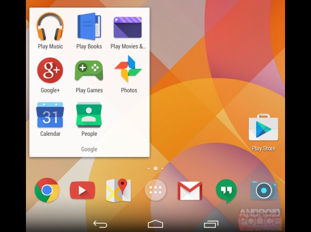
The report also carries a leaked screenshot with the alleged new app icons for Books, Calendar, Camera, Chrome, Games, Gmail, Google+, Hangouts, Maps, Movies, People, Play Music, Play Store and YouTube.
Some of the app icons in the leaked screenshot have been given a complete makeover like the Play Store icon, which now houses a Play symbol in bluish colour tone. Meanwhile others have received minor change in colour scheme or design.
As of now, there is no word as to how 'Moonshine' ties into Project Hera.
Notably, the Google's current visual asset guidelines list rules for app icon designs, such as design principles, colour pallets, colour combination, and typography among others.
An earlier report suggested that the Project Hera is real and even claimed that it is an attempt of Mountain View giant to unify users' experience on Android, Chrome and Search - building Chromium build for Android. The report also cited some leaked screenshots that showed apps with HTML5-based UI, where users could perform actions online without even using the full app.
A purported Gmail app screenshot was also leaked showing a developmental version, which pointed to a redesigned UI. However, the leaked purported image of the Gmail app had blurred details.
Get your daily dose of tech news, reviews, and insights, in under 80 characters on Gadgets 360 Turbo. Connect with fellow tech lovers on our Forum. Follow us on X, Facebook, WhatsApp, Threads and Google News for instant updates. Catch all the action on our YouTube channel.
Related Stories
- Samsung Galaxy Unpacked 2026
- iPhone 17 Pro Max
- ChatGPT
- iOS 26
- Laptop Under 50000
- Smartwatch Under 10000
- Apple Vision Pro
- Oneplus 12
- OnePlus Nord CE 3 Lite 5G
- iPhone 13
- Xiaomi 14 Pro
- Oppo Find N3
- Tecno Spark Go (2023)
- Realme V30
- Best Phones Under 25000
- Samsung Galaxy S24 Series
- Cryptocurrency
- iQoo 12
- Samsung Galaxy S24 Ultra
- Giottus
- Samsung Galaxy Z Flip 5
- Apple 'Scary Fast'
- Housefull 5
- GoPro Hero 12 Black Review
- Invincible Season 2
- JioGlass
- HD Ready TV
- Latest Mobile Phones
- Compare Phones
- Vivo T5 Pro 5G
- OPPO F33 5G
- OPPO F33 Pro 5G
- Redmi A7 Pro 5G
- Redmi R70m 5G
- Redmi R70 5G
- OPPO A6s Pro
- Realme Narzo 100 Lite 5G
- Asus Zenbook S14
- Asus Vivobook 16 (2026)
- Moto Pad (2026)
- Vivo Pad 6 Pro
- boAt Valour Watch 1R
- Xiaomi Watch S5
- Xiaomi TV S Mini LED 2026 (75-inch)
- Xiaomi TV S Mini LED 2026 (65-inch)
- Asus ROG Ally
- Nintendo Switch Lite
- Haier 1.6 Ton 5 Star Inverter Split AC (HSU19G-MZAID5BN-INV)
- Haier 1.6 Ton 5 Star Inverter Split AC (HSU19G-MZAIM5BN-INV)


