Google revamps Web version of the Play Store
By Anupam Saxena | Updated: 16 July 2013 10:59 IST
Click Here to Add Gadgets360 As A Trusted Source

Advertisement
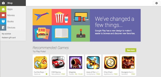
Google has revamped the Web version of the Play Store, its content destination through which it offers Apps, Movies, Books and Devices, in addition to Music (not available in the Indian market yet).
The updated Web version of the Play Store sports an interface similar to the one seen in the redesigned Play Store apps for Android, employing the use of cards and white space, which was rolled out in April. This essentially means that the Play Store will feature a consistent user interface, and users will feel at home, no matter which device they use.
Navigating the Play Store is now simpler as content categories including Apps, Movies, Books and Devices, are located at a column on the left hand side, with the user's Wishlist and the option to redeem gift cards. The home page features recommended content, top lists, new releases, and other listings based on different themes (for example apps of a particular genre, books under Rs. 100). The content listing is also in the form of cards.
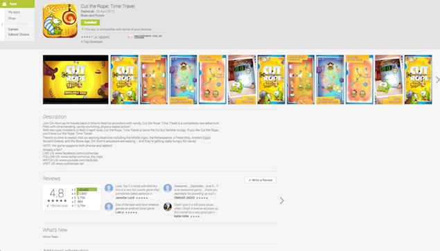 Clicking on a card listing takes you to its own page. Gone are the columns and tabs that separated app versions, reviews and change-log/ what's new. The Install button is right at the top with the 'Add to Wishlist' button, device compatibility and the option to recommend it on Google+, followed by the app demo video, and a gallery of big screenshots that can be browsed through a slider on the same page. This is followed by the description of the app, Reviews, What's new (change log), Additional Information, Similar apps and More from developer, all on the same page.
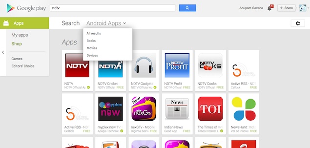 The Search feature also allows users to filter results across different content categories.
The new design offers simple navigation, is faster and is focused on aiding discovery of content.
The updated Web version of the Play Store sports an interface similar to the one seen in the redesigned Play Store apps for Android, employing the use of cards and white space, which was rolled out in April. This essentially means that the Play Store will feature a consistent user interface, and users will feel at home, no matter which device they use.
Navigating the Play Store is now simpler as content categories including Apps, Movies, Books and Devices, are located at a column on the left hand side, with the user's Wishlist and the option to redeem gift cards. The home page features recommended content, top lists, new releases, and other listings based on different themes (for example apps of a particular genre, books under Rs. 100). The content listing is also in the form of cards.
The new design offers simple navigation, is faster and is focused on aiding discovery of content.
Comments
For details of the latest launches and news from Samsung, Xiaomi, Realme, OnePlus, Oppo and other companies at the Mobile World Congress in Barcelona, visit our MWC 2026 hub.
Further reading:
Android, Google, Google Play, Google Play Store, Redesigned Play Store, Redesigned web Play Store
Related Stories
Popular on Gadgets
- Samsung Galaxy Unpacked 2026
- iPhone 17 Pro Max
- ChatGPT
- iOS 26
- Laptop Under 50000
- Smartwatch Under 10000
- Apple Vision Pro
- Oneplus 12
- OnePlus Nord CE 3 Lite 5G
- iPhone 13
- Xiaomi 14 Pro
- Oppo Find N3
- Tecno Spark Go (2023)
- Realme V30
- Best Phones Under 25000
- Samsung Galaxy S24 Series
- Cryptocurrency
- iQoo 12
- Samsung Galaxy S24 Ultra
- Giottus
- Samsung Galaxy Z Flip 5
- Apple 'Scary Fast'
- Housefull 5
- GoPro Hero 12 Black Review
- Invincible Season 2
- JioGlass
- HD Ready TV
- Latest Mobile Phones
- Compare Phones
Latest Gadgets
- Realme C83 5G
- Nothing Phone 4a Pro
- Infinix Note 60 Ultra
- Nothing Phone 4a
- Honor 600 Lite
- Nubia Neo 5 GT
- Realme Narzo Power 5G
- Vivo X300 FE
- MacBook Neo
- MacBook Pro 16-Inch (M5 Max, 2026)
- Tecno Megapad 2
- Apple iPad Air 13-Inch (2026) Wi-Fi + Cellular
- Tecno Watch GT 1S
- Huawei Watch GT Runner 2
- Xiaomi QLED TV X Pro 75
- Haier H5E Series
- Asus ROG Ally
- Nintendo Switch Lite
- Haier 1.6 Ton 5 Star Inverter Split AC (HSU19G-MZAID5BN-INV)
- Haier 1.6 Ton 5 Star Inverter Split AC (HSU19G-MZAIM5BN-INV)
© Copyright Red Pixels Ventures Limited 2026. All rights reserved.


