Google Hangouts 4.0 Leak Reveals an Overhauled Interface

Google has been upgrading its Hangouts app regularly over the past few months in order to bring it in line with the Android 5.0 Lollipop's Material Design mantra. The search giant now seems to be bringing the user interface of the messaging app even closer to its Material Design theme, if a new report is to be believed.
Android Police claims to have gotten its hands on v4.0 of Google Hangouts ahead of its official release, and details the changes. As per the report, it looks like Google is working on fixing several issues in the app dealing with the interface and accessibility.
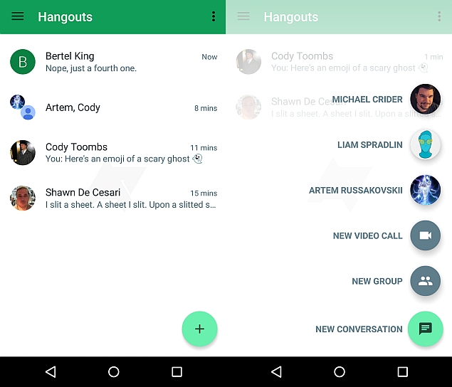
Besides a new loading screen, Google Hangouts v4.0 users will reportedly not see the 'people' and 'messaging' tabs but just one window showing the messages. The two tabs however, can be seen only if the user has Google Dialer installed in the device.
Also, the app would include an inbox-like floating action button (seen above) at the bottom right corner for creating a new message. On tapping, the action button shows options to create a new message, a video call, SMS, or start new group, apart from speed dial options of frequently used contacts. The report claims that users can access the contacts tab both from the drawer and from the action button.
While from the drawer users can navigate to the regular list of contacts, a new conversation is launched if users navigate there from the floating action button. Access to 'new group' option is also possible from inside a specific conversation. A different animation and interface for 'Anyone Else?' prompt while initiating a conversation has been shown in Hangouts 4.0.
The unannounced version of the Google Hangouts also ditches the trash icon on top right when a Hangout conversation is selected, and instead shows a delete option in the overflow menu on top along with a 'notify' option, which is said to mark the conversation as unread.
In group conversations, the Google Hangouts v4.0 would show a black bar on top for few seconds when the user mutes the conversation. Currently the Hangouts app shows a red bar inside the conversation. Option to set a "status" is also seen present in the app drawer. In the chat screen, users would see the emoji, insert image, take image, share location options below the typing window. The options are currently hidden under the 'attach' clip-icon. In addition, the outgoing messages have turned white, while the incoming ones are shown in green, opposite from what is available in the current Hangouts version. The image or document attachment style is also changed.
If the user has SMS enabled in the device, a small dropdown at the left side of the message box will be seen that includes options to switch between messaging options. The Google Hangouts v4.0 however sports the same layout for tablets and is yet to be optimised for the large screen device. The app shows a single pane view instead of a split-pane view.
While the leak is certainly detailed and Android Police has a history of credible information, readers should note Google may make changes by the time its starts rolling out Hangouts v4.0 to general users.
For the latest tech news and reviews, follow Gadgets 360 on X, Facebook, WhatsApp, Threads and Google News. For the latest videos on gadgets and tech, subscribe to our YouTube channel. If you want to know everything about top influencers, follow our in-house Who'sThat360 on Instagram and YouTube.
Related Stories
- Samsung Galaxy Unpacked 2025
- ChatGPT
- Redmi Note 14 Pro+
- iPhone 16
- Apple Vision Pro
- Oneplus 12
- OnePlus Nord CE 3 Lite 5G
- iPhone 13
- Xiaomi 14 Pro
- Oppo Find N3
- Tecno Spark Go (2023)
- Realme V30
- Best Phones Under 25000
- Samsung Galaxy S24 Series
- Cryptocurrency
- iQoo 12
- Samsung Galaxy S24 Ultra
- Giottus
- Samsung Galaxy Z Flip 5
- Apple 'Scary Fast'
- Housefull 5
- GoPro Hero 12 Black Review
- Invincible Season 2
- JioGlass
- HD Ready TV
- Laptop Under 50000
- Smartwatch Under 10000
- Latest Mobile Phones
- Compare Phones
- Moto G15 Power
- Moto G15
- Realme 14x 5G
- Poco M7 Pro 5G
- Poco C75 5G
- Vivo Y300 (China)
- HMD Arc
- Lava Blaze Duo 5G
- Asus Zenbook S 14
- MacBook Pro 16-inch (M4 Max, 2024)
- Honor Pad V9
- Tecno Megapad 11
- Redmi Watch 5
- Huawei Watch Ultimate Design
- Sony 65 Inches Ultra HD (4K) LED Smart TV (KD-65X74L)
- TCL 55 Inches Ultra HD (4K) LED Smart TV (55C61B)
- Sony PlayStation 5 Pro
- Sony PlayStation 5 Slim Digital Edition
- Blue Star 1.5 Ton 3 Star Inverter Split AC (IC318DNUHC)
- Blue Star 1.5 Ton 3 Star Inverter Split AC (IA318VKU)


