Facebook unveils Paper, a Flipboard-style news reader app for iPhone
By NDTV Correspondent | Updated: 30 January 2014 20:00 IST
Click Here to Add Gadgets360 As A Trusted Source

Advertisement
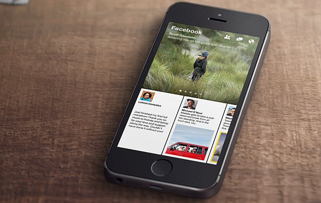
Facebook has announced the launch of its first news reader app, called Paper. It will be available for the iPhone in the US on February 3. Facebook says Paper is the first product from the Facebook Creative Labs, where it claims to be "crafting new apps to support the diverse ways people want to connect and share."
The social networking giant had been rumoured to be readying the app earlier in January, and the unveiled app is exactly in line with earlier expectations, featuring a Flipboard-style layout.
The newly-unveiled Paper is also the first of the new standalone apps from Facebook, new products in the vein of Messenger and Instagram that CEO Zuckerberg hinted at during Wednesday's earnings call - a Facebook Groups app is also expected.
The Facebook Paper app in many ways can replace the regular Facebook app, as it allows users to browse and interact with posts/ stories from their News Feed - the primary function of the regular app - in a brand new 'immersive design and fullscreen, distraction-free layout'. While all the functions of the main app aren't present, Paper's layout is certainly an attractive, high-bandwidth alternative.
 The 'distraction-free layout' also has us wondering just where Facebook will sticks ads into the application, as without them, it would losing a platform for mobile advertising, which currently brings more than 50 percent of its advertising revenue.
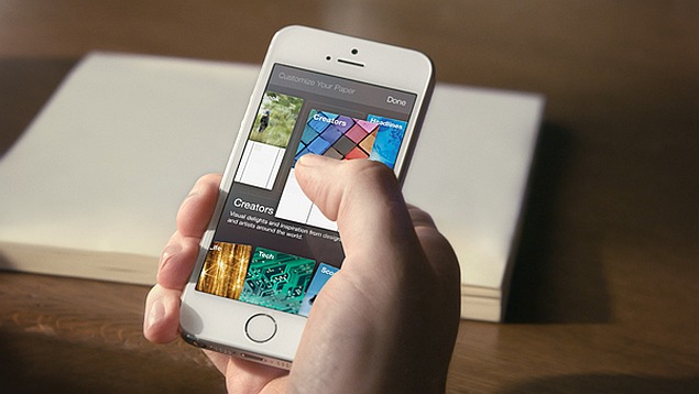
You might be wondering why Facebook Paper is called a standalone news reader app, if all it shows are stories from the user's News Feed. Well, it's being called one because it also shows curated news and feature content in themed sections to users.
Themes and topics include more than a dozen choices initially, such as photography, sports, food, science and design. Content in these sections is chosen by Facebook editors from new as well-established publications. Detailed covers will apparently make it easier to spot preferred sources. Users at this point will not be able to add their own sources.
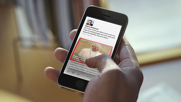 Coming back to the interface of Paper, Facebook is touting intuitive controls, allowing users to easily browse stories with 'natural movements'. The company says users will also be able pan-through high-resolution panoramic photos by simply tilting the phone. Fullscreen autoplay videos will apparently also aid in the immersive experience.
As for posting content, Facebook says it has made it "easier to craft and share beautiful stories." This is via a new compose mode, which will also show users a live preview of their post before they share it.
For more details ahead of the official launch, refer to Facebook's Paper page, and also check out the video below.
The social networking giant had been rumoured to be readying the app earlier in January, and the unveiled app is exactly in line with earlier expectations, featuring a Flipboard-style layout.
The newly-unveiled Paper is also the first of the new standalone apps from Facebook, new products in the vein of Messenger and Instagram that CEO Zuckerberg hinted at during Wednesday's earnings call - a Facebook Groups app is also expected.
The Facebook Paper app in many ways can replace the regular Facebook app, as it allows users to browse and interact with posts/ stories from their News Feed - the primary function of the regular app - in a brand new 'immersive design and fullscreen, distraction-free layout'. While all the functions of the main app aren't present, Paper's layout is certainly an attractive, high-bandwidth alternative.
You might be wondering why Facebook Paper is called a standalone news reader app, if all it shows are stories from the user's News Feed. Well, it's being called one because it also shows curated news and feature content in themed sections to users.
Themes and topics include more than a dozen choices initially, such as photography, sports, food, science and design. Content in these sections is chosen by Facebook editors from new as well-established publications. Detailed covers will apparently make it easier to spot preferred sources. Users at this point will not be able to add their own sources.
As for posting content, Facebook says it has made it "easier to craft and share beautiful stories." This is via a new compose mode, which will also show users a live preview of their post before they share it.
For more details ahead of the official launch, refer to Facebook's Paper page, and also check out the video below.
Comments
Get your daily dose of tech news, reviews, and insights, in under 80 characters on Gadgets 360 Turbo. Connect with fellow tech lovers on our Forum. Follow us on X, Facebook, WhatsApp, Threads and Google News for instant updates. Catch all the action on our YouTube channel.
Further reading:
FB, Facebook, Facebook Paper, Facebook app, Paper app, app, iOS app, iPhone app, news-reading app, social, social networking
Related Stories
Popular on Gadgets
- Samsung Galaxy Unpacked 2026
- iPhone 17 Pro Max
- ChatGPT
- iOS 26
- Laptop Under 50000
- Smartwatch Under 10000
- Apple Vision Pro
- Oneplus 12
- OnePlus Nord CE 3 Lite 5G
- iPhone 13
- Xiaomi 14 Pro
- Oppo Find N3
- Tecno Spark Go (2023)
- Realme V30
- Best Phones Under 25000
- Samsung Galaxy S24 Series
- Cryptocurrency
- iQoo 12
- Samsung Galaxy S24 Ultra
- Giottus
- Samsung Galaxy Z Flip 5
- Apple 'Scary Fast'
- Housefull 5
- GoPro Hero 12 Black Review
- Invincible Season 2
- JioGlass
- HD Ready TV
- Latest Mobile Phones
- Compare Phones
Latest Gadgets
- Honor Play 70C
- Honor Play 80 Plus
- Moto G47
- Motorola Razr 2026
- Motorola Razr+ 2026
- Motorola Razr Ultra 2026
- Moto G37
- Moto G37 Power
- Dell XPS 16
- Dell XPS 14
- OnePlus Pad 4
- Redmi Pad 2 9.7 4G
- NoiseFit Diva Araya
- OPPO Watch X3 Mini
- Xiaomi TV S Mini LED 2026 (75-inch)
- Xiaomi TV S Mini LED 2026 (65-inch)
- Asus ROG Ally
- Nintendo Switch Lite
- Blue Star 1.5 Ton 5 Star Inverter Split AC (IA518ZXUS)
- Blue Star 1.5 Ton 3 Star Inverter Split AC (IA318ZXU)
© Copyright Red Pixels Ventures Limited 2026. All rights reserved.
-
 Astronomers Discover Trans-Neptunian Object With Atmosphere in Outer Solar System
-
 Samsung's One UI 8.5 Update Finally Rolls Out to Galaxy S25 Series, S24 Series, S25 FE, Z Fold 7 and Z Flip 7
-
 Samsung Galaxy A27 5G Shows Up on Geekbench Again With Slightly Improved Performance Scores
-
 Adobe Unveils New Productivity Agent for Acrobat, Adds New Features to PDF Spaces


