Facebook for iOS gets an iOS 7-style redesign
By Anupam Saxena | Updated: 19 September 2013 15:14 IST

Click Here to Add Gadgets360 As A Trusted Source

Advertisement
Following the public release of iOS 7, which features a completely overhauled user interface and new design elements, we're gradually seeing updated third-party apps that sport a new look in line with the new operating system.
One of the major app redesigns has been done by Facebook for its iPhone app. The social networking service has completely revamped its iOS app not just for iOS 7 but also for other versions of iOS including iOS 5 and iOS 6.
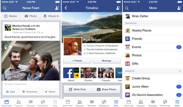
Facebook has always used a more custom design instead of going with iOS style navigation elements. However, the updated app in a way switches to more iOS-like navigation with a new bar at the bottom of the app, that features buttons for News feed, Friend Requests, messages, notifications, and a More button that offers a menu which was previously included in a sliding pane at the left hand, a feature that some people also call the Hamburger menu.
The bar is white in colour with grey text and icons for passive tabs and blue text and icon for the active one in iOS 7. The same bar is black and follows the old iOS design scheme on iOS 5 and iOS 6. The top header is also translucent on iOS 7.
The More menu features the user profile, Nearby Places to check-in, other Pages that you're moderating, Groups, Events, Friends lists, Photos and other options.
The app header features a Search button and a button for bringing the Chat sliding pane at the right hand.
The News Feed tab also offers three buttons at the top for posting a status message, uploading a Photo and Checking in at a place.
 The Facebook app for iOS is a universal app, which means the same app also runs on the iPad. However, the iPad counterpart still retains the original UI elements including the sliding pane at the left hand and three small icons for Friend requests, Messages, and Notifications at the top header. However, the header now sports blue colour.
The new app is now live on the iTunes App Store. However, it could take some time till you see an update option, while it rolls out to all regions.
One of the major app redesigns has been done by Facebook for its iPhone app. The social networking service has completely revamped its iOS app not just for iOS 7 but also for other versions of iOS including iOS 5 and iOS 6.
Facebook has always used a more custom design instead of going with iOS style navigation elements. However, the updated app in a way switches to more iOS-like navigation with a new bar at the bottom of the app, that features buttons for News feed, Friend Requests, messages, notifications, and a More button that offers a menu which was previously included in a sliding pane at the left hand, a feature that some people also call the Hamburger menu.
The bar is white in colour with grey text and icons for passive tabs and blue text and icon for the active one in iOS 7. The same bar is black and follows the old iOS design scheme on iOS 5 and iOS 6. The top header is also translucent on iOS 7.
The More menu features the user profile, Nearby Places to check-in, other Pages that you're moderating, Groups, Events, Friends lists, Photos and other options.
The app header features a Search button and a button for bringing the Chat sliding pane at the right hand.
The News Feed tab also offers three buttons at the top for posting a status message, uploading a Photo and Checking in at a place.
The new app is now live on the iTunes App Store. However, it could take some time till you see an update option, while it rolls out to all regions.
Comments
Get your daily dose of tech news, reviews, and insights, in under 80 characters on Gadgets 360 Turbo. Connect with fellow tech lovers on our Forum. Follow us on X, Facebook, WhatsApp, Threads and Google News for instant updates. Catch all the action on our YouTube channel.
Related Stories
Popular on Gadgets
- Samsung Galaxy Unpacked 2026
- iPhone 17 Pro Max
- ChatGPT
- iOS 26
- Laptop Under 50000
- Smartwatch Under 10000
- Apple Vision Pro
- Oneplus 12
- OnePlus Nord CE 3 Lite 5G
- iPhone 13
- Xiaomi 14 Pro
- Oppo Find N3
- Tecno Spark Go (2023)
- Realme V30
- Best Phones Under 25000
- Samsung Galaxy S24 Series
- Cryptocurrency
- iQoo 12
- Samsung Galaxy S24 Ultra
- Giottus
- Samsung Galaxy Z Flip 5
- Apple 'Scary Fast'
- Housefull 5
- GoPro Hero 12 Black Review
- Invincible Season 2
- JioGlass
- HD Ready TV
- Latest Mobile Phones
- Compare Phones
Latest Gadgets
- OnePlus Ace 6 Ultra
- Poco C81 Pro
- Vivo Y500s
- Vivo Y600 Pro
- Infinix GT 50 Pro
- Vivo Y6 5G
- Vivo Y05 5G
- Poco C81x
- Dell XPS 16
- Dell XPS 14
- Redmi Pad 2 9.7 4G
- Redmi Pad 2 9.7
- NoiseFit Diva Araya
- OPPO Watch X3 Mini
- Xiaomi TV S Mini LED 2026 (75-inch)
- Xiaomi TV S Mini LED 2026 (65-inch)
- Asus ROG Ally
- Nintendo Switch Lite
- Voltas 1 Ton 3 Star Inverter Split AC (183V Vectra Zenith Silver(4503752))
- Voltas 1 Ton 3 Star Inverter Split AC (123V Vertis Smart Elite Gold(4503704))
© Copyright Red Pixels Ventures Limited 2026. All rights reserved.


