- Home
- Apps
- Apps Features
- Sorry Google, Material Design Just Doesn't Belong on iOS
Sorry Google, Material Design Just Doesn't Belong on iOS
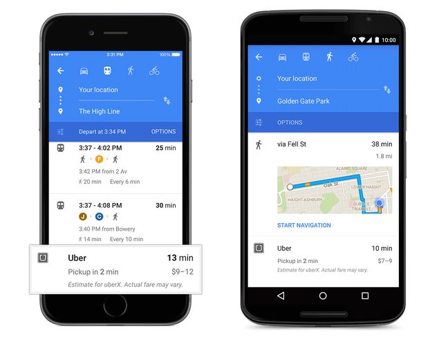
Last week, Google released an update to Google Maps for iOS with one major change - Material Design. This is one of the headline features of Google's latest Android 5.0 Lollipop operating system.
One of the goals of Google's Material Design programme is to "develop a single underlying system that allows for a unified experience across platforms and device sizes". True to that, Google Maps for iOS 4.0.0 looks almost identical to its Android counterpart. And as a result, the app now looks completely out of place on iOS.
With Material Design, Google's aim is to create a user interface that is consistent across apps; one that looks good, is intuitive and has smooth animations. That's the theory, anyway.
Google Maps' blog post announcing the release of the latest Google Maps mentions a few other things: "Bold colours and textures are in-and Google Maps is on trend, with a slick new style to make traveling with Maps even easier."
In practice things don't work out as well.
Thanks to the new design, using Google Maps on iOS is a jarring experience, that makes you feel like you're switching between different operating systems every time you load the app.
What Google seems to have ignored is that apps are not websites - a good website will offer a consistent look no matter which platform you open it from. On the other hand, a good app blends into the platform, and feels like a natural part of your device. That's not just our opinion either - Google has the same view when it comes to apps running on Android.
In the above video, Google employees talk about designing apps for Android and they stress on the fact that the app should use interface elements native to the OS. An important point for developers is to "make sure that you're not blindly copying the exact png assets across platforms."
Google's own guidelines for Android developers also mention this: "For any icon in your existing set where the symbol is different from Android's, use Android's symbol but give it your brand's styling."
Google's Material Design apps do the opposite of this and the result is that using them on iOS feels jarring. Apple pundit and design critic John Gruber wrote:
"Follow the idioms and standards of the platform you're writing for" is good sound advice. But Google is doing just the opposite with nearly all of their iOS apps. They're not adhering to iOS design idioms - they're adhering to their own Material Design style. Look no further than the "sharing" button in the iOS YouTube app - it's Android's.
While there is no official Google statement on this design choice, Matias Duarte, Vice President Design, Google wrote this on Google+ last year, in response to a question about Google using Android share icons in its iOS apps: "The share icon Google uses in its properties (and the share icon that Android endorses) is a popular opensource icon and one that we feel well describes the connective nature of sharing. In a sense you could say we believe it is part of our brand and that Google's brand is to embrace the open and universal standard."
![]()
![]() iOS has a native sharing icon that everyone recognises (left) but Google's YouTube app (right) prefers to use one Android users would be more comfortable with.
iOS has a native sharing icon that everyone recognises (left) but Google's YouTube app (right) prefers to use one Android users would be more comfortable with.
It's rather convenient for Google to claim that its own standards are the de facto open and universal standard. Critics of Google's iOS apps feel that the company's design choices smack of arrogance. You can even argue that Google is consciously avoiding native iOS design in order to stamp its branding on its biggest rival.
Marco Arment, an iOS app developer who made apps such as Instapaper and Overcast, wrote in a post responding to Duarte's justification for using Android icons on iOS: "Maybe it's just my inability to understand anything Matias Duarte ever says, but I see this as Google's typical bullshit, insulting our intelligence as they push a self-serving corporate branding initiative and sheer arrogance as an inevitable, morally imperative 'open standard'."
Arment adds in the post, "Why not tell the truth? Google's apps don't use the iOS share icons because Google doesn't respect iOS and thinks its standard UI widgets are better, even in their iOS apps, on a platform surrounded by other apps that all use the standard iOS share icon."
This post was written a day before Google released the Material Design update for Google Maps on iOS, and until then, the debate around Google's UI design for iOS was over minor elements such as the share icon in YouTube for iOS. The same YouTube app has a menu that uses iOS fonts and a transparency effect in line with native iOS 7 design. However, it's only a matter of time until YouTube gets its Material Design update, after which Google will have a suite of Android-ish apps (Gmail, Inbox by Google, Google Maps and YouTube being the most popular ones) on iOS.
Arment highlights this by writing: "Secondarily, it reinforces their branding and makes the rest of iOS feel just a little bit more alien to people who heavily buy into the Google ecosystem, reducing iOS' lock-in and making it cognitively easier to switch away."
Google's attempt at giving iOS users a taste of its Material Design UI feels as if it is trying too hard to force Android down their throat. Google's strategy could pay off, and some people may eventually decide that they like Material Design better than iOS's UI. But there's an equal chance of people just looking for apps that feel at home on iOS.
Get your daily dose of tech news, reviews, and insights, in under 80 characters on Gadgets 360 Turbo. Connect with fellow tech lovers on our Forum. Follow us on X, Facebook, WhatsApp, Threads and Google News for instant updates. Catch all the action on our YouTube channel.
Related Stories
- Samsung Galaxy Unpacked 2026
- iPhone 17 Pro Max
- ChatGPT
- iOS 26
- Laptop Under 50000
- Smartwatch Under 10000
- Apple Vision Pro
- Oneplus 12
- OnePlus Nord CE 3 Lite 5G
- iPhone 13
- Xiaomi 14 Pro
- Oppo Find N3
- Tecno Spark Go (2023)
- Realme V30
- Best Phones Under 25000
- Samsung Galaxy S24 Series
- Cryptocurrency
- iQoo 12
- Samsung Galaxy S24 Ultra
- Giottus
- Samsung Galaxy Z Flip 5
- Apple 'Scary Fast'
- Housefull 5
- GoPro Hero 12 Black Review
- Invincible Season 2
- JioGlass
- HD Ready TV
- Latest Mobile Phones
- Compare Phones
- Honor X80i
- Honor Play 80 Pro
- Redmi Note 15 SE 5G
- Redmi A7 Pro
- OPPO K15 Pro
- OPPO K15 Pro+
- Lava Bold N2 Lite
- Lava Bold N2 Pro
- Xiaomi Book Pro 14
- MacBook Neo
- Vivo Pad 6 Pro
- Lenovo Legion Y700 Gen 5
- boAt Valour Watch 1R
- Xiaomi Watch S5
- Xiaomi QLED TV X Pro 75
- Haier H5E Series
- Asus ROG Ally
- Nintendo Switch Lite
- Haier 1.6 Ton 5 Star Inverter Split AC (HSU19G-MZAID5BN-INV)
- Haier 1.6 Ton 5 Star Inverter Split AC (HSU19G-MZAIM5BN-INV)


